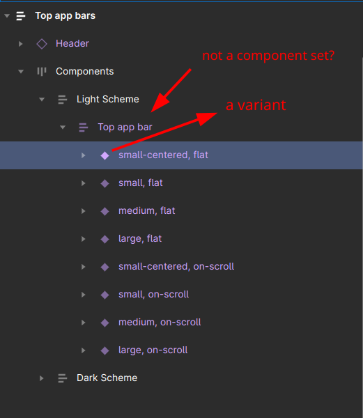
I’m exploring the Material 3 Design Kit, and I could use some assistance to fully understand what I’m currently observing.
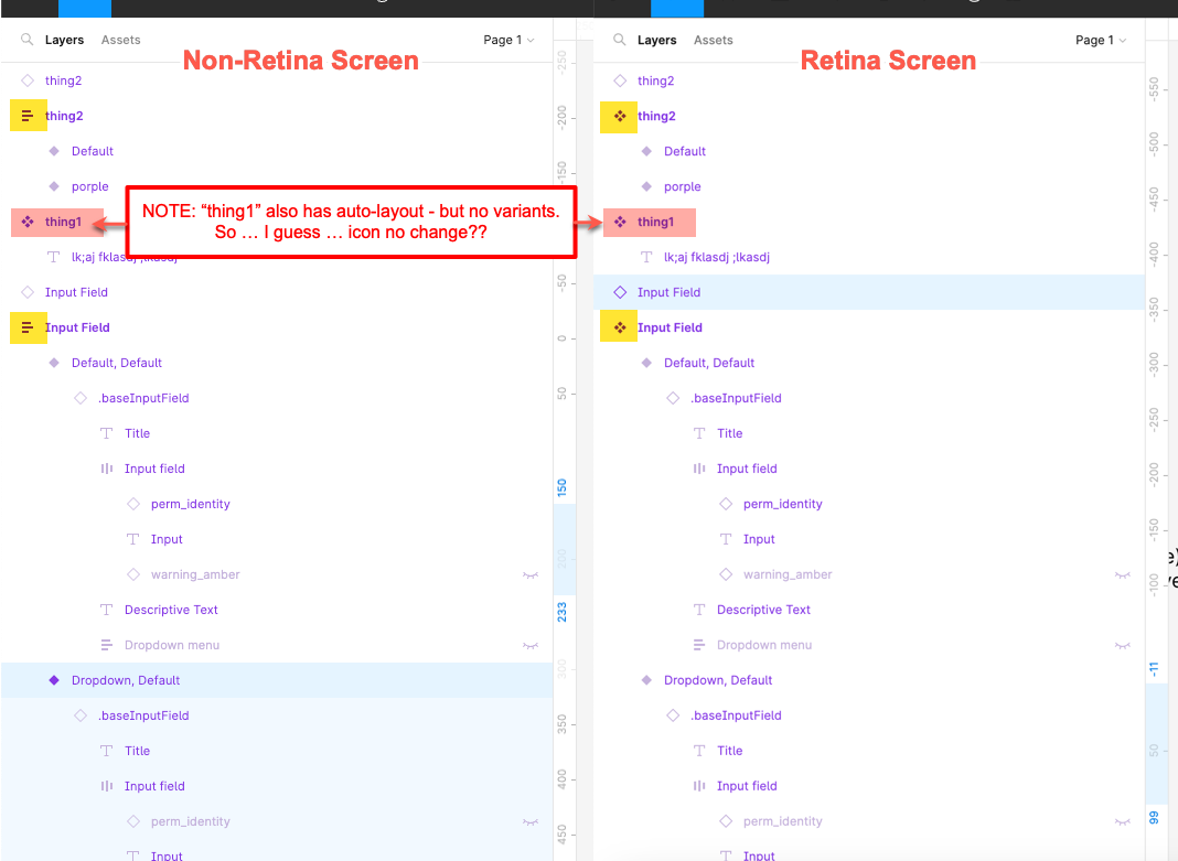
As you see on the screenshot, there are a few layers with the “filled diamond” icon, which designates them as Variants. However, there are no parent or ancestor layers that are marked with the multiple-filled-diamonds icon, i.e. the component one. What’s the matter here?
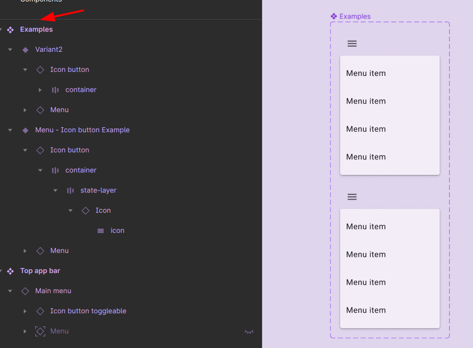
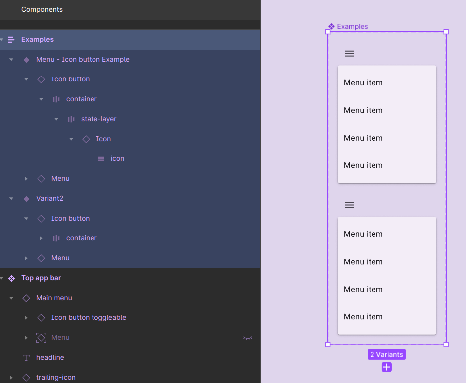
This seems bizarre, but I just noticed that the icon changes based on the presence of variants and which screen I view these components on.
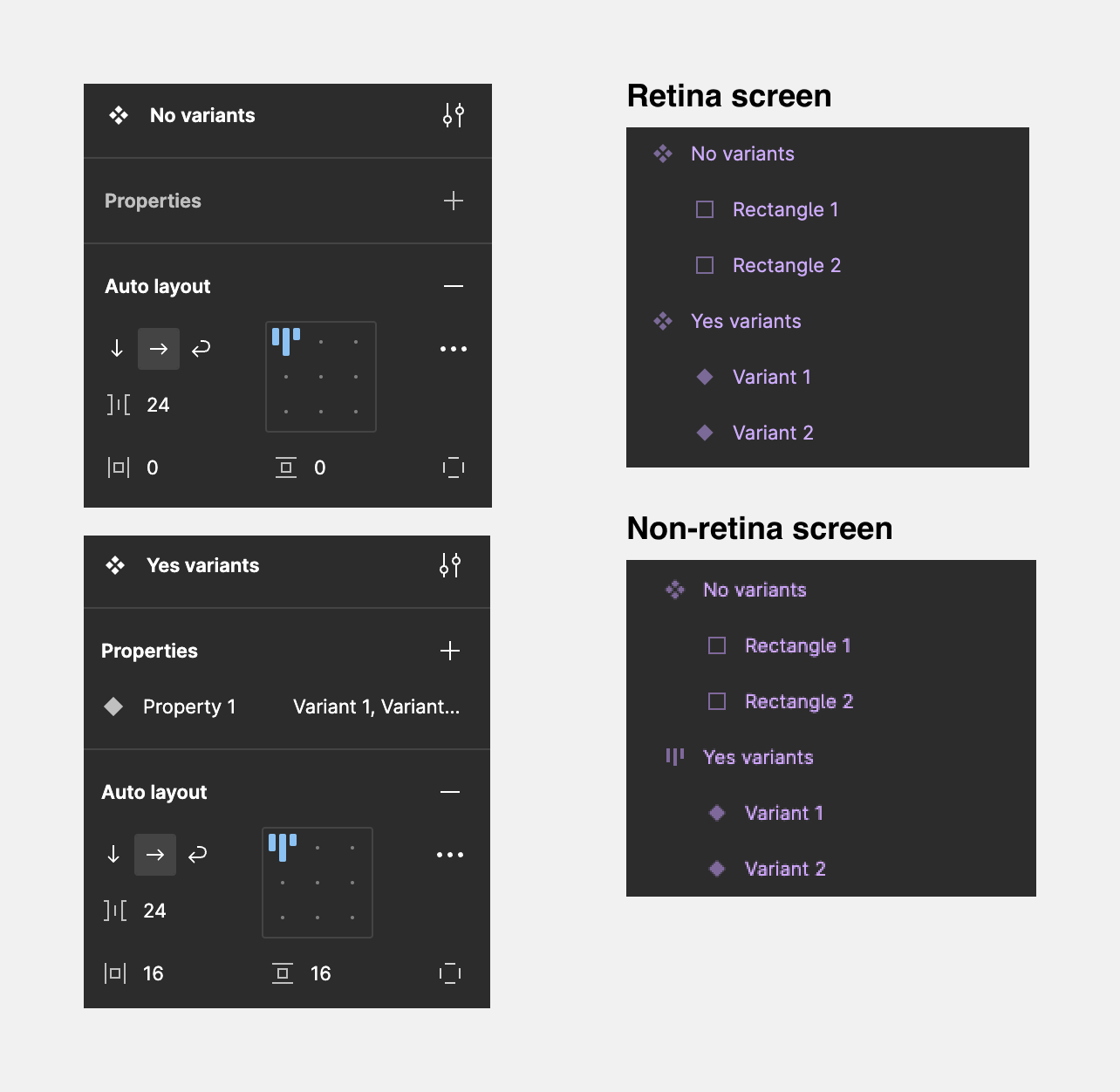
Two components, one without variants, one with. Both have auto layout. The component’s icon will indicate auto layout only if the component has variants, and viewed on a non-retina screen. No difference on the retina screen (i.e. the icon displays as a component for both).
Component set is a container for components, thus having an indication that it has auto layout is sensible. For a single component it’s not a big deal as you cannot change flow direction and stuff
It seems that:
if there’s auto-layout on the component, and the component has variants, then that component’s icon changes to an “auto-layout” icon instead of a component icon?
Why?
And why only on a component that has variants?
Seems a strange design choice, IMHO.
For me personally, it’s already confusing enough to call a component with variants a “component set” when it’s really just a component. (And I’m still not clear on whether a “base component,” e.g. one named with a “.” or “_” prefix, is something else entirely…) We’ve got some of the diamond icons changing color from very faint to bright purple (when selected), and others staying the same color all the time (whether selected or not). And now we’ve got icons changing completely based on one specific property setting (auto-layout), as if that defines the type of component that it is. Odd.
Also confirmed that this behavior is different on a retina screen and a non-retina screen, as @IraX observed: