Include color variable alias in dev mode side panel

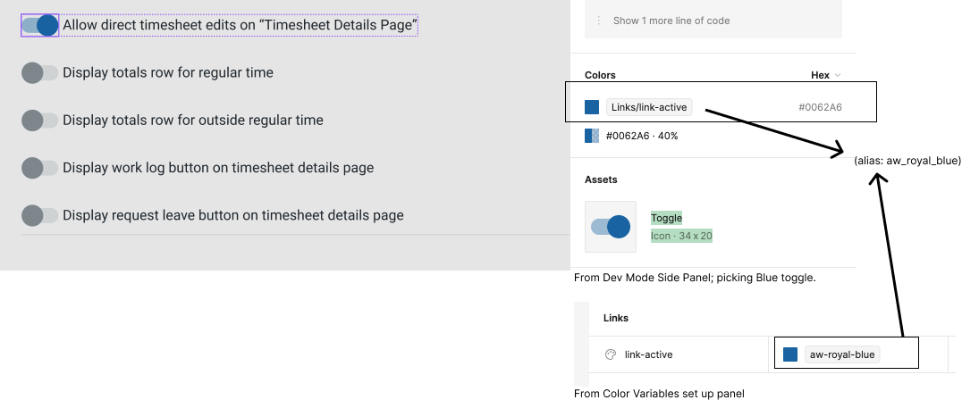
Hi. I have set up all my color variables in my design system “App_Usage_Collection.” But my devs use storybook and they call the colors by their primitive names, so I set up another collection of color variables called _Storybook. I alias the Storybook Primitives in the App_Color_Usage collection. BUT in dev mode I only see the app_color_usage collection variable name, not the alias. Can we also please see the alias listed? Thanks! :pray:

16 Likes

Yes please!! Was looking for this and it would be immensely useful!!

4 Likes

Really… wanted to fix…

4 Likes

Tell your friends who agree to upvote this please!

2 Likes

I need aliases for my use case as well.

3 Likes

pleaseee, we need this!

2 Likes

I’ve created root variables for all of my root colors. Then, for each component I am creating alias variables for colors of specific elements (e.g., text, background, border) in different states (default, hover, active, disabled) and configurations (e.g., default, error, selected). The alias variables link back to specific root variables. However, in dev mode all I see is the HEX code, not the name of the root variable that the developer should assign as the value to the alias variable for the specific element of the component in a specific state and configuration. I think this is a big oversight, as the developer would need to find the correct root variable that needs to be assigned to each alias variable for each component for each theme when creating the themes in CSS by matching up HEX codes.

TL;DR; if a variable is getting its value from another variable, please give us the option to see this relationship in Dev Mode.

Here is a basic example:

/* Global CSS ------------------*/

/* root colors */
/* --[name space]-[var type]-root-[name] */
--ns-color-root-light: #AAAAAA;
--ns-color-root-neutral: #808080;
--ns-color-root-dark: #111111;


/* alias colors for Button component */
/* --[name space]-[var type]-[component]-[configuration a...n]-[state]-[element] */

/* light theme */
.light {
    --ns-color-button-primary-default-label: var(--ns-color-root-dark);
    --ns-color-button-primary-default-background: var(--ns-color-root-neutral);
    --ns-color-button-primary-default-border: var(--ns-color-root-dark);
}

/* dark theme */
.dark {
    --ns-color-button-primary-default-label: var(--ns-color-root-light);
    --ns-color-button-primary-default-background: var(--ns-color-root-neutral);
    --ns-color-button-primary-default-border: var(--ns-color-root-light);
}

/*----------------------*/
/* Button component CSS */

color: var(--ns-color-button-primary-default-label);
background-color: var(--ns-color-button-primary-default-background);
border-color: var(--ns-color-button-primary-default-border);
/* When I inspect the Button in dev mode,
I want to see the names of the variables that these three
variables are getting their values from, NOT the HEX. **/
2 Likes

I’m having the same issue. My devs need to see the values that are feeding the semantic components, but there’s no way to do that in dev mode. The unfortunate workaround is that I need to manually define the underlying primitive values using Code Syntax, which is going to be a time consuming task for 250 variables. Please introduce this feature!

5 Likes

I have THOUSANDS (really) of aliased variables. I need this feature. Let’s do it, Figma! :fire: :fire: :fire:

6 Likes

Hey, @Josh ! How are you doing?

It would be great to get some feedback on this issue here, so I can know how I should use aliased variables for now… If Figma is going to implement something in the next few days, I’ll keep my semantic-to-component-tokens scheme, otherwise, I will only use semantic aliased variables for now… Could you help us, please?

Thanks a lot!

Hey, @RizePoint_Product , did you find any plugin to help?

Unfortunately not. We settled on a workaround, though, which was me listing the color “formula” as a note next to the relevant components.

Ex: All outlines are [color]-70, all text is [color]-80, etc. The “Color” is part of the component properties so that, at least, they have access to.

Upvoted along with a few other similar requests here. Developers REALLY need this to implement and maintain design systems in code. Right now you need to make all your developers editors just to see the alias mappings. Or provide a screenshot of the mapping.

It feels like a core part of the variables feature to be able to see the trail.

2 Likes

I am also running into this same issue. We have put effort into defining two collections for color variables: one collection for primitive colors, and another for semantic color variables. Upon our initial attempt at development handoff with our newly defined semantic color variables, our dev team immediately came back to us with confusion as they weren’t able to reference the primitive color tokens (which is what they are used to referencing, and what they have defined as tokens in their css). So now what I need to do is essentially revert our handoff documentation to reference the original color styles, which is certainly not ideal.

It would be GREAT if Figma could display the root/primitive/aliased color token alongside the hex value in dev mode. Please and thank you!!

1 Like

I honestly can’t comprehend how this made it passed the whiteboard stage without including something as necessary as this

2 Likes

Yes please, we run into these issues far too often during design handoffs from myself to the devs. Please update this :slight_smile:

Please, I need this. Now! :wink:

We really need this, please Figma :pray:

That would be really awesome :pray:

Dev mode needs this update +1 +1 +1 +1