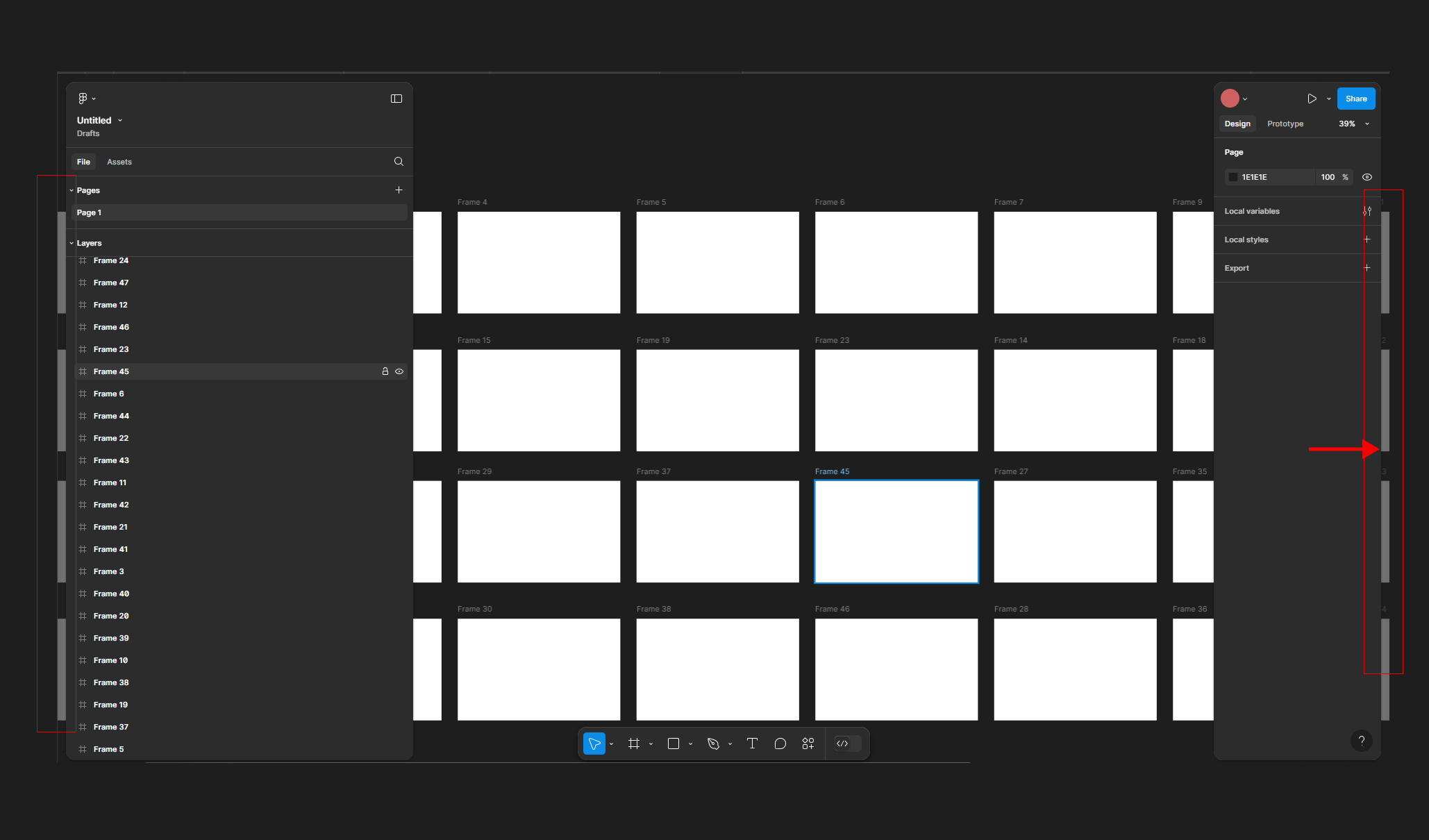
The new Professional Plan update feels like a step back. The interface now resembles Webflow, causing major distractions when working on multiple screens. The new spacing function is unnecessary and hinders workflow. Please revert to the previous version.
Also, why do I have to hover over “Auto Layout” to see the frame resolution? This is inconvenient and time-consuming.
Hi there, do you see this bug in desktop app, browser or both?
If it happens on desktop app, can you please try to clear out the cache, to see if that helps?
If this doesn’t help, our team can investigate it further. Please fill out this form: here Be sure to use your Figma account email, your desktop specs, and include a link to the file, and share it with support-share@figma.com, so we can take a closer look.
I have to say, it’s problem of the design. UI3 is really annoying and time consuming
After re-viewing your screenshot, this is actually intentional (I thought there was a bug with the scrollbar but it is your frames in the background. Sorry about this!).
We will pass your feedback about the UI3 along to our team, thank you!
Yeah, I got distracted and annoyed the whole day working on UI3. Please, I want the old version, neat and clean. I don’t think UI/UX designers need a floating canvas like this.