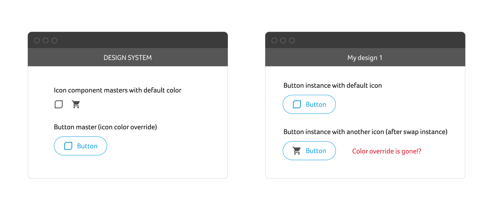
Simple button that uses an icon of color, which I’d like to keep after swapping it with another icon. It’s very common use case and I have no idea how to achieve. Currently I’m messing up my designs by re-applying color in each and every instance in each and every design after each and every swap.
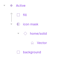
Here’s what I’ve learned about this: Color overrides, and in fact all overrides, only persist if the swapped components have the same layer structure. If your icons have a different number of “vector” layers, only the number of layers from the original icon will transfer their color overrides to the swapped-in icon. If you can merge/group any vector shapes in your icon using the “union” operation, they will look like one layer and the color override should persist when swapping. Hope this explanation made sense!
Yes, you need to make sure the layer structure of all icons are the same.
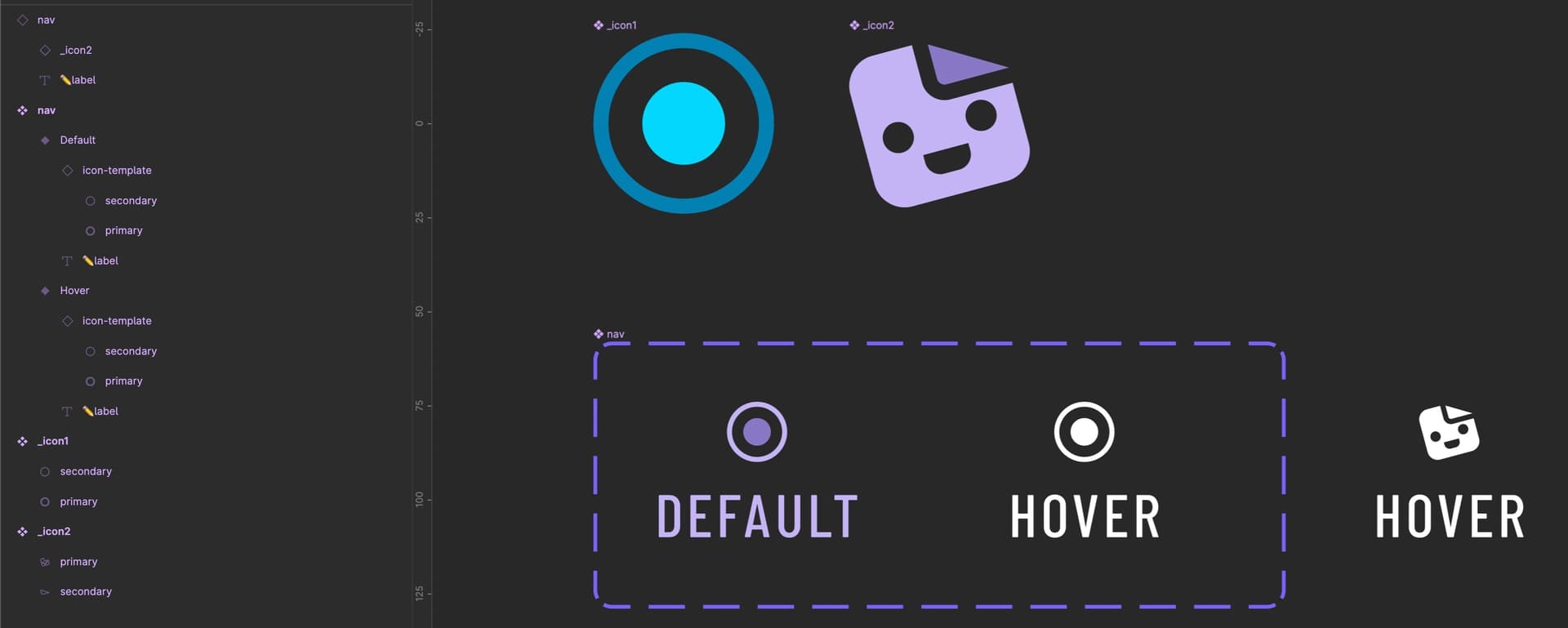
On the example, I have two icons with two colors and I convert these two colors into white while hovering.
I named the icon shape-layers as primary and secondary, and then on the hover-able component I applied the color override on the layers secondary and primary.
That way If I swap this icon with an icon that also contains layers named primary/secondary, these layers will also receive the color-override.
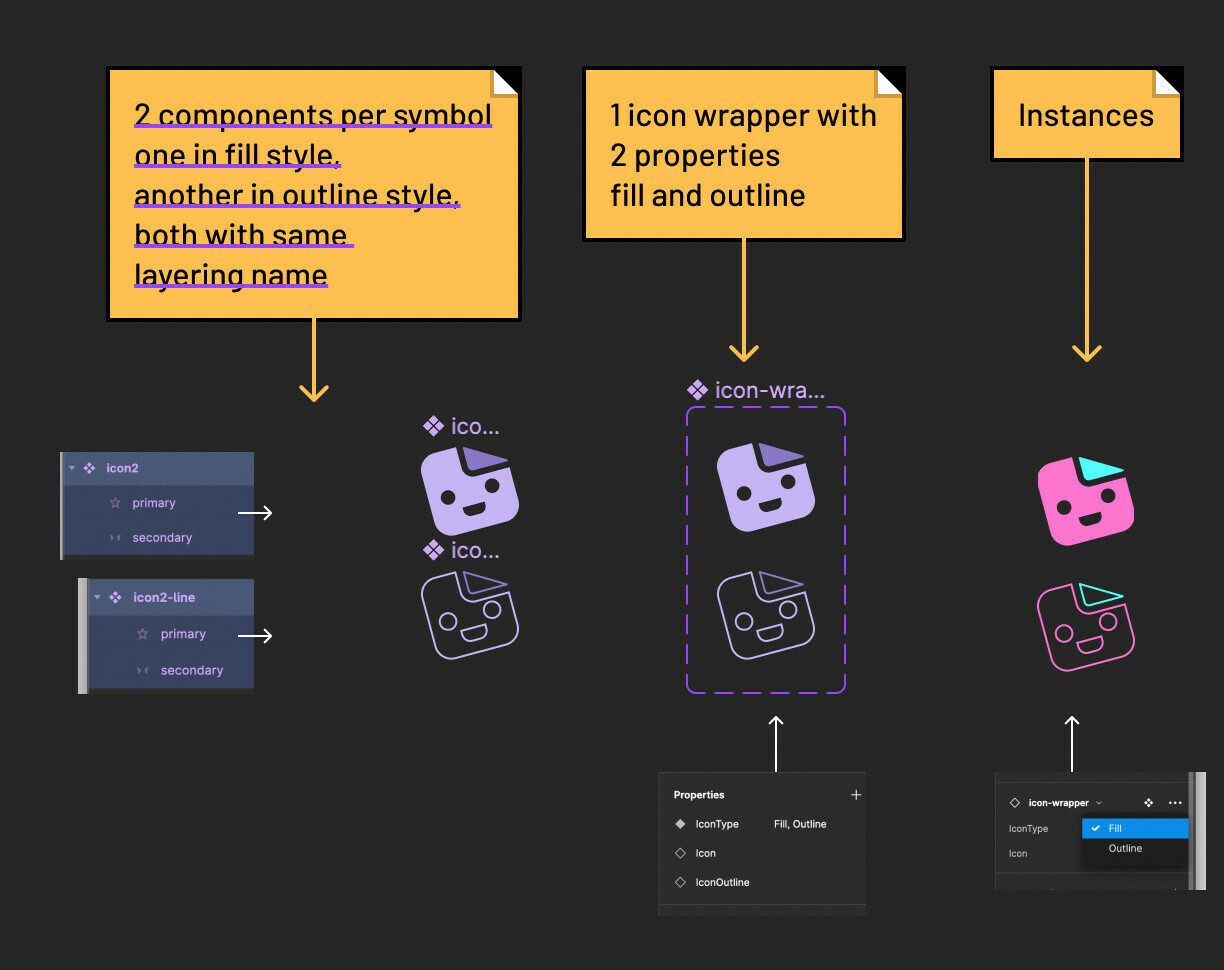
Hey there @Daniel_Racca. I am using an icon wrapper to manage the icon size within nested components. As I do also want to have the line thickness of the icons the same also when appearing in a different size, I have created them using a stroke. But when I want to add a variant control to switch to a filled version the layer structure can be the same but the color will be recognised as stroke and not fill and therefore the override breaks.
Do you have a solution for that too? Would be nice to have a solution for this issue @Figma_Support
yeah maybe you’ll need two different iconWraps component variants and two different icon styles one for outline icons and another for filled icons and then change the colors override per icon type manually. Here’s a video and a screenshot
Hey @Daniel_Racca That’s actually not the solution to my issue. Maybe I was not entirely clear about the topic. As you can see in your example when you change the instance to the outline version I want the color overrides to remain the same. And that is simply something that is not working yet properly.
See if I do not want to work with duo color icons but just need a single color for both the line version and the fill version of the icon (both already inctances of the master component) I can control both colors (line = stroke-prop and fill = fill-prop) to be overridden by just a single click on the parent frame’s color inheritance. When changing the icon within that (including the same layer structure) the inheritance does not work properly.
Maybe it is more clearer now. I am not sure, haha.
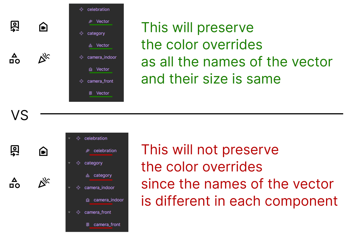
the color override works through the instance swap for me because the following two conditions:
all of the 3000 shapes have same name (“vector” in my case) and
I have directly overridden the colors of the shapes (which have the same name, height and width) and not on the frame of the icon (which has unique names).
It doesn’t work here. I made a component with an icon and made all its states, but when I want to use that component in another frame and change de Icon it doesn’t go the color together
Hey @Pratyush_Tewari you are using shapes here right? Probably made out of different unified shapes with stroke and fill properties. While they can include both, once you unify them, they actually receive the color information via the fill prop if you want to change it, and as this is the same everywhere that works fine.
However if I want to use instances inside a wrapper component and inside this one change the color override of the nested one (that can then change from stroke prop to fill prop) this override will not be passed on.
I guess this is just something I have to live with and always go with a unified shape approach. Let’s see
Hi @Oliver_Schwaiger - The icons ((union / and flattened - like you mentioned, I created a massive library of about 3000 icons form the new google variable font symbols).
In my previous screenshot, these icons are being used inside the button component as an instance swap property. The buttons have colored states (like hover and disabled) and I have changed the color of the shape in each button variant.
the color override works through the instance swap for me because the following two conditions:
all of the 3000 shapes have same name (“vector” in my case) and
I have directly overridden the colors of the shapes (which have the same name, height and width) and not on the frame of the icon (which has unique names).
So when even I swap for a new icon in a button … the color override for states and variants work across all the 3000 icons inside for that icon.
I’ll make a video about it and share to explain as it seems like an important feature for massive design systems.
Muchas gracias por la información. Al día de hoy (024/07/2024) funciona este método, tenía mal nombrado las capas de los íconos y al momento de cambiar de color en los componentes los íconos no respetaban el color que asignaba, cuando cambié el nombre de los iconos por la palabra “icon” a todos por igual, funcionó por magia. Muchas gracias por la solución, me he demorado días resolviendo este problema.