First on top layer order in Auto-Layout

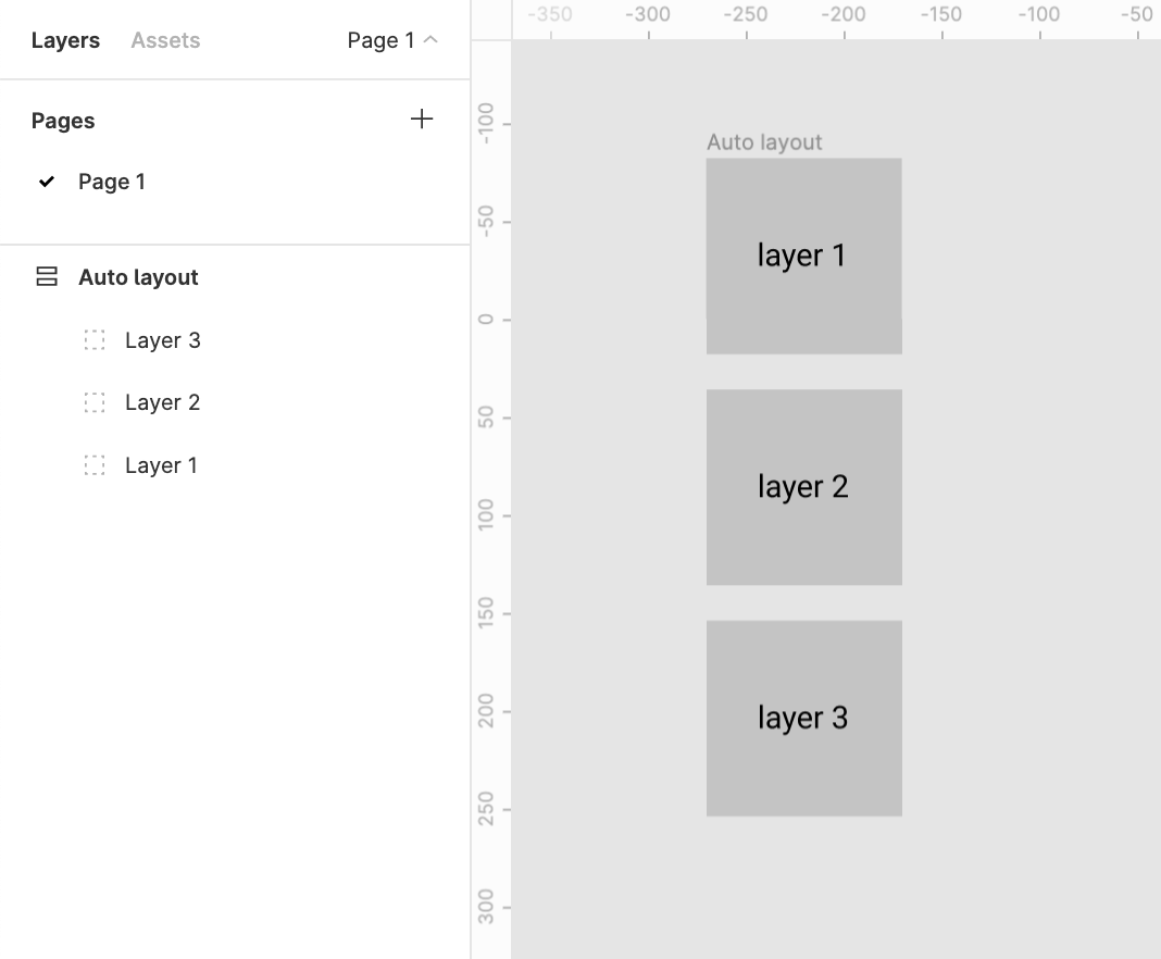
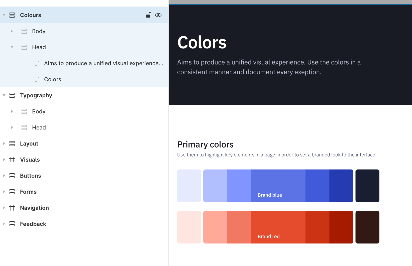
Currently auto layout arranges layers from bottom up, i.e. the lower most layer in the layers list appears on top of every other layer on the workspace.

This creates two problems

1. Confusion
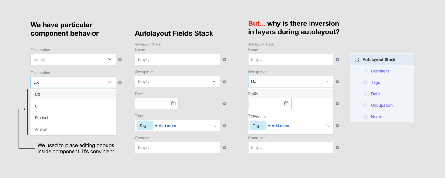
There’s a clear confusion of the order of layers shown in the layers menu and the representation in the workspace. This requires a bit of getting used to

2. Effects like drop shadow don’t work like they are expected to
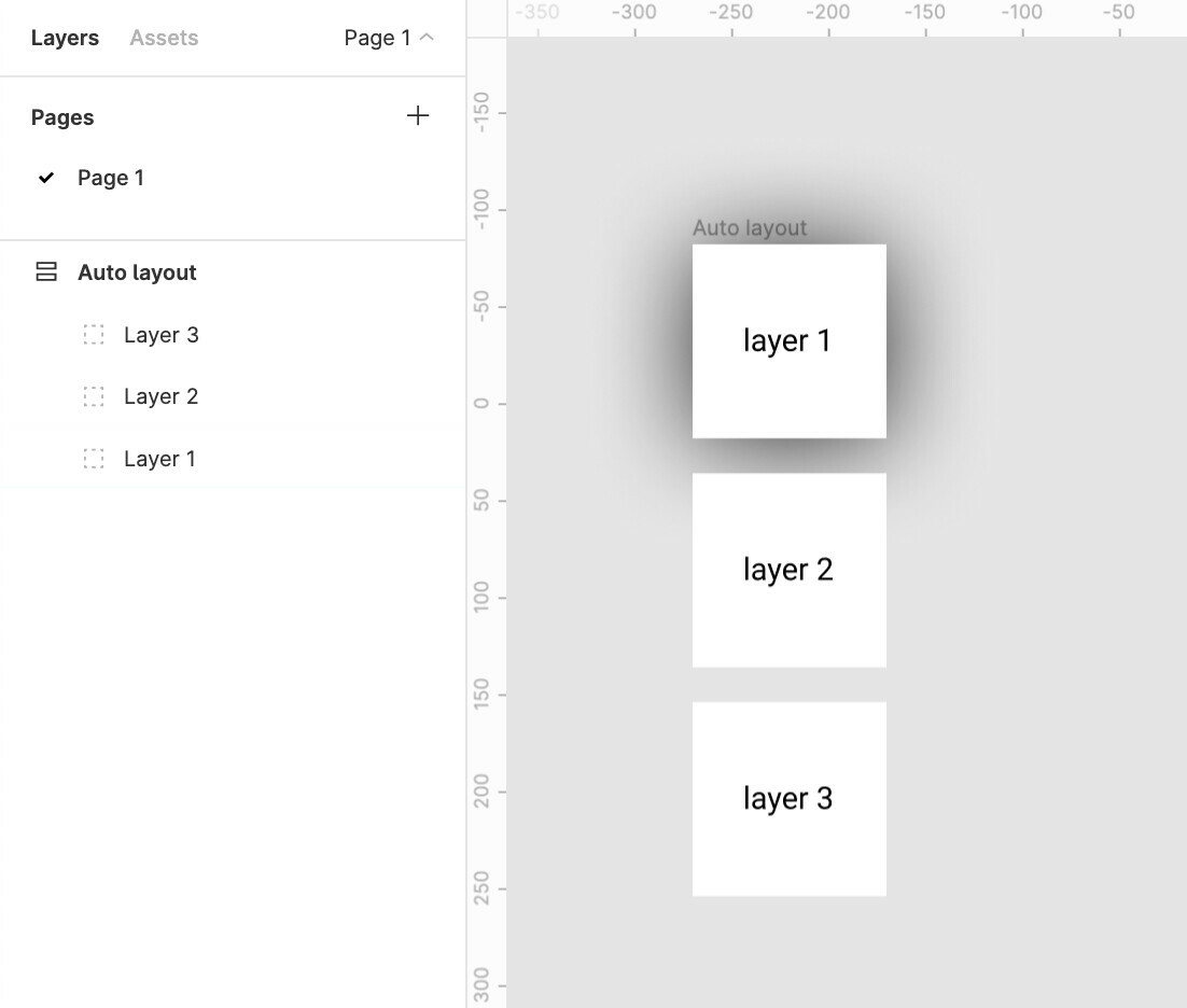
Applying a drop shadow to layer 1 does not cast the shadow on layer 2

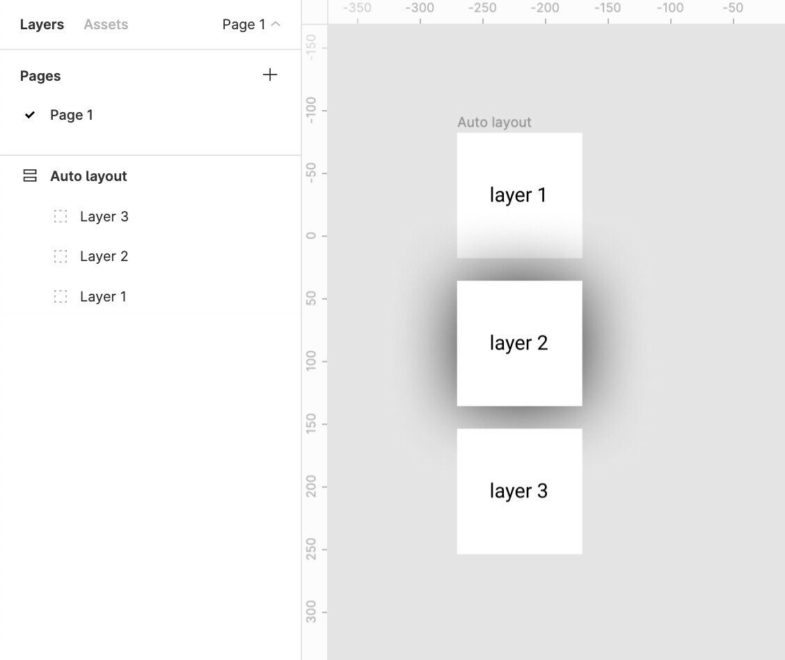
And applying a drop shadow to layer 2 casts a shadow over the top layer 1

The Order in the layer menu should be reversed.
Does anybody else see merit in this?

Update:
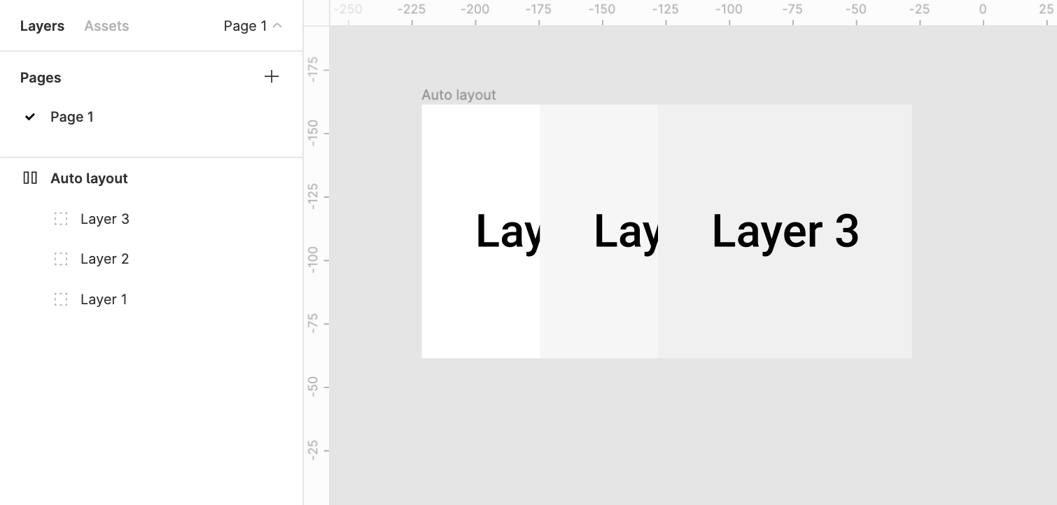
The same logic applies to horizontal auto-layouts.
The right most element is on top whereas the left most element should be on top majorly because we scan left to right hence the element on the lleft most extremity is to be scanned first.

for example:
Say we require a stack of layers to be shown which shuffles on drag

It would make more sense to bring layer1 above layer2 above layer3

19 Likes

+1
It’s really annoying, that I’m forced to remove auto layout to reorder layers and get the shadows right and sometimes to stick the components.

4 Likes

I agree it’s super annoying.
I suppose it comes from the fact that when you design a list, you create the first item, then the second, then the 3rd, etc. in that order. And you tend to consider the first is the most important one and therefore should be the one on “the top” casting shadow on everyone else. That’s because the way you read is either left to right (in most cultures) and top to bottom I guess…

But most for most tools, when you add a new object it has to be on the top of everything, simply to make sure you’re going to see it!

So the top-most in our intuition is actually the bottom-most in the tool’s logic.

We would need a way to gracefully combine those two logics…

2 Likes

When working in Auto-layout, the layers on the left panel are in the reverse order from the elements on the artboard. It would he helpful if they matched order so that the top element on the artboard is the the first layer on the left panel, not the last. Also if using a horizontal layout elements going from left to right would be top to bottom on the layer panel.

4 Likes

i disagree, because the layer panel is shown in order of the layer’s z-index. flipping this is actually less intuitive and would cause problems everywhere else.

2 Likes

I understand that what you’re describing is how it works when you’re not working in Auto-layout and it makes sense. However, Auto-layout works with a vertical and horizontal direction (X & Y), not with the z-index.

2 Likes

I don’t find this intuitive, I agree with the reporter. Layer panel systematically in reverse order compared to your object in the canvas.

In the case of auto-layout, where items do not overlap, Z index does not seem to matter to me. I guess we could consider the top object of a vertical auto-layout could be the one on the top layer too. At the moment Figma considers the bottom object is on the top layer, not sure why…

1 Like

The current order is super confusing. The first item in a list of item should be at the top not the bottom. Thats how it works by default in HTML with CSS Flex too. Maybe allow an option for this if there is legitimate reason for the reversed order but IMO it should work how Flex works by default.

3 Likes

I’ve found myself wanting the layer order to be reversed on Auto Layout. With the ability to change the order in a flexbox we should probably be able to do the same thing in Auto Layout.

I was creating a prototype with a menu included inside a component but because the order is reversed, it shows up behind all the following content. I had to change all the autolayouts to normal frames and reorder all the layers in order for it to work properly.

What occurred:

The result I wanted:

3 Likes

I had a very similar issue as @Phil_Larsen but there are probably cases in which having the top to bottom order might be useful so it’d be great if there was just an auto layout setting that inverts the order so you can pick whatever suits the application best

5 Likes

I agree, it’s super confusing!

I get why it’s the case but it’s the reason I never use the layers panel apart from re-naming things, I’ve recently started using the CTRL + R shortcut so I use it directly even less now.

I think an option to “reverse” the order in auto-layout settings (similar to flexbox) could be backwards-compatible.

1 Like

It would be nice to be able to toggle the arrows so that it changes the direction of the stack. Several times, some components appear below others because they are not correctly ordered in the sidebar. I had to remove auto layout and switch order in the sidebar…

Another approach would be to offer a z-index property.

2 Likes

it’s real problem and not convenient for extended component behaviour, like fields with editing popups.

6 Likes

I can relate! 100%

2 Likes

Maybe if we could have a way of changing the z-index would already solve 95% of the problems. Tooltips are almost impossible to implement with auto-layout because they are always getting under other components and there’s no way of fixing it.

3 Likes

i think, it have to exist an ability to set checkbox “absolute position” in autolayout with variants “over”, “behind”. now, i use special 1px-height hack frame and set position of particular details in out of that borders.

1 Like

I agree, this is annoying and not logical!

1 Like

Inverted order really confused me when I started to use autolayout in Figma. I don’t see any reason to use reverse in this topic, especially with issues about shadows etc. I thought that there was some explanation for this behavior but haven’t see yet. May be Figma will give us discription of this decision. Vote for direct order!

1 Like

100% agree. Interactive components for dropdowns would be so powerful if I could simply reverse the layering. Instead I can’t use my dropdowns with autolayout.

There’s this feature request of changing/forcing the z-index of an element that probably would fix this problem Feature request: Z-index property that is independent from autolayout - #11 by Roger_Junior

I would highly suggest you guys share your experiences and vote there so we can make the Figma team aware of this issue.