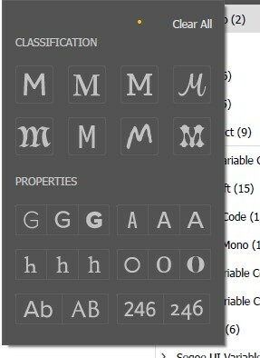
This is the singular reason why choosing fonts is so tedious in Figma. I’m thankful for the update to finally be able to see the font before applying it to my text (which is the literal bare minimum), but being able to see what a font looks like doesn’t make choosing a font any easier if you know what kind of font you need, but you still have to scroll through hundreds of alphabetically organised fonts of varying classifications that don’t apply to you, when a simple filter would make the decision 10 times quicker. It makes the experience of designing start to finish in Figma frustratingly difficult.
Enter your E-mail address. We'll send you an e-mail with instructions to reset your password.

