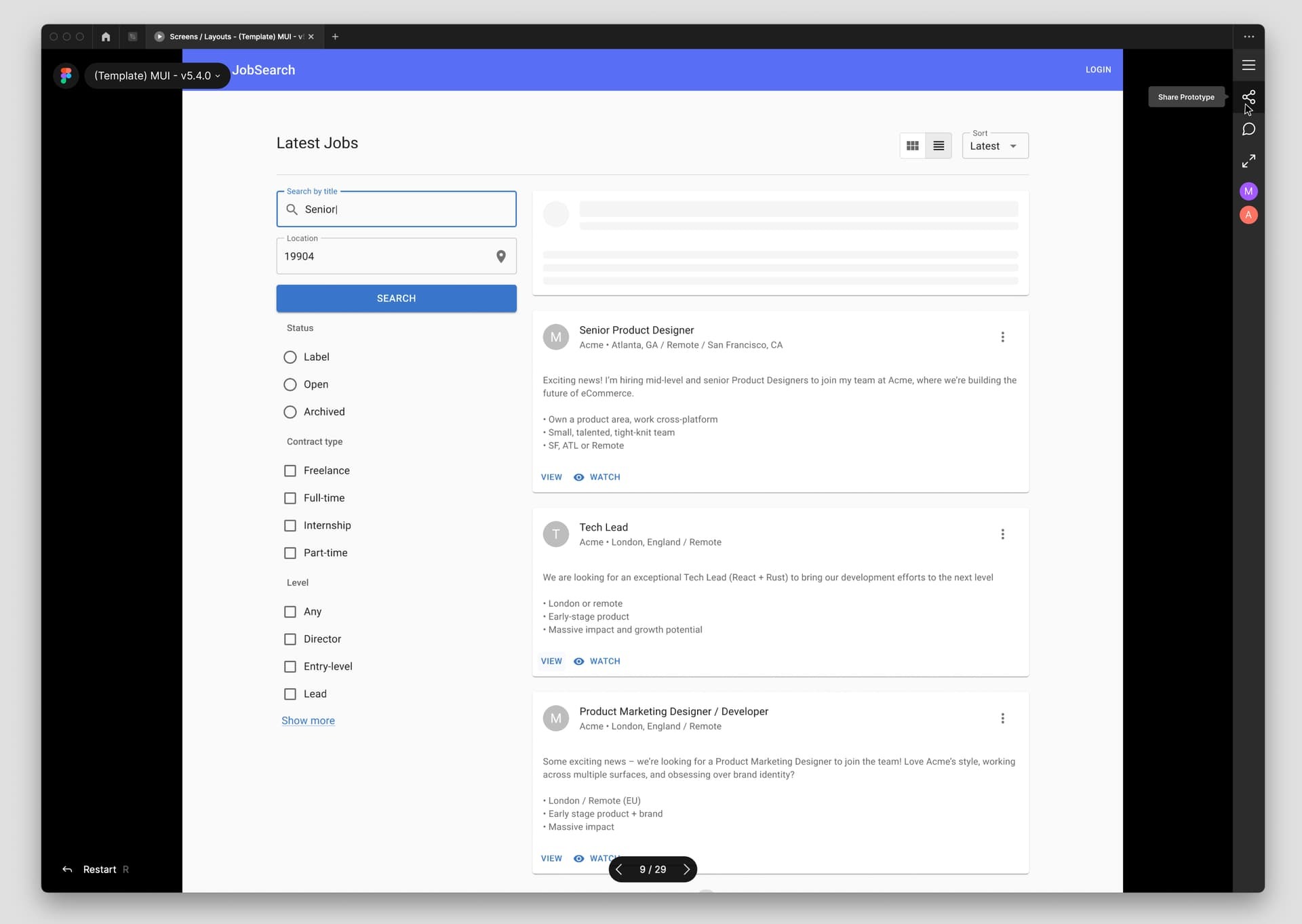
When viewing prototypes the top bar of the UI interferes and it’s impossible to see and/or interact with the very upper part of the content, such as headers and menus.
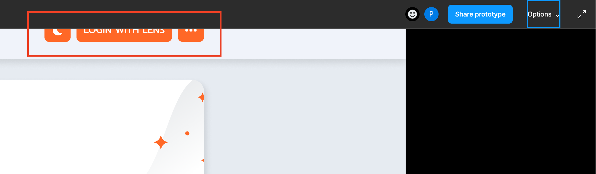
This isn’t great, there’s no reason that top-bar should appear on top of the design at all. Hiding the UI also hides the sidebar to toggle flows. The design frame should start below that bar, I don’t recall this behavior in early versions of Figma
I agree on this one, that bar has definitely been an unpleasant experience when it comes to reviewing your designs. I don’t like that it is enabled via hover, it’s very tricky how it behaves. There are 2 ways to fix this! The easiest one is to not have the bar appear above the design so having it at the top and always visible and push the design preview down.
OR
A much better way is to make that bar a sidebar on the right and thus it’s not overlapping on top of the design. I also simplified the UI to use icons instead of text BUT I included tooltips when the user hovers over these actions. See the attached image for details.
As always much love for Figma and their amazing team for making an awesome product for designers.
I strongly agree with you, i think movin the tob-bar into a sidebar would make a lot more sense, and bring a lot less frustration into the prototype process.
I dont think moving the screen below the top-bar would be a good idea cause it would make the screen size (height) smaller