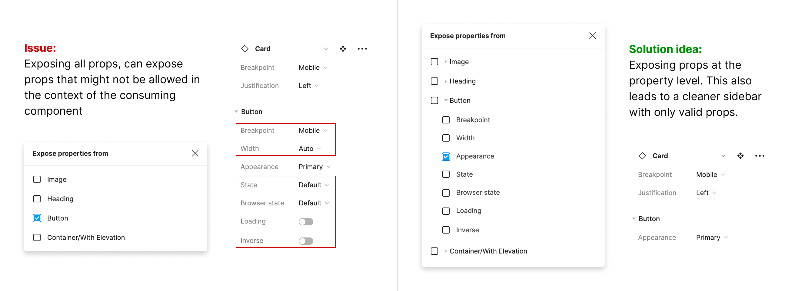
+1 it’s super needed when building complex design system components, with multiple atoms inside a larger component. Now it’s easy design consumers can break the molecule by changing specific props in the atom that shouldn’t be accessible.
Agree. Adding “_” before property name would be a very nice feature.
Having a ton of unnecessary properties in the component panel quickly get’s to a point where DS users come into a tl;dr mode, which drastically reduces component acceptance.
The solution could be so simple
- if checked, add toggle icons for nested properties to hide or show.
- even sub-properties from further nested components should be reflected there: toggle a property with nested sub-properties should add another expandable level for it
+1
cant stress enough, how needed this is
This missing feature has become even more glaring to me with Figma UI3.
UI3 seems to default to collapsing the properties of any nested components, which makes them less discoverable to design system consumers.
I realize that what I ultimately want is a way to in some way, shape or form elevate certain nested component properties to be “first-class citizen” properties of the parent component (e.g., the text and icon swap properties of a nested button component).
And UI3 (presumably in a bid to make the cascade of nested component props less overwhelming overall) pushes in the opposite direction, instead making all nested component properties very much second-class citizens that you will only find if you know to look for them. (And, in cases where a parent component has multiple nested components, you may need to hunt.)
I can imagine a few potential solutions to my needs:
- Allow the values of component properties to be configured to pass through and be used as values for nested components (e.g., configure a nested component text property to use the value set to a text property in the parent; allow component consumers to select a state variant by name in the parent component and configure it to cascade down to the state variants of nested components)
- Allow properties of nested components to be selected to be ‘promoted’ to the top of the component property stack, where they can live alongside the parent properties (albeit probably with some sort of visual/textual indication that they’re scoped to a specific subcomponent)
- Allow properties of nested components to be optionally hidden completely in the scope of the parent component (their values being ‘hard-coded’ in the master component and unavailable to consumers at the instance level)
- Allow specific nested component properties to be set to expanded by default in the properties panel (with other nested properties hidden behind something like a “See all” link)
This topic was automatically closed 90 days after the last reply. New replies are no longer allowed.
+1 this is an absolute requirement for our DS.
Why was the proposed solution in new UI to hide away all nested component properties. Stakeholders that are not designers will find it to very difficult to use.
We also need this functionality in our designsystem.
+1! this would really make it easy to manage which pieces you want people to have control over in order to ensure consistent use of components
Posting just to keep it alive
This is a very critical feature for design systems trying to utilize an atomic approach to their design system. If teams want to provide highly configured patterns for quick use or to provide more guidance and control over the patterns teams are using, there needs to be a way to control EXACTLY what the end-user designer can configure.
I work on a team that consumes our design system to build pattern-level components for the teams we support. We DON’T control the design system, but instead the reusable patterns built with it. In some scenarios, we may want to allow users to make changes to certain text or instance swap functionality that is inherited from the original “atom” component, and other times we want to limit what is used.
For example, if we build a pattern for something (say a card) with an icon button, we may allow users to swap both the button and edit the text. In other patterns, we may want to allow them to edit the text only, but restrict usage to a single icon.
The all-or-nothing approach to exposing nested component properties leads to bad practices like detatching atoms to re-create a more limited set of properties, or relying on documentation to let end-user designers know what they should and should not modify. (And let’s face it, many don’t like to read documentation)
Wow, kinda shocked this is still not in Figma. Too bad they are busy on Slides and AI.
Absolutely needed!! I can’t understand why this feature isn’t there yet, IMO this is a must have.
+1
It’s so essential to have something like this for atomic design systems.
Still waiting for this
+1 - Need this feature as well.
Desperatly waiting for this feature as well
Please do add this feature. I need it as well.