Every icon best practice you need to know

I’m a Figma tutor and get asked about icon best practices a LOT. I made this cheat sheet for my students and thought some designers here might find it helpful as well!


Icons are a foundational part of any design system. They’re tiny, language-independent, symbols that help us understand and navigate digital products. Each one acts as a small building block to create bigger, more complex components. In this article, we’ll go over how to set up your icons, use them in designs, and hand them off for development.

Before we get started, let’s go over the different types of icons.

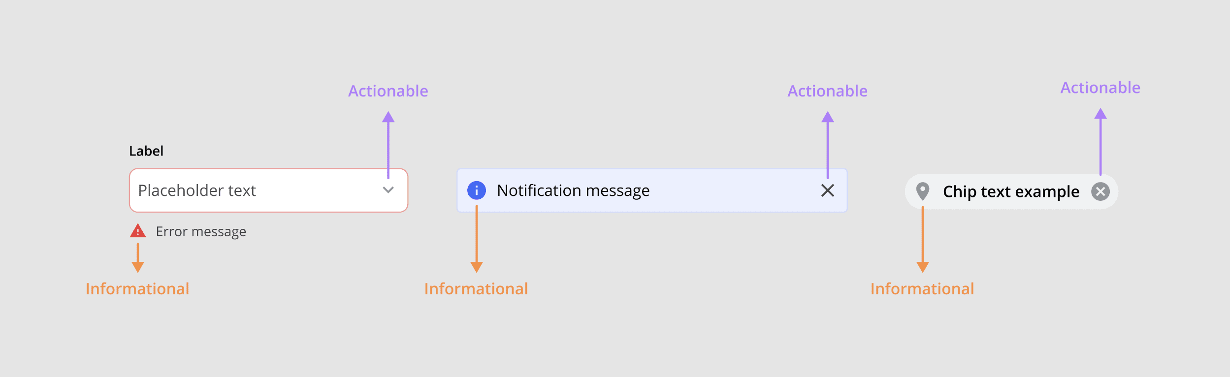
Actionable icons: These icons are clickable and can trigger an action. They can open something, close something, or navigate the user to a new location.

Informational icons: These icons are not clickable. They describe or highlight information the user needs to know. They can replace text, add emphasis, or make a design more accessible.


Setting up icons

Create an organized, consistent set of icons before you start designing any other components in your design system. This speeds up your workflow, makes your designs more consistent, and enables you to scale your website or product.

Choose an icon library

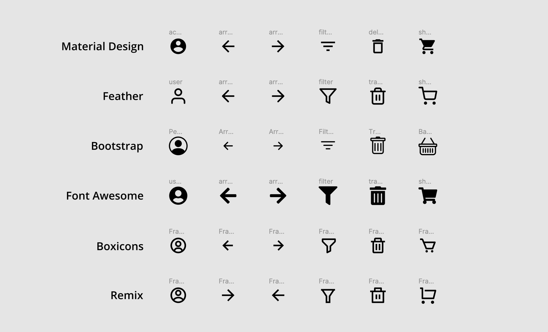
For most web projects, we recommend using a large, established icon library. Obscure icon libraries usually have a limited selection with no icon font support. And creating your own custom icons takes a LOT of time and skill to get right.

Here’s a collection of established icon libraries with a large selection of SVG icons, multiple fill/stroke states, and font support. Choose one that best matches your brand.
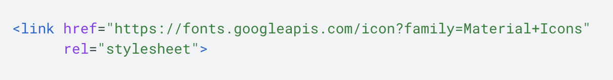
Note: If you’re up to the challenge of making custom icons, Figma is a great place for it! Even the icon pro’s at Font Awesome prefer Figma to other vector drawing tools. But we still recommend icon libraries unless there’s a clear design use-case for custom icons.

Add icons to your Figma file

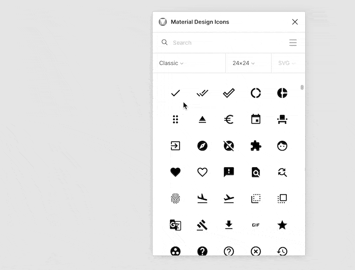
Add icons from the library you’ve selected as SVG files. This allows you to edit the icon’s vector color and size. Add the icons by downloading then dragging and dropping them into your file, or by selecting them in a plugin (most recommended).

a) Add downloaded icons
Download icons from the web onto your computer, then drag and drop them into your Figma file.
Download - C

b) Add icons from a Figma plugin
Install an icon plugin, open the plugin in your file, then drag and drop the icon(s) into your file.
Plugin - C

Customize icons

Customize icon size, color, and resizing behavior. This makes designing with your icons much faster because fewer overrides need to be made while designing. It also helps keep your designs consistent.

1) Size each icon
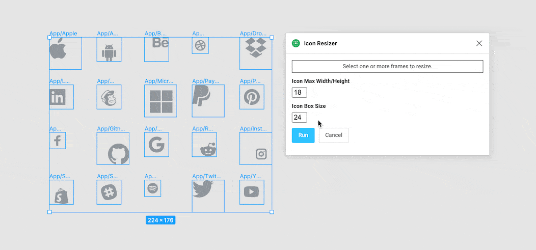
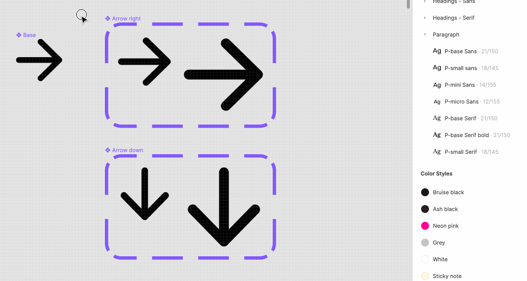
Once added, SVG icons will appear as a square frame with a vector inside. Resize each frame to match your default icon size. Choose a default icon size that is divisible by 4 or 8 so your icons will align with your base unit (e.g. 16x16, 20x20, 24x24).

Each frame should contain a small amount of internal padding on all sides (e.g. 2px). This ensures all icons appear evenly sized/spaced despite being different shapes. The same logic applies to adding more or less kerning around different type characters.

Pro tip: Use the plugin Icon Resizer to resize many icons at once.
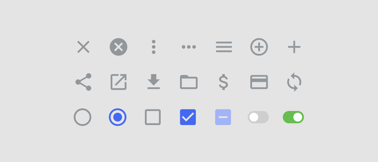
Icon Resizer - C

2) Style each icon
Customize the fill color of every icon vector to match your branding. For example, update every icon from black to your default gray style. Also, update stateful icons to show their “active” color by default (e.g. radio buttons and checkboxes).

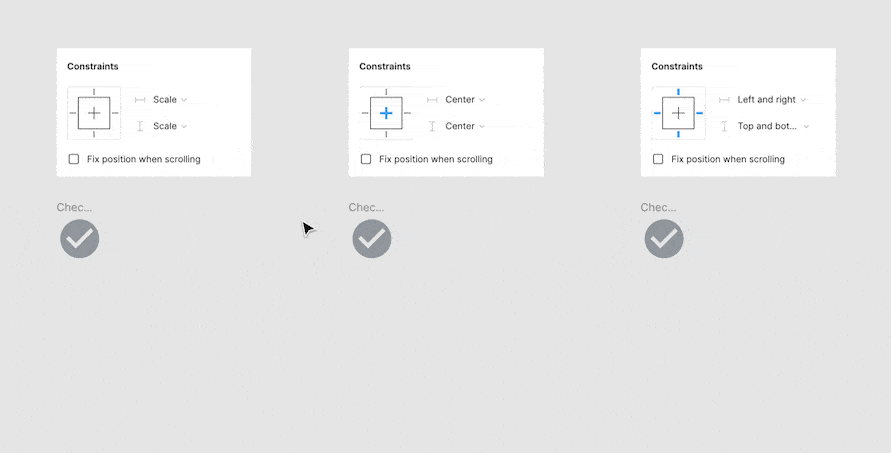
3) Set the resizing behavior
Set the constraints for every icon vector to “scale/scale” so it grows and shrinks along with the size of its frame. This way each icon can change size and maintain the perfect ratio between size and padding.
Scale - C

Turn into Main components

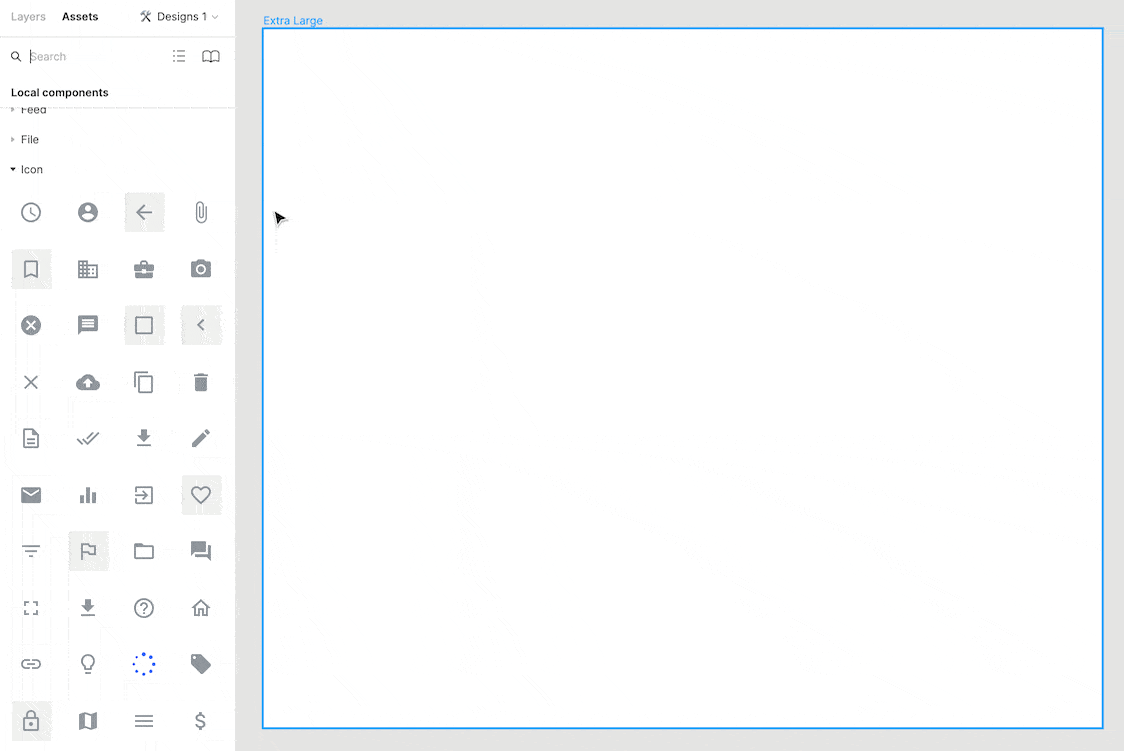
Turn every icon into a main component to use instances of them across your designs. This makes finding, adding, and swapping icons easier. It also makes bulk updates to your icons MUCH faster. For example, changing an icon’s color. Edit the one main component rather than hunting down every icon in your designs.

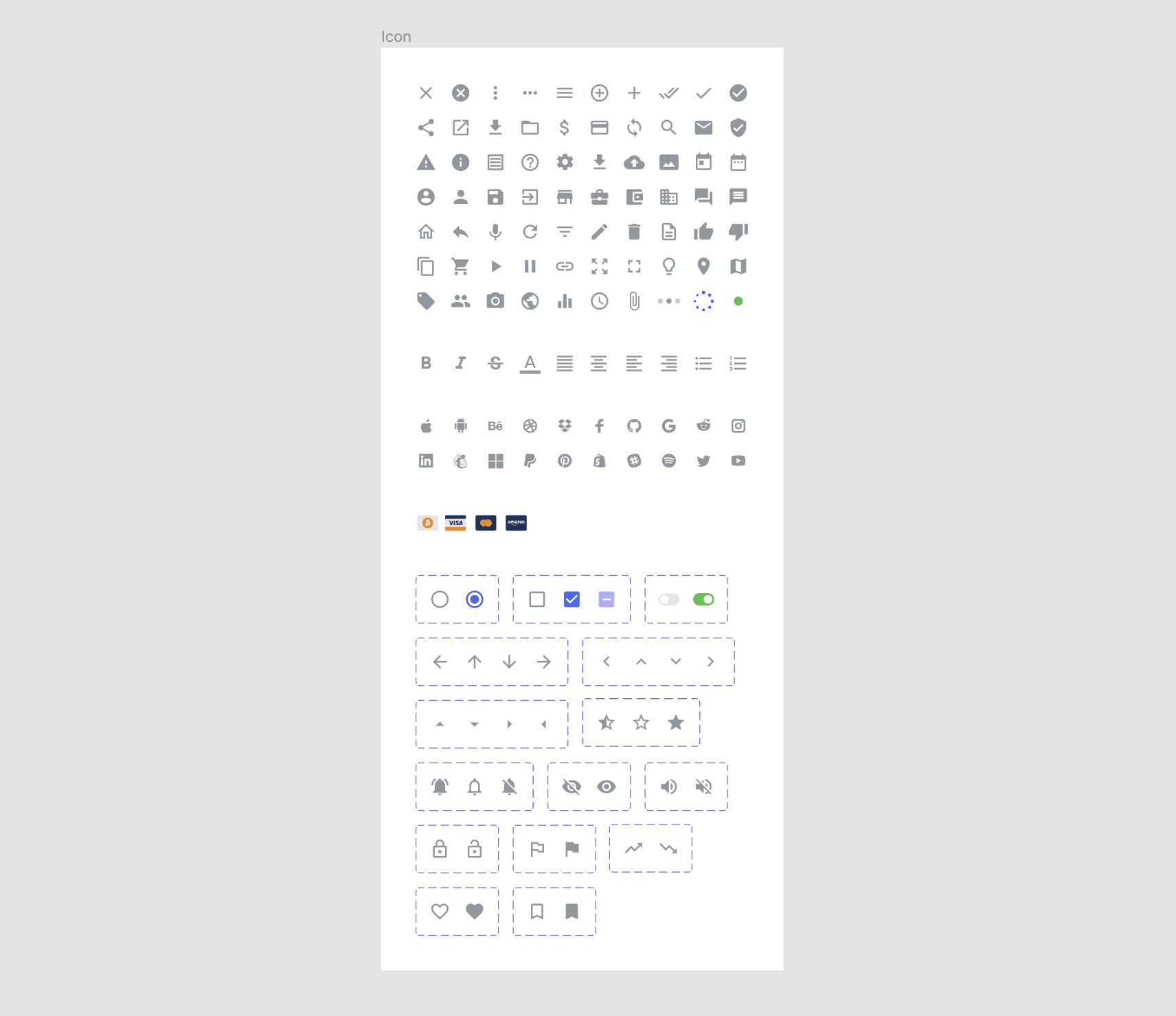
  1. Place all icons on a frame labeled “Icon”. This adds organization to your file. It also adds the same nesting hierarchy in the Asset Panel as writing “Icon/” at the beginning of every name.
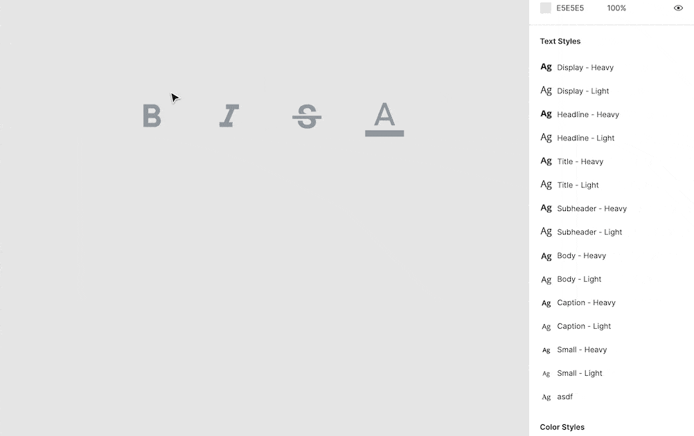
  2. Name each icon (e.g. “Close”). Use the forward slash ("/") naming method for categories of icons (e.g. “Format/Bold”, “Format/Italic”)
  3. Select all icons and click “create multiple components” in the toolbar.

Pro tip: Combine like icons as variants for faster instance swapping and the ability to use Interactive Components. This is only recommended for icons that are part of a set (ie. up/down/left/right arrows), or icons that will have hover/click prototype behaviors (e.g. radio buttons). Learn more about using variants here.


Using Icons

Once your icons have been set up you’re ready to start using instances of them in your designs. They can be used as singular elements or nested inside larger components.

Add & swap icon instances

Instances are a copy of their main components. They can be found and added from the Asset Panel and swapped out in a number of different ways.

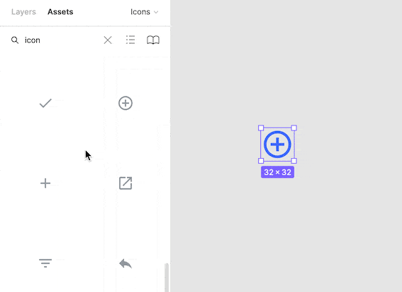
1) Add icon instance
Find the desired icon in the Asset Panel. From here, drag and drop an instance of it into your designs.
Add instance - C

2) Swap icon
Drag and drop the new icon over the original icon while holding the " option " key. Any style/size overrides to the original icon will persist.
Swap - C

3) Swap nested icon
Select the nested icon, then choose a new icon in the Instance Menu. Any style/size overrides to the original icon persist.
Swap 2 - C

4) Swap variant icon
Select the icon and update its type or state by choosing a different property value.
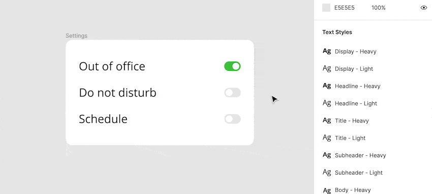
Variant - C

Apply overrides

Customize icon instances by applying size and color overrides. These overrides only affect the instance and do not update the main component. To apply overrides, edit the size of the icon or select the icon vector and choose a new fill color.

Pro tip: Select the nested vector shape in multiple icons by selecting all their frames and pressing " enter ". This will update your selection to only the nested children (vectors), and allow you to bulk edit color.
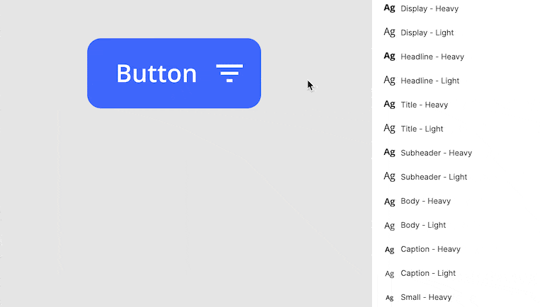
Override - C

Use icons as atoms

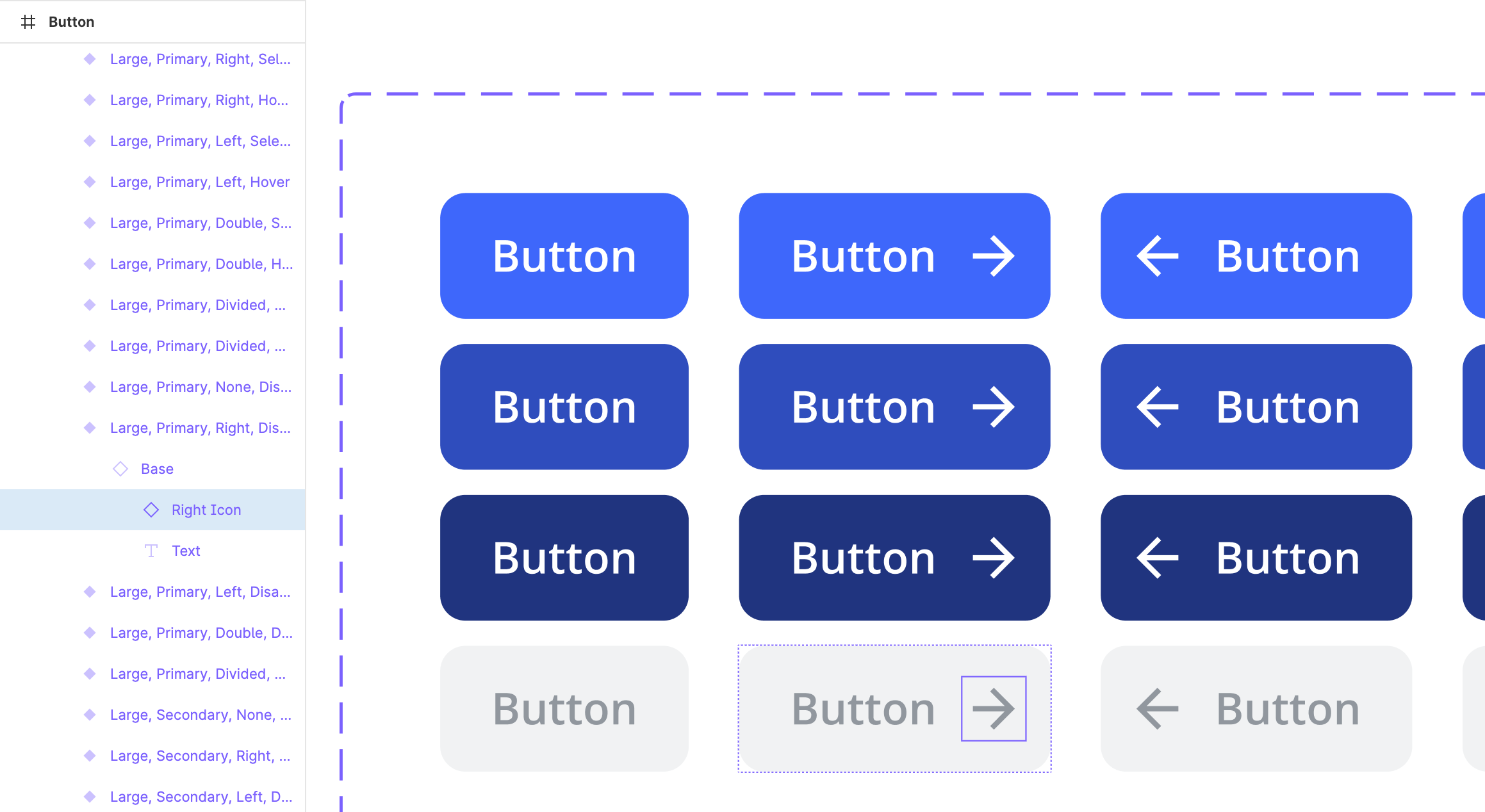
Use icons as atoms and nest them inside of other, more complex components. For example, nest an arrow icon inside of a button.

Pro tip: Give every nested icon a generic name. This way overrides will persist when swapping/configuring components in your designs. For example, name every right icon “Right Icon” in each button variant. When you change the state of a customized button, the icon type persists, and the color updates accordingly.


Developer handoff

When it’s time to handoff the designs, developers can inspect and export icons as needed from the Figma file. To make things even easier for them prepare the icon assets in advance. This can be done by exporting all the icons, creating a spritesheet, or using an icon font (most recommended).
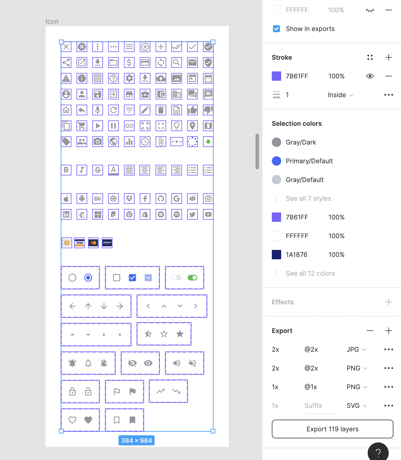
Export icons

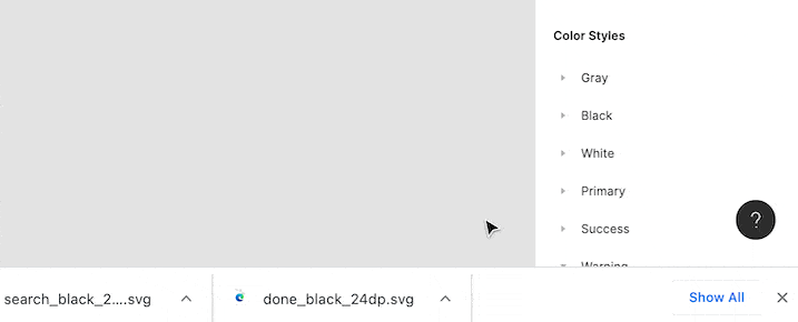
Export icons as an SVG, PNG, or JPEG. To export icons, select each of their frames and click the " + " symbol next to “Export” in the Design Panel. Then choose your preferred format and select " Export X layers ". Select the " + " symbol multiple times to export multiple different formats at once.

SVG is an XML-based vector graphic. It allows exports to have a transparent background and scale up/down without any loss of quality. SVGs can also be represented in scripts or code, making them the best choice for the web.

PNG is a lossless bitmap format. It allows the export to have a transparent background and maintain high quality when compressed. This is the next best choice for the web.

JPEG is a lossy compression of an image. It cannot have a transparent background and its dimensions are fixed making the quality lower. For this reason, it is not recommended for the web.
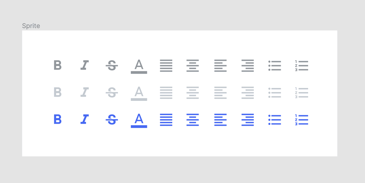
Spritesheet

Use an icon spritesheet if using multiple icons without an icon font for faster loading time. A spritesheet is a single image that includes all the icons in use with specific X and Y positions. These positions are then used to display the correct icon in the correct place.

Icon font

Using an icon font is the most recommended way to use icons. They take advantage of the typographic rendering capabilities of modern browsers. This allows developers to incorporate icons with only a few lines of code. It is easier, takes up less space, and looks great. When choosing an icon library, look for one with a supported icon font (see list above).


If you found this helpful, checkout some of my other guides: The UI Prep Blog

24 Likes

This is a nice writeup! Thanks for sharing.

The one thing I’ve done the same is to include certain icons as variants within the library. I haven’t found an easy way to document/discuss this with our design team as to which icons are variants, other than to tell them to go in and look at the library page where the icons are. Have you any thoughts on to best approach this?

My rule of thumb for when to use variants for icons is: never. In the example above, what’s shown as variants are different controls, not icons. They are things you can toggle, they are interchangeable. Ignoring the obvious example like a radio button and a checkbox, the sound on/off icons work as a button in this case, so they may have different color and styling depending on whether or not they are toggled. The stocks up/down icons can be green and yellow respectively. And in this case they do have different states which can be toggled. But as icons they are not more than a pictogram, so they shouldn’t have different states.

10 Likes

Yeah that’s where I’m on the fence about… Certain icons used a lot (think Arrows), I want to quickly toggle between states some times, and a variant option seems quicker or as fast as dragging to replace from the library (dependant on how familiar the user is with Figma/work flow). I do see your point though @Gleb how an icon is an icon and should be considered one and the same from the library point of view.

1 Like

@adamfinley, a structure I’ve found helpful is to have an underlying “base” vector shape that controls the actual pictogram. This gets nested in frames of various sizes with auto layout applied (this is important if you use icons at different sizes and want the parent frame the icon is nested in to respond to changes the icon’s size, such as a button using auto layout).

The example you mentioned, arrows, are a particularly good at illustrating the benefits of using the base vector. Even if you’re designing the icon in another tool like Adobe Illsutrator, the “base vector” component lets you update multiple icons at once and ensure they’re all consistent.

icon structure

As you mentioned, you could also handle the change in direction (up, down, left, right) as a variant property! The base vector concept would still apply in that case too. The only drawback to it is it adds an extra layer in your icons, but I personally think the time saved in icon maintenance is worth it.

2 Likes

It’s gonna be more laggy with more nested items (unless of course you are building something small instead of having hundreds of screens in the file). However, I just realized that you are gonna need an extra container anyway to set the outer component to hug contents so it changes size when you swap the component.

To me, while this is helpful, this is pretty much useless. How often do you update this icon anyway? I believe its easy enough to simply copy-paste the new icon into place if you decide to change it. And you’ll also have the freedom to change the smaller icon version manually, which may be necessary to improve legibility or make the overall shape pixel perfect.

1 Like

That’s a great point about different icon styles at different styles! Reminds me of @Bonnie_Kate_Wolf’s article, “A complete guide to iconography” and the example she uses:

I believe the same “base vector” method I described could apply in that case too, though it’s utility is quite specific: if you’re designing icons in Figma, and if you’re using variants on your icon components, then this is one way to make managing icon components easier. If you’re not doing doing either of those things then this probably isn’t necessary.

For the team I’m on today, there is a desire to be very strict about the sizes icons show up in the product. Specifying those sizes as variants saves my teammates from having to memorize those values, or bother with manually setting them (either by typing in values in the height/width area of the design panel, or dragging frame corners around). It’s not how everyone will want to work, but it’s been handy for my team.

4 Likes

Thanks for sharing the article and your experience, this is super helpful to know!

Happy to! And I appreciate you bringing up cases where icon artwork changes with the size, that’s a circumstance I haven’t encountered in my work yet but still important to consider :pray:

Hi Molly.

Great post, thank you. We’re using FontAwesome in our design system and I have some questions:

  1. How do you treat icon sizing within a design system? Do you only create icon components in one size and then have other guidelines that dictate icon sizing? I’ve created Small, Medium and Large icons in my design system and find that it is getting too large to maintain.

  2. Do you flatten icons as shapes or keep them as a font?

1 Like

Thanks for sharing :raised_hands:t3: lots of useful tips.

I agree they should have the same style, but what about grouping chevron left,up,down,right together?

My answer applies to chevrons as well. Are they icons or control elements? In my view if you are thinking of chevrons in terms of variations, what types of chevrons are used in different places and contexts, they are no longer considered icons — they are control elements like radio buttons or checkboxes. As such, only the base chevron could exist in the icon set. And then it would be grouped by usage. For example right and down chevrons can be used in collapsible blocks, while right can only be used in context menus, so you could separate them and even use different style chevrons for different contexts. And the up chevron may even not exist in the product, so creating a variant for it is not necessary to avoid confusion. Chevrons as control elements could also have states, animations, etc. Those would be within the variants too if necessary. But at the base you only have one or two separate chevron icons, which are not grouped and don’t consider the context of use, therefore don’t have states/variants.

ok, got it! Thanks for the thorough answer @Gleb !

Hey all,

What is everyones thoughts on stroked vs outlined icons? Which does a dev prefer? Some icon sets I get are stroked lines, and some are outlined. Stroked can sometimes cause issues with scaling and readability, but also has its advantages…

Thanks

2 Likes

I’m interested in you folks’ approach for icon spacing within buttons. From my experience, consistent sized frames work best for modularity, but often don’t work in practice when you factor in the optical weight of each vector shape. For example, an icon that takes up more physical space within the component (a 16 × 16 frame, for example), needs more spacing around it, otherwise it sits too close to text. And similarly, narrow icons look too loose.

Are unique frame sizes the answer? What if you need animation between two states? Or vertical alignment? Is it better to use a single base icon component, with variants that control a fixed or dynamic frame width?

6 Likes

@Molly_Hellmuth I have a probably stupid question but still, i’ll shoot.

you seem to advise if I understand correctly, to import all the icons as invidual vector shapes, and then components.

In the case of FontAwesome we use for example, it is 16000 icons, that are actually about 4000 unique icons available in 4 weights.

Are we just supposed to import the svgs of the actual individual icons we’re going to use ? or all of it ?

What you’re suggesting will decouple each icon from its similar icons of different weight, and from its name that’s findable on the fontawesome website. also, as you explain you have to adjust bounding boxes for each icon and lots of extra work

Sure, using the icons via the official FontAwesome component represents its own drawbacks, but it allows for easy management of sizes, weights, colors, naming, and still allows developers to make a custom svg spritesheet out of the icons actually used in the designs.

why choose the more complicated process you described instead of the official component that uses the font internally ? for finer control of some properties of the icons ?

I would be very grateful if you could share with us the pros/cons of both methods from your experience.

Thanks a lot!

I have 1000 icons in my library, drawn by me.
I have placed these svgs to Figma.
I update 20 icons and add 10 new ones.
Easiest way is to clear the icons from Figma and place them all again. It is not that easy to find the correct icons from this kind of amount of icons you see.
Even though the names remain the same and they are in a folder (icons / my-icon-name) the linking is lost. Why?
If I choose one of the icons used earlier in my design and select “go to main component”, it says that " the file does not exist". So the icons wont get updated after all.
Any suggestions?

Hey Molly.
Thank you a lot for your hard word in composing the guide.

That is one of the most comprehensive guides on creating an icon library on the web I’ve read.

May add that article 7 Principles of Icon Design. Creating a high-quality icon family… | by Helena Zhang | UX Collective in addition (not affiliated).

Completely agree, there is absolutely no point in grouping similar icons as variants, it’s just adding another necessary way of selecting an icon.

Imagine the workflow, there is an innate search function that allows you to see all the icons available, hiding some of the “arrows” as variants just make it a lot more complex and another thing to “remember” as designers, this is very unscalable and confusing.

Simply keep all icons in the same hierarchy of components, no need to nest them.

1 Like