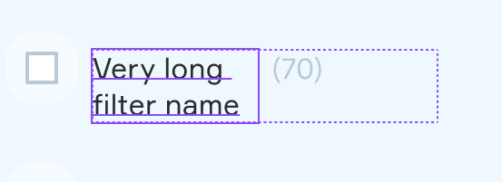
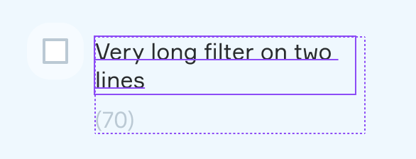
it would be nice to have the option to insert floating components inside text (like Emojis).
Use case would be for signs or infos in complex dashboards. Its a hustle to do this now manually and also set kind of boundingboxes to sync different heighs of text and component.
Hi!
I want to add a text link component within a paragraph of text. I was thinking about using two text fields, one “text before” and one “text after link” and applying the auto-layout wrapping option. Unfortunately the text doesn’t wrap within the text field, but instead the entire text field is pushed into the next line. Are there any workarounds?
I often have a trailing icon component, ellipsis or “show more” component displayed at the end of text. As requested from several other contributors, I think it would be valuable to have the ability to add a component within a text element so that it adapts to the position of where it is located within the text.
100% this would be a fantastic enhancement to Figma. Currently the Auto Layout - Wrap functions like flexbox wrap, which is great for frames.
However when grouping multiple text elements it should behave more like display:inline
Having 2 text styles in a single text block is unreliable and prevents the ability to use text property variants in components.
+1, we just need “inline” (vs block) components. This is a core feature in CSS layouts but has to be hacked together all crazy in Figma. Allow us to at least mimic a “span” tag with basic features like background color, border, and padding — that would handle 90% of use cases IMO.
This would be very helpful because currently there is no way to have 2 text elements behind each other like you could with HTML/CSS display:inline.
The goal is to have text elements (display:inline) and any other component (display:inline-block) be aligned on the same baseline.
Currently the only thing you can do is:
Both set as Fill.
They will share the width 50/50.
One set as Fill, other set as Hug
Fill will take most space, but text will wrap inside width instead of taking full width.
One set as Fixed, other set as Hug
This will take the full width, but the next element will not continue on the same baseline but start a new line.
And here the goal, but this is currently impossible
This is a simple example with 2 text elements. Ideally this would also work with other components like icons.
TLDR;
So what we need is some kind of auto-layout support to create display:inline and display:inline-block elements.