Component scaled element not inherited by instances

I’m creating some icons with a base resolution of 1024 x 1024.

Each icon design variation is created as its own component at 1024px.

Then, I have some components which contain those icons where those icons are scaled to different sizes depending on the treatment. (60px, 72px, etc.) In order to maintain the icon design at various scales, I use the scaling tool accessed via the ‘k’ key.

From within the main component (non instances) I can then swap the scaled icon for any other icon component and the scaling applied by the ‘k’ tool is maintained.

However, when creating instances of the component, and then attempting to swap the inner icon instance in exactly the same way as I do within the parent instance, scaling is NOT maintained.

I’ve attached a video which demonstrates the issue:
https://imgur.com/F2wLXJd

In the video, I’ve created two example icons. The first icon contains a series of grey capsules which should be scaled. The second icon is exactly the same but with yellow capsules.

The icon-01 component has been placed within a new component and scaled to 60px with the ‘k’ scaling tool. As you can see in the video, when the inner icon instance is swapped within the parent instance, the scaling is maintained and the capsules are correctly scaled. This is the expected behaviour.

But, when performing the same operation from a child instance, the scaling is lost and the capsules are rendered much larger than expected.

Is this a Figma bug or is there a way to do this?

I’ve heard workarounds of using the ‘scale’ constraints all the way down, but 1) it hasn’t worked for me, and 2) it shouldn’t be necessary as the top-level scaling should cascade down (as it does within the parent component).

3 Likes

Create a size component. You can see an example here:

So the only way to do it is via flattening? Seems like a bug as the behaviour does seem to differ between child/parent.

Flattening is required in order for the stroke weight to be correct when swapping different icons.

Could you share a link to a file with a couple of your icons so that I can see their structure and test?

Thanks for the workaround ideas. The flattening technique works for some types of components, but really I’d prefer a non-destructive method so I can easily tweak the design if I need to.

I’ve filed a bug report. It seems unlikely that the component instances are supposed to behave differently from their parent instances – and that’s what’s currently happening.

In the meantime, I’ll just have to workaround it!

Thanks again.

4 Likes

We are facing the same issue so it seems this issue still exists :confused:

It has always worked like this, sadly.

I’m facing the same issue when trying to create a generic component with swappable instances. If I need to change the icon or illustration, all possible instances have to be the exact same (final) size; otherwise, the layout breaks.

This limitation requires me to create multiple copies of the same asset (big, medium, small, etc.), so that they can be used in components of varying sizes.

I wish the scaling of the original instance was preserved after swapping - or, even better, if there was an option to either preserve the scaling or use the original one.

3 Likes

I’m having the same issue where the scaling is not preserved. Realised that this issue was posted about two years ago. What was your solution in the end please? Did anyone get back to you re your bug report?

Would be amazing to hear what advice you might have on this @Gleb :pray:

Does this help?

Thanks for responding. I have mirrored the structure you have set out in the file + applied it to the components I’m working with. I still find that the “scaled size” does not get retained.

I have created a demo of the issue I’m dealing with, please could you tell me where I’m going wrong?

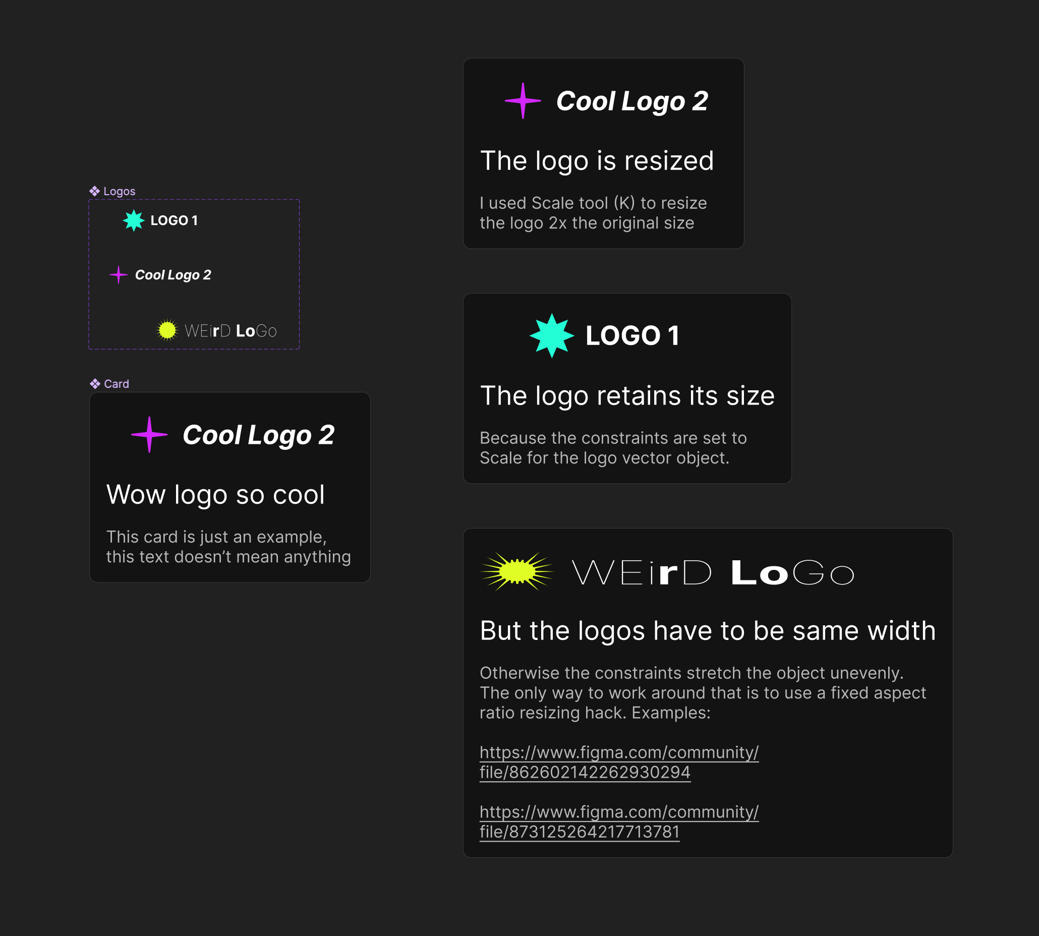
Ah, this seems to be the reverse of the issue: you want the size to change depending on what is swapped. This is possible with one limitation: the sizes of original items need to match, both height and width. You don’t need auto layout as I suggested above as it does the reverse of what you want.

Instead you simply need to set the constraints of the item you want to be resized to Scale. Here is a demo file: https://figma.fun/3wsgwY.

The only issue is the items need to match both width and height otherwise they will be resized not proportionally. The only way to work around that is to use a fixed aspect ratio resizing hack. I don’t know much about it but you can find some examples in the Community. Here are a couple of files made by my friends that originated this hack:

But now it’s available as a plugin in a more convenient form:

I haven’t tried but it should work I think.

Thanks so much for responding and creating a demo file Gleb!

Thanks for suggesting the fixed aspect ratio hack. I’ve had a look into it and it seems so far that it mainly works for keeping the aspect ratio for “Cover images” - ie. a frame that has an image fill. I’ve asked on the Ratios page if anyone know if this would also work for in my case where I’m using vectors.

So that leaves me with going for a fixed width + height for all logos. This is a bit of an awkward solution because in my case, if my team puts logos side by side, it will look too spaced out. Is there a way to adjust it in this case? Thanks again!

The only solution is fixed aspect ratio. I don’t know about the plugin but the hack itself should work for all kinds of layers. Check the files I shared. Do some searching yourself to see if you can find more examples or plugins.

Sept 2024, variants inside an instance (component) still not retaining the overall parent instance scale when switching variant. Common sense. :rage:

1 Like