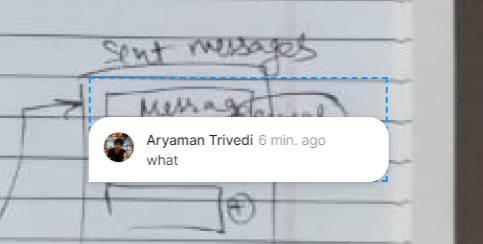
When a comment is made on a selected area, the comment bubble expands inside the same area. This hides a part of the data the comment is about, thus making the entire system more cumbersome. I’d recommend making the comments pop up on the top right, outside the selected area.

Comment UI hiding selected area
This topic has been closed for replies.
Enter your E-mail address. We'll send you an e-mail with instructions to reset your password.
