Change variant on resizing a component

Hey all. I was wondering is it possible to use min and max width/height of an component and use it for trigger to change a variant. For example: I have a proerty Size, and I have a component with 3 sizes. I want whaen I use the component when resizing it to automatically switch to 1 of the 3 sizes using height/width as a trigger. Is this possible.

1 Like

Hey Martin, this is a great question! Did I understand this correctly you want to resize your component and trigger the variant with it? Let me ask internally and come back to you once I get more information from the team.

Yes. So I have a component and variant prioperty calles Size with variants S, M, L. I want to auto switch between these variants when using the component and resizing it.

For ex: S is triggered when height is < 16px, M when between 17 and 32 and etc.

Thank you for clarifying!
I’d suggest working with conditionals. Conditional is a rule that defines if an action should trigger. They are written with if/else logic.

As an example in your case: If height is < 16px than (you’ll receive) Variant S. If not, or else M.

Please let me know if you’ve already tried applying conditionals or if you need help to implement it. Happy to help further!

1 Like

I was trying to solve the problem. But isn’t what you are saying only while viewing prototype?

were you able to figure it out ?

Hey @gtr!
Yes you’re right this action works when viewing prototypes, you can use multiple actions and conditionals to handle multiple or different outcomes within the same interaction.

Is this not what you’re trying to achieve?

Hello @Gayani_S Thanks for your response.
I was trying to figure out a way to make that happen on the canvas itself.
To describe briefly : I have a button which is responsive to the text it contains. The width to the button is the only variable. There is a diagonal strike through across the whole button. I want the diagonal strike to be responsive based on the size of the button. Was trying to define multiple variants of different diagonal strike-throughs and expect the instance of the button to shift from one variant to wider variant as I change the text.

1 Like

Hey @gtr, apologies for the delayed response!

I do think this isn’t possible at this moment. However, I am double checking this with the team. Will get back to you once I get a response!

If you can show me a screenshot of what you are making I’m fairly sure this is possible without any variants or prototyping. Is it just a single diagonal line going from one corner to the other?

I’ve asked the team and the team also thinks that this will be possible by binding both the button variant and the strikethrough variant to a shared variable, the swap only happens with the following actions:

  • Change-to action in a prototype mockup in presentation mode
  • Manually changing the bound variable value in the “local variables” menu

But great to hear @mattaningram might have a workaround for you.

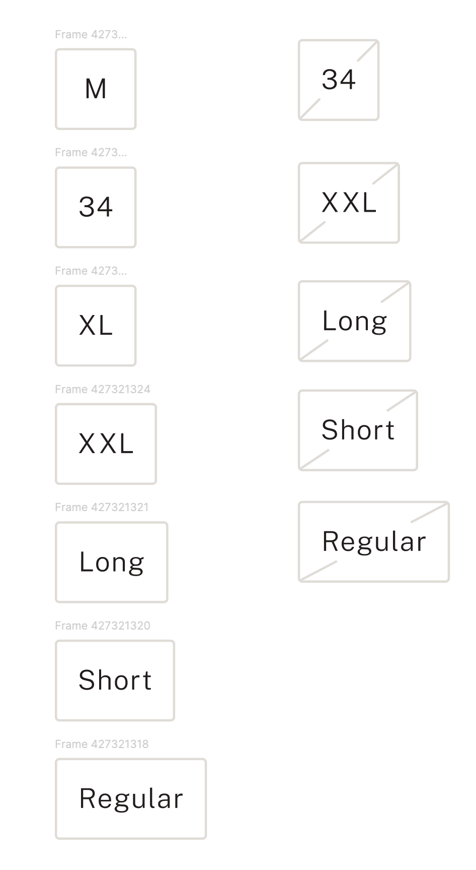
Yes, it’s a single diagonal across the button. Below is an image. left coloumn is without strike, right is with strike. I have had to define the right column individually but was wondering if we could the diagonal one work like how button sizes would increase in an auto-laid out setup.

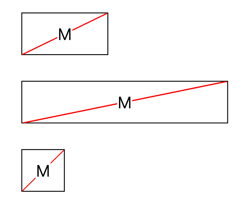
Place the line inside the box, give it absolute position and set constraints to “left and right”. It should now stick to the corners regardless of box’s size.

You don’t even need to create separate variant for crossed out box, just assign boolean property to the line’s visibility.

1 Like

Thanks for your response. But the expectation is for the diagonal to change its length and orientation based on the container size. Having the lines in abs pos keeps them in the position but it will not reorient to look like a diagonal. Hence, had made a separate set of variants. Attaching an image for reference.

That’s because you are using two separate lines for that. My solution uses one. Text has white background to mask the diagonal underneath it.

Edit:
When using my solution don’t use “line” for the diagonal. Line becomes thinner or thicker when is stretched in Figma. Instead use rectangle with 1px width(or any other depending on your needs).

1 Like

Thanks for the response. This helps. This was our version in the wireframes but it seemed slightly crude. It was a small detail in the UI which made us iterate with two lines. Wanted the ends to be rounded where the lines meet the letter. I know it makes no difference when viewing on a mobile screen, but designer complex took over. :upside_down_face:
But really appreciate your help. The advice on left and right constraint was vital.

Also, I chose to use pen tool as it is centrally aligned with the path.

Thanks and regards,

It may be crude, but it’s usually implemented that way using either vector bg, gradient or something similar. When designing I try to stay as close to the way it will be implemented as it’s possible.

Sure, you could implement it with separate diagonals, but similar to the design, it would be rather inflexible and would require more work from developers to make it work.

1 Like

What @Bart_K showed is also how I would approach it both in Figma and in code. Making the tip rounded would be very difficult for a developer as well and probably not worth the extra effort.

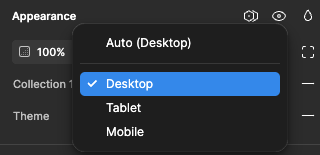
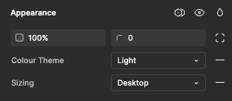
Hi, is it possible to change variant inside a frame (header on a webpage) to change when I’m rezising the whole screen(frame)? I have applied dimensions to both the header(s) and the frame, and I would like the header to change variant from desktop to mobile (not just scale) when I change between token sets.

Thank you in advance :slight_smile:

1 Like

Hey @Jeanette_Hafnor, thank you for reaching out!

I am not quite sure here, I’m just checking this internally with the team. I’ll get back to you once I receive a reply.

Thank you for your patience!