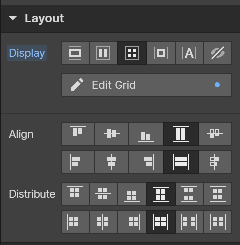
I love the Auto-layout feature but is a pity that I need to choose between horizontal or vertical. Why not both?
My suggestion is an option inside Auto-Layout called Grid that would allow me to choose the amount of columns and rows and create a grid using a smart layout.
They have this in XD, and it’s great. I switched from XD to Figma, and overall, Figma is better. But I do miss that feature (and being able to move layers inside instances)
I’d really love to see this, it would help a lot with layer hygiene. It also aligns closer with the way things are actually built in code, as elements in html and flex box are able to wrap.
I would love this for the simple reason of making component sets more manageable. Adding variants after the fact is a PITA when you have to resize the border all the time. It would be soooooo convenient if the component set could expand/shrink dynamically.
Figma should mimic both CSS grids and Flexbox properties exactly the way that HTML does, at that point it’s going to be a major step forward in filling in the gap between design and development. Webflow, as someone mentioned, is a perfect example of how feasable that can be.
Hey, FIgma is there any word on bringing grid functionality to auto layout? Designing responsive grids should be simple, but choosing a column or row layout can misalign one or the other when cell content width and or height varies. This means manually adjusting for different width mockups.
Hey @David_Simpson, thanks for sharing your feedback! I understand how important responsive grids are for your workflow. While I can’t share any updates just yet, I’ll make sure to pass this along to the team for consideration.