Allow Hover AND Click together

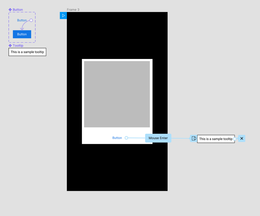
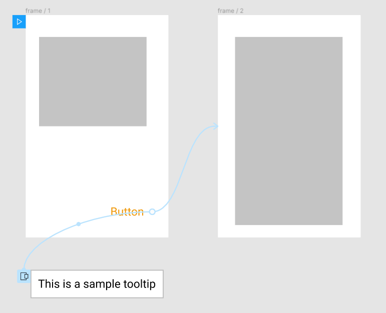
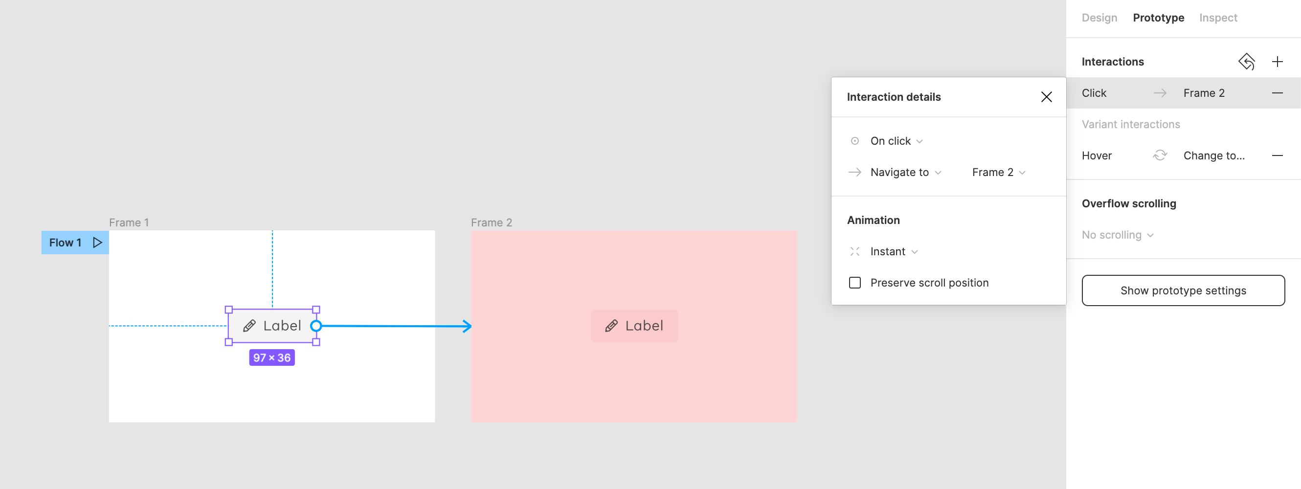
With the interactive components, a variant can now have a tooltip. But unfortunately hover and clickactions are still mutual exclusive.
I’m designing for a desktop application and having a tooltip per inputelement/button is crucial.

71 Likes

Agree - this feels so basic and simple I don’t understand why we don’t have it.
It makes even the simplest of prototypes for me extremely heavy and time-consuming to create.

34 Likes

If you add the hover on the component level you can add the click when prototyping. Or does your button change changes state when clicked? Do you have an example of the issue?

1 Like

The button already has a hover in the component level.
But I need something that allows a hoverbutton, a tooltip while hovering AND a clickaction.

Of course, I could add the hover inside of the variant of my button, but therefore I’d need to remove the autolayout or add another frame that does not react as an autolayout. This is not what I want.

10 Likes

You can add the tooltip when prototyping as Mouse enter / Open Overlay / Manual … the problem is closing will require either a click outside or adding a separate interaction to the tooltip itself to close after a given time or when clicked on etc.

This is probably the best way to do it. But, you could create a new master component that is made-up the button and tooltip components and add the states. Although this will break layouts (probably) when swapping instances on interaction.

Otherwise what could Figma do to make this better?

1 Like

But how would you activate the click on the button to reach the next frame. The “mouse enter” is not helping here. I already tried it. My current approach is to create duplicate frames (one with hover/mouse enter) to show the hover on frame1, and then by clicking somewhere randomly simulating the click action on the duplicated frame.

I’ve seen the master-component solution for tooltips in their playground that introduces the interactive components, but … it’s making things really harder. To maintain the hierarchy (so overrides are still working) all variants would need to have the same nesting. But following the instructions in the playground I’m forced to get rid of the autolayout, which makes my design not as flexible as it was before.

I don’t know what figma could do. I understand that the overlay adds … another layer, which makes everything below that layer not reachable.
Still, I wished there would be an option. E.g. by making enabling a checkbox saying: do you want to use the description of this component as tooltip? And when I click yes, it just appears. No “open as overlay” connection needed at all.

6 Likes

Right! Sorry, I haven’t had my coffee yet. :slight_smile:

I didn’t realise that the Tooltip component blocks the Button even though they aren’t overlaid… that’s a bit odd.

The product seems to be a bit confused. Interactive components don’t really work with the ‘lay-out every single scenario as a frame’-approach.

Haha, no worries. I think they are already doing a great job.
And with the focus on mobile applications I also understand that something like “tooltips” or “conditional logic” is nothing you want to focus on initially. It makes things only more complicated if you don’t think it through.
But for me, to bring the interactive components to live, I’d really like to have this Hover+Click Action AND the ability to add conditions.
I know that e.g. protopie allows this and also the interaction between figma and protopie is already very good.
But then again - protopie does not support autolayout (when I checked 2 month ago) and also does not import the components created in figma.

4 Likes

Yes, I agree! Maybe we’re too demanding. :slight_smile:

We moved from Axure + Sketch + InVision + Abstract + Zeplin over to Axure + Figma and the workflow is much less painful!
We still use Axure for UX and to create the fully functioning prototype. Axure can do really complex stuff, like databases, that we can’t (yet) reproduce in Figma.
For complex animations without any code I still find AE to be the fastest, although I’m wanting to check Principle or Protopie, but never find the time to properly dive in.
Anyway, let’s hope our prayers get answered and waking up in the middle of the night from a component nightmare will be a thing of the past. :slight_smile:

5 Likes

Hi, I recantly also across on this problem and to be honest there’s no clear workaround to this. There’s no possible way to add hover and click interaction to the same frame and display in on preview with interactive components. But I use imperfect solution that may be also help with your problem.

I discover that it’s everything fine when variants don’t have layers that overflow basic size. Problems starts when you have tooltip that goes beyond box size.

I deal with it by for example adding hover interaction to the 24x24 icon (overlay set manually to present tooltip) and then nest this frame with another frame 40x40 (touch target) and on that parent frame add click interaction. (Details in video).

I think when interactive components leave beta, Figma team will solve this problem but for now we must carry on with imperfect tricks. Glad if this messeage help someone.

9 Likes

I made a workaround and managed by applying the ‘on click’ event on the ‘open overlay’ element.
So the on click event is NOT applied on the initial button. But the element that is the actual rollover state.

3 Likes

Just to make it clear - you open an overlay on click (e.g. toolitip) and then if you click on the tooltip you go to the next screen, right?

The only issue I still see here is, that it is not reflecting a real flow … a tooltip does not show up on click normally. And how should a tester know, that he needs to click on the tooltip instead of the button (except that the tooltip gets highlighted when clicking somewhere in the prototype window)

But still, a good work around if you as a designer just want to show the different states :slight_smile:

7 Likes

Here is my solution for a button that has on and off state and a tooltip.
From the main screen I created a hover open overlay interaction link from the button. The link goes to a frame with both the tooltip and the button as children, where the button has opacity of 0%. The button then has a click interaction which uses swap overlay going to another frame of the same dimensions but without the tooltip and the button with on state. The button’s interaction here is close overlay on click.

7 Likes

I think my request is in the same vein here, but I’ll add my use case just for context.

My use case: I want an edit button to appear over a section of the page when you hover on that section. What I’ve done is create a component that is just an empty frame with an edit button in the upper right-hand corner. The edit button itself is a separate component that has a hover effect wired up within its variant group. For each section, I want to set up separate click interactions that open different modals.

The problem is, it seems like I can’t set separate interactions for different states of a component. When I hover over my empty frame, the edit button appears, no problem. I then move my mouse over to the edit button which then triggers the hover effect for that button, great. The problem is these are both buried under hover interactions, so in the actual design mode I don’t see these objects by default. I can go to the component panel and turn on the hover state for each of them, then create the prototype interactions, but Figma doesn’t seem to remember these actions when in prototype playback mode.

I think this is the same thing OP is getting at — allowing a hover and a click interaction to exist on the same component instance.

@h.rude Hello

I think I found a perfect workaround, I’m still testing all outcomes but so far so good

Create your tooltip / make it a component / make an instance of it / create your icon and do the same / put both instance and icon in a frame with the right way of hovering and auto-layout/ make it a component / make it a variant/ name variant 1, Visible=True / name variant 2, Visible=False / now in variant 2, reduce the visibility of you tooltip to zero=0 / make a prototype of false to true by mouse enter and leave / now put you false variant into your design and link by click to wherever you want

this way when you hover one there is a tooltip and without overlays, so you can click through it and it’s easier than it sounds, when you put in the design there is no need for hard work anymore and you have a nice component with tooltips

PS: I haven’t still test it inside a full page and messy auto layouts but I think it should work fine if you make a good auto layout

6 Likes

@h.rude

I have tested what @GameClude is describing. It takes a little extra time to set up but does work.

Here’s a tutorial that helped create the components

:dog:

Also ran into this limiting issue pretty quickly using interactive components. The use case is around needing things like tooltips and hover states on a button along with a click. The workaround of embedding the tooltip into the components themselves isn’t one that fits in with a flexible design system.

I would consider this a basic interaction.

4 Likes

I can’t believe this isn’t possible - especially since it lets you create this interaction with no kind of suggestion that it won’t work, but then it just doesn’t work on the Prototype :thinking:

6 Likes

Is there a way to have a tooltip, on an element, that overlays on hover, but you can also click on the element as well?

I’ve tried to use interactive components, but as you can see below, because the tooltip is not an overlay, and sits within an auto-layout table row, it goes under the cell next to it.
figma2