
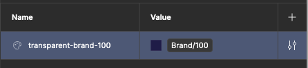
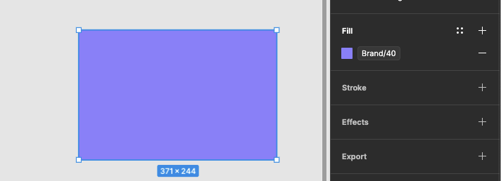
When aliasing a color variable to another (img 1), or using it directly on an element (img 2), we should be able to override the opacity without the need to create a variable for each transparency variation:
Cant override opacity in the alias:
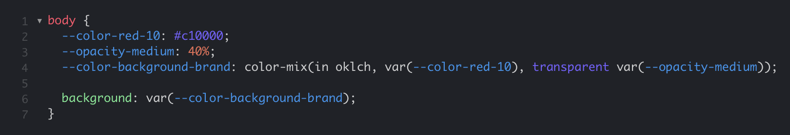
Example 2
Cant override the fill opacity:
