Add Margins To Auto Layout

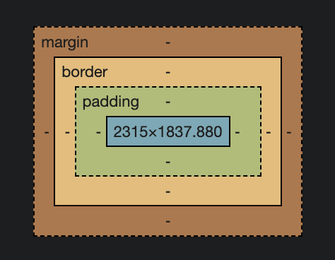
Auto-Layout has padding (inner spacing), but no margins (outer spacing).

Currently the only 2 ways to add spacing is to:

  • Create a spacer element or
  • Wrap the items in another frame and apply gap spacing
    • This creates a lot of unnecessary frames, and sometimes creates nesting so deep it goes outside the layers panel.

Not sure if a technical limitation left this out of consideration in the first few versions of Auto Layout, but it would be much appreciated if it were included in a future version as it comes up as a significant limitation many times a day.

21 Likes

This topic was automatically closed 30 days after the last reply. New replies are no longer allowed.

The padding and gap feature of the Auto Layout is super nice already, but wouldn’t it be even nicer if there also was a setting for margins? Some elements/components need some white space and sometimes they need a special/custom margin beside/over/under other components in the Auto Layout.

5 Likes

I completely agree. Currently, if you want margins around an element you need to place it in another container (sorta like DIV-ititis). Having an option for margins in addition to the paddings we have now would make mock-ups closer to real-world HTML/CSS - not to mention less cluttered layer structures.

2 Likes

Oh yes! We need margins! Is this the only thead for margin? Only 6 votes?? for real?!

It could look something like this:
image
maybe?! Please?!

2 Likes

Just to reignite… we would so love this

2 Likes

How are there no margin settings for a frame? Really?
A fundamental setting that is missing…
Until the day it is included, extra frames it is I suppose…

1 Like

Just chiming in that margin settings would be a godsend. Really need this option especially for those of us that are using a CSS mental model when laying stuff out in Figma.

1 Like

Margins are a must have, paddings cannot have negative values which is really needed in some cases.

Only 38 votes for such a must have? :flushed:

I also agree that this would be very helpful! As someone who works with CSS regularly, I cannot accomplish certain things (such as adding spacing to a component with a background) in Figma as I would in CSS using margins without affecting their appearance. Margins would be a valued feature for me.

Bumping this because I’m also having this issue where devs are expecting to see margin-top instead of padding-top so it’s a little confusing (especially in a big team since they have to remember to not use “padding” property).

Seems like a big big miss to not include margins! As the comment above mine states, it’s important for designers to be able to work with the same properties as devs do to cut down on confusion, double work, etc.

those of us that are using a CSS mental model

Not to mention, those developers using actual CSS to build the things we make in Figma!

I mean ideally, shouldn’t autolayout have a 1:1 relationship to flexbox? Wouldn’t it be easier for everyone if autolayout’s capabilities and options and values exactly matched flexbox (like adding margins)? We’re not designing in a vacuum - I don’t design stuff so that it looks good in Figma, I design it so that some developer can take it and build it.

1 Like

Absolutely agree. What’s the point of having an entirely unique type of object with different attributes/limitations/quirks when the obvious purpose/benefit is to mimic flexbox containers?