1/3-2/3 layout-need both constraints and hug?

Newbie, only a week in. Be gentle. Nomenclature may be off.
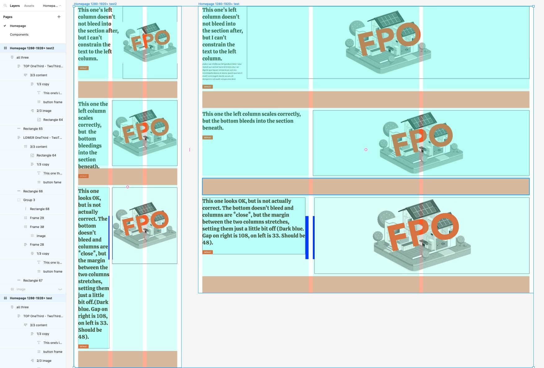
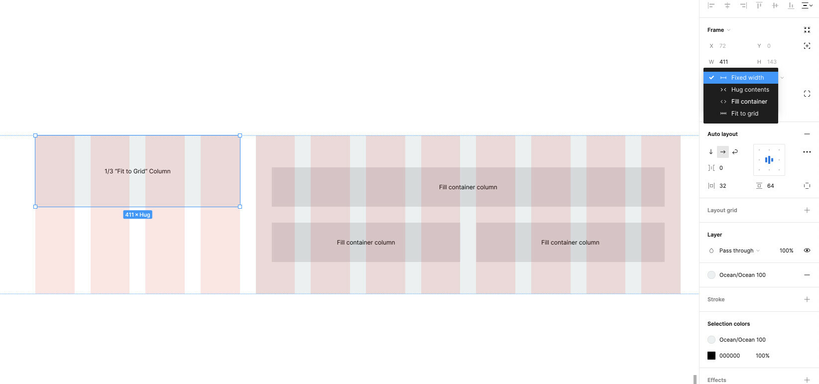
Trying to create 1/3-2/3 column layout. Can not figure out how to both make text responsive properly constrained within the grid, and keep sections from bleeding into the following section. The first seems to require constraints (available with frames, but not with autolayout). Second seems to require the “hug” feature (available with autolayout, but not frames). I’ve spent hours nesting every combo I can think of, to no avail. Am I missing something? Am I expecting too much? See attached screenshot for illustration.

The 3rd option is certainly ‘close enough’, but for learning purposes, I’d like to understand how to do this.

1 Like

Hard to say anything specific without the shared file.

This is a current limitation of Figma, also discussed here: either Auto Layout with an even layout, or constraints but without Auto Layout. I’m assuming in the third example you used the “Scale” constraint but would be curious to see the file as well.

1 Like

Thanks! I had actually seen the second link you provided–that’s how I got as far as I did. I was so happy that the solution was simpler than I thought… then added text to the top left container, and fell down a three hour rabbit hole chasing my tail to solve that issue.

Yes, the third example used scale. Ironically it’s what I started with, until I realized it meant margins also scaled.

Didn’t share file because 1-new and hadn’t figured out how to to that yet, and more importantly 2-file had a lot of the client’s half-finished website design that I figured shouldn’t be out in the world. Copied into new file here, in case there is any solution that isn’t “no solution”:

Which I may use for another thread: how do you align images top and/or left, and have them scale while maintaining that alignment? (I suspect this is also a limitation).

1 Like

I would say its just a matter of how you set up auto-layout nesting. From what I can tell and what I have done a thousand times is that you want to

  1. Set up an auto layout that has the image and the column
  2. Apply fixed width (or fill container) to the text, image should probably just be cut to the desired size
  3. Make sure they are both set to horizontal direction
  4. Apply desired spacing between
  5. group and convert to frame, make this an auto-layout, horizontal
  6. Add your desired space between these two elements

Alternatively, you can take the two different sizes and group a column of multiple of one size but you then would want to have each column in another auto-layout.

I hope I understood the problem.

I don’t think you understand the problem. Or I have misunderstood something or missed an assumption in your solution. I think Antoine had it correct, and it is a limitation of the software (a glaring one IMO).

1 Like

As @Lisa_Lessenger1 described, on part of that row needs to be fixed and the other part needs to be set to filled. Therefore, you should the the 1/3 column to fixed width (your total row width divided by 3). There is no auto fill just a fraction width feature in Auto-Layout itself.