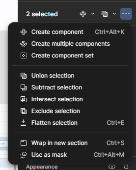
As Figma has recently updated its UI3 to use fixed side panels (which used to float), I for one would love for the top bar to be back in its place… which would also mean that the now hidden boolean operators and component switches (or any other submenu for that matter) would no longer be hidden (red squares in this screenshot).
Apparently the user base isn’t ready for an interface that floats… nor am I for a floating menu on the bottom. It really is only a few pixels loss in the total height… but improves on usability a lot, because the submenu’s (red again) aren’t hidden under some icon somewhere… but can be used right when you need them. And you can do that with a lot more components.
When I select two objects:
![]()
When I select a text:
![]()
Which in UI3 was hidden behing a submenu.

Wouldn’t it be nicer if all those options were all in the top bar!?
Or better yet… a combination of the two? On central menu for contextual tools… and full options still in a dropdown menu. Hidden in three dots in that contextual menu perhaps?
Edit: This user sums it up nicely!


