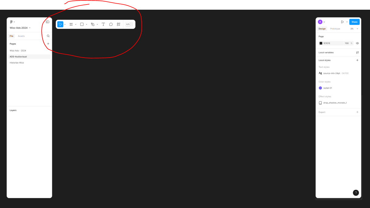
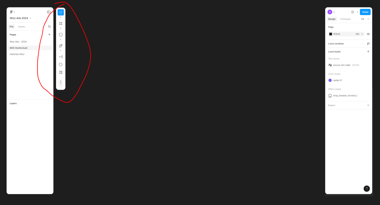
Allow us to dock/move the new UI3 toolbar


Show first post

143 replies

leigh_van_maaren

I’d like to give UI3 a chance, but the movement of the tools to the middle of my workspace is so unbelievably disruptive I can’t imagine ever using it.

I’m already constantly squeezed for height - as you’d expect, since the aspect ratio of a desktop screen vs. the long lengths of pages and mobile screens means that there is vertical scroll in 100% of my files.

The bottom of my screen is also the most visually cluttered part of my desktop by far. For any mac user using a bottom navigation bar (I presume most of us) you’re already overloaded with icons and navigation in the lower part of the screen. The way this is implemented means it’s also in the middle of my design work, and the cognitive load of trying to make decisions in this space is brutal. I have to imagine I’m not the only one out here with ADHD, and not being able to move the tools to the top or to a less cluttered part of the screen where I am not constantly clicking to work / navigate is pretty deeply unusable. I keep trying to find an option to drag them to the top, or literally, anywhere else that isn’t overlapping and hiding a critical part of my workspace.

All you’ve done is make my working area smaller for no good reason, and made the tools harder to use. I understand it’s less distance for how you’re using it, but I never want my tools in the middle of my workspace and given the fact that I’m always going to be working on files with vertical height it will always overlap my work in a super disruptive way. This is the sort of thing you offer as an option, not the only way to work. I can’t even resize it so it gets in my way less.

I couldn’t even say if the other changes are good because this creates such an annoying obstacle I can’t use it.


Dont_Panic
  • New Participant
  • 6 replies
  • October 4, 2024

Adding my perspective here.
I’m still struggling to get used to and navigate the new Figma UI. One major issue is the toolbar position. I don;t know but I can’t seem to locate it easily. It feels so out of place where I don;t expect it to be. After using Figma for six years, my workflow is tuned to having the toolbar at the top. It would be incredibly helpful to include an option to customize the toolbar’s position, allowing designers to choose what works best for them.

I can;t add any videos here so this is one from Linkedin. [Not posted here to get followers just to show the usecase]

linkedin.com

On_Josh1
  • New Member
  • 2 replies
  • October 6, 2024

Big plus one.

For me, it is an ergonomics issue. I like to work mostly around eye height - and my eyes are about 2/3rds up the screen, a toolbar above that is great, I can see it at a glance without moving my head while working on a large screen.

Thanks


Akash_Salian

Maybe someone can develop a Chrome extension to move it to the top?


Larissa1
  • 1 reply
  • October 9, 2024

It is almost impossible to work with it, the position at the bottom causes many kilometers of mouse travel per day, because you generally tend to work/look on the upper half of the screen. Please give us the option to change this as soon as possible.


Roger_Bradley

The ergonomics are way off. My monitor covers the toolbar with my laptop positioned directly in-front.

To accommodate dual screen use I have to shorten the height of Figma window on the monitor, or over-tilt my laptop screen to access windows on both simultaneously.

Please allow it to be fixed to the top 🙂


Alain_Ossandon

It would be a good idea for the user to have the freedom to position the tools’ navigation according to personal preference, maybe making it ‘magnetic’? ✨✨


Yevgeniy_Akimenko

Why not keep the toolbar in one of the sidebars? They have tons of vertical space. But when it hangs in the center, it just creates visual noise


Eli_Lozovyagin

Hi

If tabs in Figma are the top (cause they have higher hierarchy) then why is the toolbar (which has also higher hierarchy) have been placed at the bottom of the screen. It makes no logical sense. Now the user will have to jump up and down. If you want to make things according to your “logic: all should be at the bottom” → then put tabs also at the bottom.

Logic has to be consistent. Or give user freedom to bring toolbar back at the top. Or place tabs also at the bottom.


Matt54
  • 1 reply
  • October 10, 2024

I agree, I hated it when Adobe tried it and I hate it in Figma’s new UI. It’s just in the way all the time and makes me want to leave the app as soon as I can.


Charles_Henrich

Guys UX 101 – Your eyes are looking straight ahead to down when working on a screen ergonomically. You’ve placed the toolbar in an incredibly prominent location for the interface. Terrible UX, it is the literal least valuable thing in the interface, in one of the most prominent positions floating on your canvas. Definitely a big vote to allow us to dock elsewhere or hide this thing, thanks!


Drago_Havranek

Can you put main tools from bottom to top of the window like in UI2, please. It is more natural - this dom just slow me down.

And this isn’t only because I worked many years with Tools on the top. We all work (Figma app designer as well) the same job (UX/UI) design and this change isn’t better from logic and all other reasons…focus point for human eyes is on the top

or, simple give us possibility to chose: Top or Bottom

regards Drago


mpowers
  • New Member
  • 3 replies
  • October 10, 2024

Yeah–this was a horrible redesign. Never force me to have a toolbar at the bottom of the screen. If a user wants that option, so be it, but don’t make it mandatory.


Harrison_Rodriguez

Yes! I have this same issue! Would love to be able to stick the toolbar to the top or to the side in a vertical orientation.


Reid_Weigner

+1 would prefer the toolbar at the top. Or the option to hide it completely, irrespective of showing/hiding the rest of the UI.


Voros_Amadea

If anyone struggles with UI3, there’s a question mark in the bottom right corner, click that, and there’s a “go back to the old UI” option - thanks devs!

Otherwise it looked a bit sharper, but the toolbar position…

  • THE FIRST RULE OF DEVELOPMENT IS: do not fix what ain’t broken.
  • THE SECOND RULE OF DEVELOPMENT IS… 😃

Eric_Betuel

YES!!! Horrible at botom…totally busts workflow


J117
  • 1 reply
  • October 10, 2024

Literally the first thing that happened when I wanted to select a tool, I went accidently over some Start Icon, it popped up, and before I knew it I undocked an application from my start-menu. I dont even know which one it happened too quick.

Which tool you ever used except an OS has the toolbar at the bottom ? There is a reason for it. This is the worst place for it, according to any UI. If you want to change things, just because you want to move stuff around without purpose, at the very least give options, instead of forcing such changes upon the user.

Second thing I did was roll back to prev UI and fly straight here to make sure this thing gets moved. Seems there is a consensus in this thread.


Omar8
  • 1 reply
  • October 11, 2024

I like the concept of the new UI; being able to remove all side bars and purely focus on content. However, it would be nice if we can still have a small button in the corner to switch between pages without the task of reopening all the side bars back on screen.

It would be ideal if we can choose where to place the toolbar whether at the top or bottom. Depending on certain screens and workflows, this could be useful and would seem more intuitive since the new ui gives a ‘floating’ appearance which would imply flexibility.


richard10
  • New Member
  • 3 replies
  • October 11, 2024

Toolbar is now interfering with Mac Dock, as others have said 😕 Please allow us to move it!


Robert16
  • New Member
  • 5 replies
  • October 11, 2024

Please make us stick the toolbar to the top as it was before, it is placed in the middle of everything and interfering with my workflow, especially on laptop screen size. Super annoying and not useful at all. In general, I see 0 (zero) benefits in the redesign, the right side inspector panel seems confusing and disconnected from what is happening on the canvas. I would be very very very unpleased if you roll out the current design without an option to get back.


Cameron3
  • 1 reply
  • October 11, 2024

Would love for the toolbar to be movable. Bottom position is close to macOS dock and accidental hover over dock is frustrating.


Libor
  • New Member
  • 3 replies
  • October 11, 2024

Toolbar at the bottom is quite distractive in the work area, make it movable pls!


Rehan_Haque

Came here to give same feedback. Toolbar fixed at the bottom just does not work for me. It might be the way tablets are going but on a desktop , with large screen, top or left toolbar is preferred. Being able to dock/move or just select from top / bottom would be a minimum.


silviu.tinculescu.extern

Hello, I guess the title says it all.
The bottom toolbar should be movable.
I don’t like it hovering all the time in front of my design.


Reply


Cookie policy

We use cookies to enhance and personalize your experience. If you accept you agree to our full cookie policy. Learn more about our cookies.

 
Cookie settings