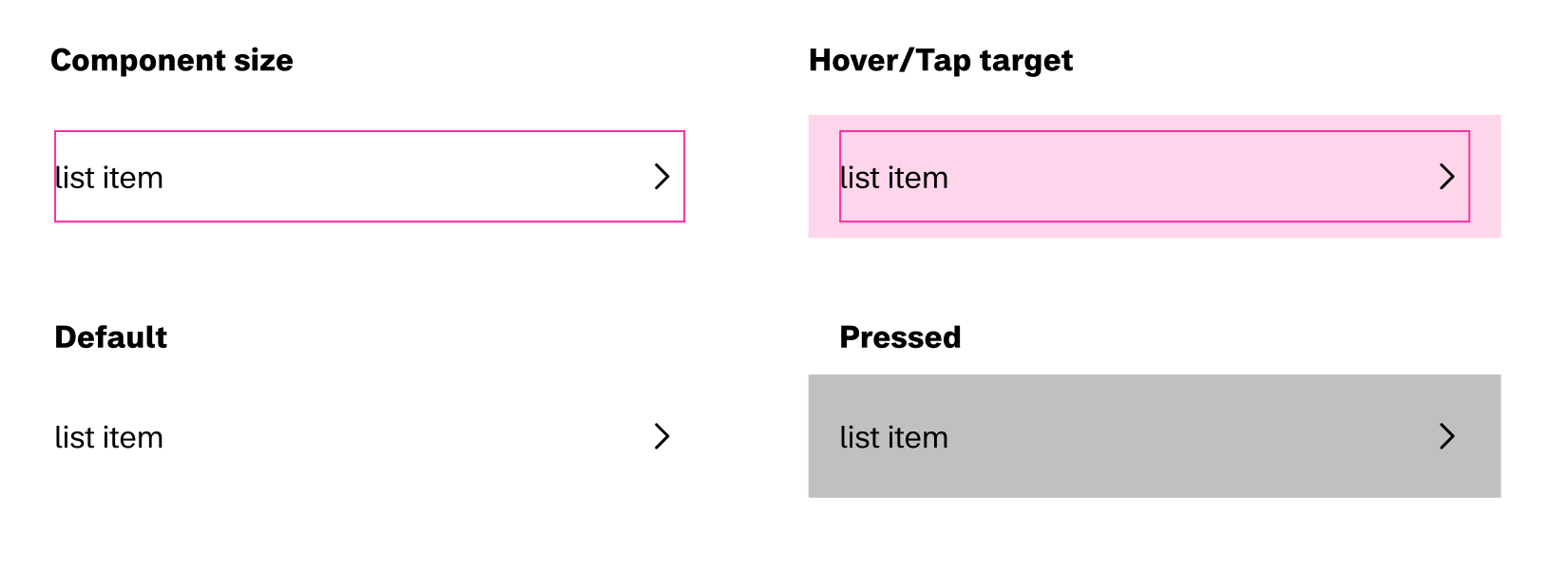
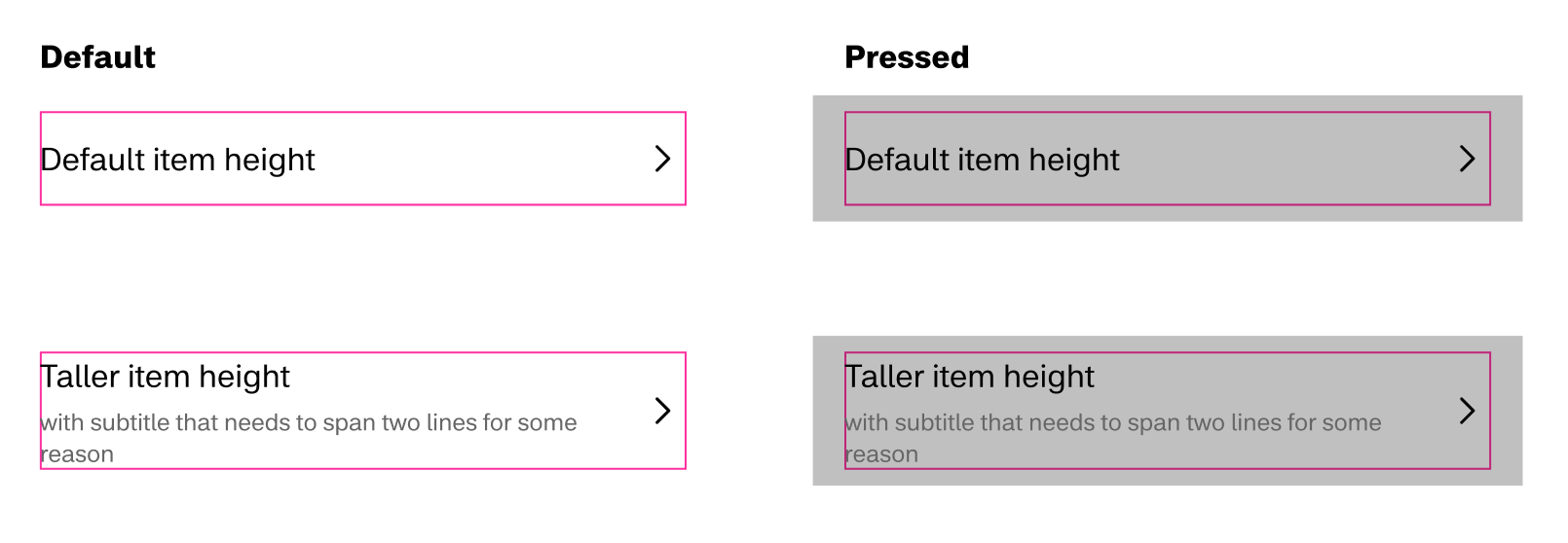
In the past when building components, the hover and tap targets where always the same size as the component itself.
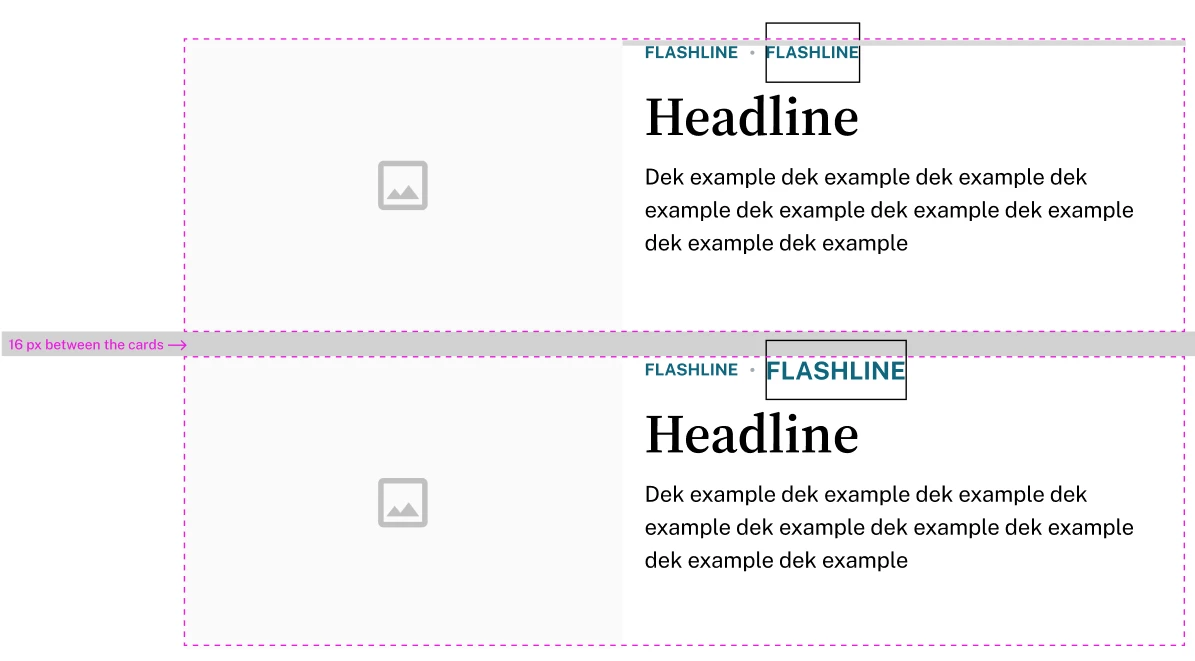
For example, in a list where the hover or tap area should span the full width of the page, the component itself needed to be full-width.
So to improve the life of our developers we wanted to transitions from using components with built in margin to allow setting the margin externally.
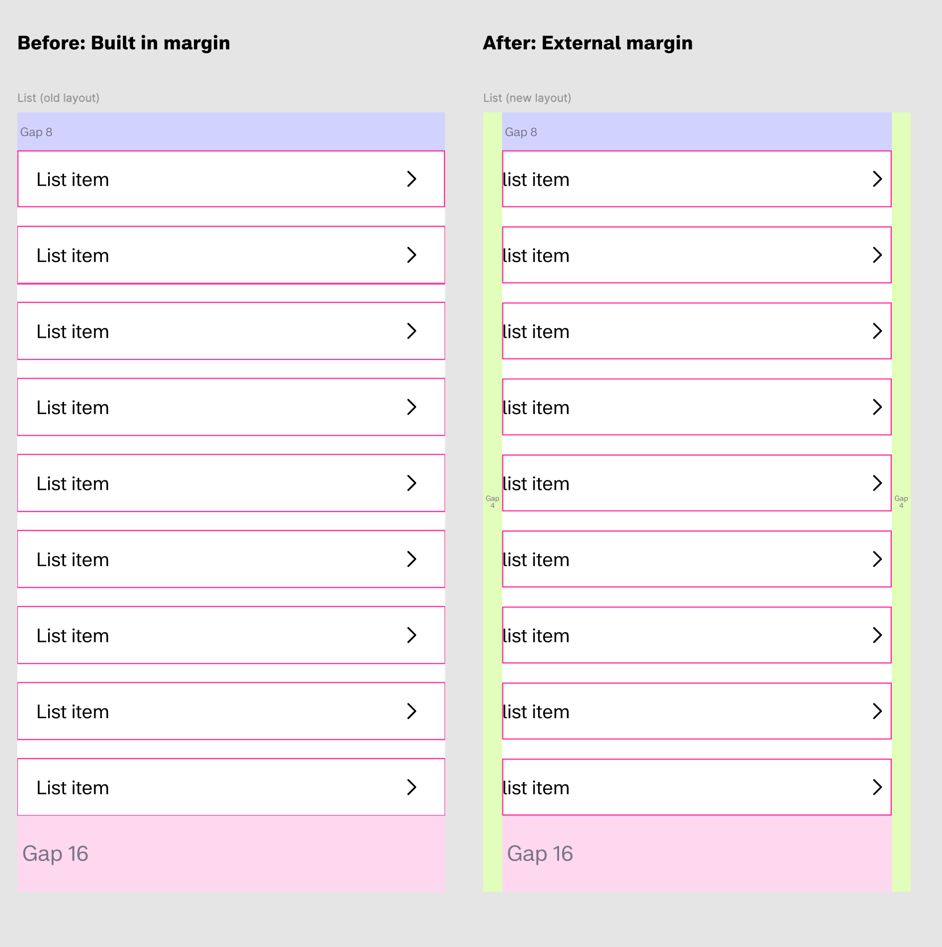
However, the challenge was how to ensure the component would still have a hover/tap target that spanned the full width.
I couldn’t find any suggestions online, but after a lot of fiddling and hacking, I discovered a surprisingly simple solution.
I wanted to share it here in case others have faced similar challenges:
Solution
Step 1:
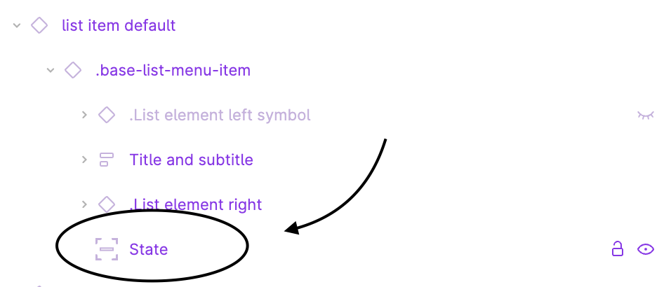
Create a layout using auto layout so that the component can scale as needed based on the content. Add the state as it’s own layer and set the position to absolute.
For each variant you can change the state as you would normally change the background.
Step 2:
Set the layer to the correct size of the target and center it. Now go to the positions panel and select all directions while holding down shift.
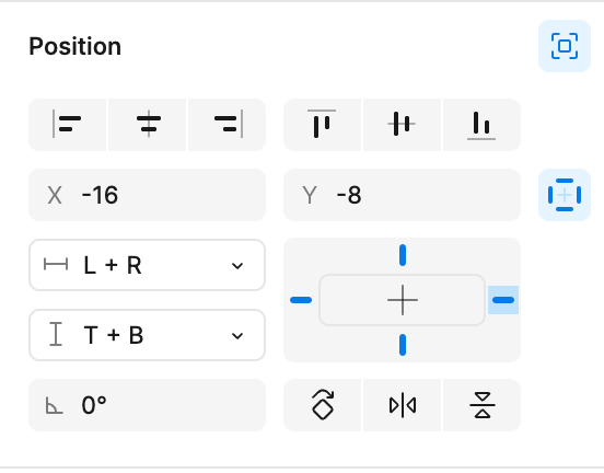
This way the horizontal constraints will be fixed and the padding will stay consistent. In this case 16px horizontally and 8px vertically. Note that selecting scale in the dropdown will not work in this case as it would result in inconsistent padding for the target when it scales.
BTW the method also works super well for inline buttons and icon buttons where you might want to have the hight 24x24 for better alignment, but have the tap target 48x48 for accessibility. OBS!! Just be careful when using these components in prototypes as you need to ensure the connection is set from the state and not the main component!

What do you think? Found better ways of achieving the same result?