Question

Fullscreen image in comments zoom in bug


Clement_Roze1

The plus and minus icons are don’t fill the entire container size – their square shape shows up on hover/click which looks awkward.


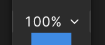
There’s also a weird 2 gray borders on the sides of the 100%:


2 replies

  • Figmate
  • 2002 replies
  • April 22, 2025

Hi ​@Clement_Roze1, thanks for bringing this to our attention!


Thanks for sharing screenshots. So, it sounds like your feedback is about the zoom controls (the + and - icons) in the bottom right of the modal that pops up when you click an image in a comment.

I get your point that it might be easier to use if the clickable area for the +/- icons was the same size as the container. We also appreciate your feedback about the percentage display.


We can't say for sure if this design will change, but we really value you sharing your thoughts with us!


Clement_Roze1

Thanks! 👍


Reply


Cookie policy

We use cookies to enhance and personalize your experience. If you accept you agree to our full cookie policy. Learn more about our cookies.

 
Cookie settings