
This doesn’t need discussion as it’s only meant as my personal opinion which has no basis other than my personal likings.


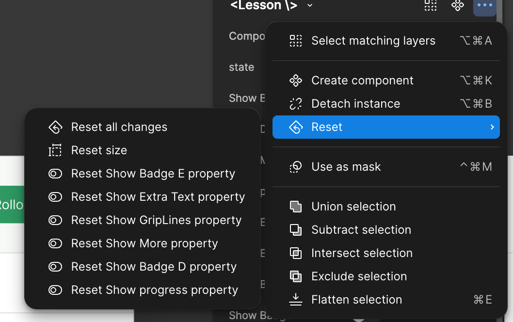
Resetting a component, is something i use a lot and now that it is burried i have to spend more time. I would want here to either have some shortcuts attached to it somewhere more prominently.


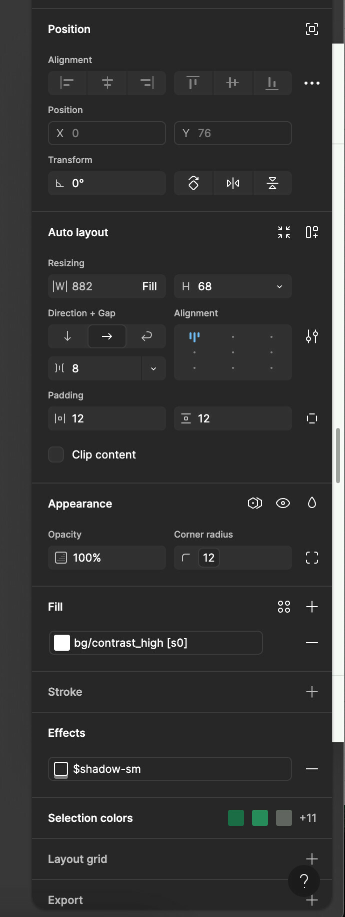
I would love to have the ability to reorder the panels (Position, Auto Layout, Appearance, Fill, Effect) similar to how i can do this in adobe programs.


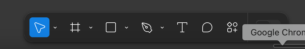
The middle-bottom toolbar is positioned prominently and i never use it. I would prefer if I could hide it or position it somewhere else. (top left, or top right, etc)


I don’t understand the value of having padding/margin around the sidebar. It feels so annoying. I would prefer if i could allow the sidebar to be used more effectively, especially given the fact that i work on a laptop and my screen size is low.


Overall, i do not like the UI3.

I know i can switch back to the old UI for the moment.

You are Absolutely right. I don’t want to use the UI3. UI2 is still perfect for me. Unfortunately on April 30 Figma is making people to use the new UI which is piece of ####.


Someone said awhile back, when you need to make a microsite to explain what you did then you didn’t do a good job making intuitive interface.

And yes, the floating tool bar at the bottom is an awesome add-on for shimmering effects!

Other tools are not figma and they don’t need to dictate what figma is.

Unreal Interface 4 please with 3D canvas and chip up my for enabling speedrun


Please, Figma, listen to your customers. We don’t want UI3!


Agreed, it’s really infuriating me that the tools bar are moved to the bottom and out of context with the tabs, name of the file, prototype controls etc. I have to keep moving my eyes between top and bottom of the screen. How they think this is an improvement to usability and effectiveness of the UI is beyond me. Also having a floating tool bar isn’t a better use of space within the work area, it just gets in the way of the content the stuff in the canvas. The UI2 top bar is the most effective and efficient use of space. 


Tool Bar now on the bottom for what again? It was so much better before and our eyes had less to travel whenever needed. Plus now ‘Actions menu’ (Command + / or Command + K) also forces me to look down away from where my eyes are almost always at.

One of the shortcuts I used the most was ‘K’ to get to scale and then a single tab to get to width value. Now I could either tab through 38 times! to do the same, take my mouse and select it manually, or with time hopefully force myself to form a new muscle memory and use ‘Shift+Tab’ instead —except I would need to ‘Shift+Tab’ not just once but 3 times. So what use to take 2 key strokes now takes 6 at minimum (‘k’ + ‘Shift’+’Tab’+ another 3x ‘Shift+Tabs’) and a whopping 39 keystrokes at maximum! Or use the mouse which is what shortcuts were meant to avoid. 


Reply