
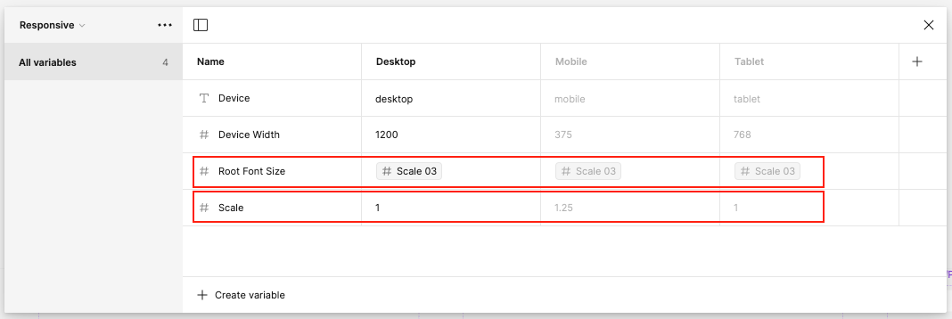
Looking under the hood at Figma’s “Simple design system”, there’s a “Responsive” collection, with variables for “Root font size” and “Scale”… These look like they could be implementing a REM-based font-size approach - if the “Scale” variable could be used in variable calculations, which to my knowledge, it still cannot yet…
- I gather that “#Scale03” could be used to change the font size to a different scale variable depending on the mode selected (Desktop/Mobile/Tablet) - but it isn’t leveraging that
- “Scale” on the other hand looks like it could be a multiplier, so that (Example: a 16px font size in desktop would be 20px (16*1.25) on mobile… but I’m not sure what this is actually doing here…
I haven’t fully watched all of Config24 sessions yet, so I apologise if this is a dumb question covered in any talks.
Anyone know what this does?
Thanks