I’d really appreciate some help here, can’t get mobile prototyping to work in the way I’d expect.


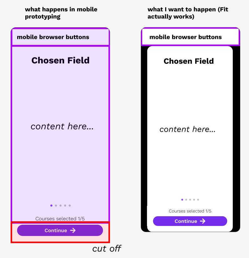
I am prototyping an app with a bottom anchored toolbar. As such, “Fit” type settings are critical to avoid users from missing these buttons. However, any combination of settings I try in prototyping (Fit, fill, presentation, different preset phone frames) do not actually fit my prototype within phones of varying sizes. Here’s an image of what I’d expect would happen.


I’d expect a fixed ratio and I’d get black bars on the sides. This is pretty much how desktop prototypes show - they work on any screen size because the frame is fixed and fits to any window size, with black bars added as needed.


Any help is really appreciated here. I don’t get how mobile prototypes could not support “Fit” in the way I’m describing, as that’d make testing anything with bottom-anchored toolbars/buttons much more unreliable based on phone size.


Thanks for any input!

Hey there, thanks for reaching out and sorry to hear you’re having trouble!


It’s hard to be sure what’s happening without seeing your file. Are you able to share a link to the file so that we here in the community can take a closer look?


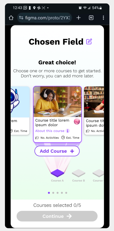
Hey, thanks so much for getting back to me. Unfortunately I can’t share the file, but here’s a video.


The problem seems to center around the overall Figma phone frame size (in this case 390 x 844) being taller than what my phone can display in the mobile browser (mainly due to the browser search bar). What I expect to happen with the prototype “fit” setting is something like the following:


So I’d expect black bars to show along the left and right, so that the entire frame can show. But this is not what’s happening - Figma is instead fitting the prototype based on the width, causing content to be cut off on the bottom.


I don’t think there’s a way to solve this with like… fixed or sticky scroll behaviors on anchored toolbars. Sticky will still just stick the toolbar to where you place it in the Figma frame, such as at the bottom. Figma frames aren’t responsive (?) - like I can’t set a frame to height 100%.


More broadly, I’m trying to understand how people test prototypes on mobile, across a variety of devices with different heights. If your overarching phone frame height is static, and “fit” or “fill” settings don’t work like my screenshot above, it seems like you can’t really depend on mobile prototypes to show bottom-stickied toolbars (on smaller-height devices). Or even if someone has different device back nav settings (swipe to go back, vs that bottom back/home/etc toolbar, which further reduces height).


Thanks, hopefully this helps.


Thanks for the additional context!


We’ll pass this onto our team to take a closer look. While we can’t promise an immediate fix, keep an eye out on our future Release Notes.


Reply