Solved

Is it possible to create an adaptive res bottom navbar in a prototype?


Guilherme_Xot_Pironi

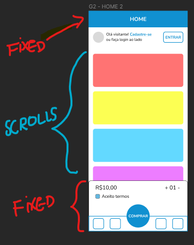
I’m creating a mobile prototype with adaptive resolution containing a fixed navbar at the bottom of the screen and a fixed header at the top of the screen.

I was able to make the header stick to the top of the prototype as the user scrolls the content underneath it. However, I can’t do the same with the navbar at the bottom of the screen because there is no option to fix an element’s position at the bottom of the screen.

This means that the navbar scrolls with the rest of the screen if I don’t fix its position. However, if I do fix it, it stops adapting to the screen size of the mobile phone of the person testing the prototype.

Is there a way to solve this?

Best answer by tank666

Do the same as with the header (position: fixed), just set the bottom constraint for the bottom navbar.

Figma Learn - Help Center
View original
This topic has been closed for replies.

3 replies

Guilherme_Xot_Pironi

figma duvida

Reference image


tank666
  • 4873 replies
  • Answer
  • March 28, 2024

Do the same as with the header (position: fixed), just set the bottom constraint for the bottom navbar.

Figma Learn - Help Center

Guilherme_Xot_Pironi

Thanks! It worked! I was using an auto-layout on the main frame so I couldn’t set the constraints. I removed the auto-layout and it worked like a charm


Cookie policy

We use cookies to enhance and personalize your experience. If you accept you agree to our full cookie policy. Learn more about our cookies.

 
Cookie settings