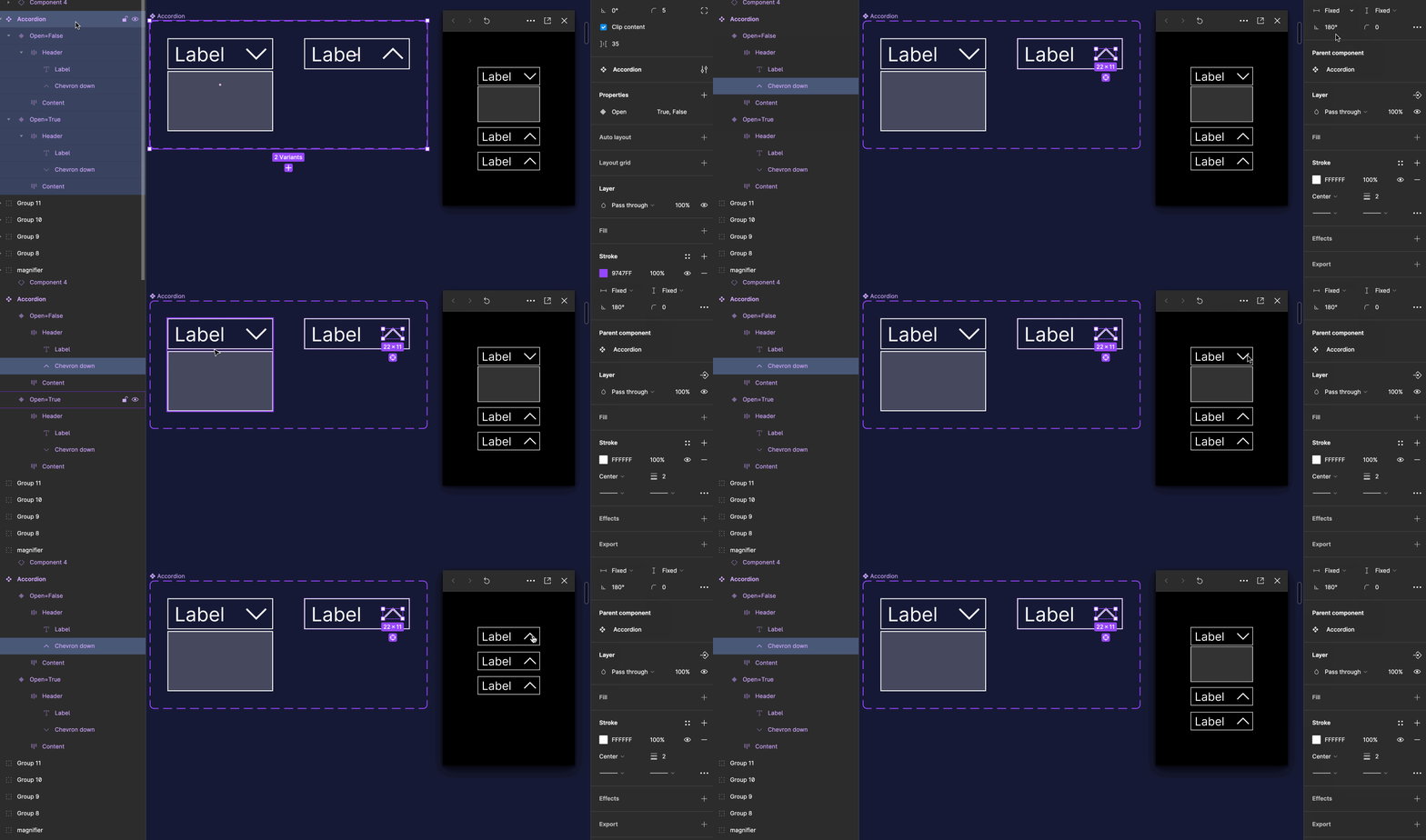
I can’t figure out why my chevron isn’t rotating in my accordion component when I play the prototype. The chevron arrow has a direction property (up, down, left, right). I’ve made sure that the vector is the only thing that’s rotating.


When I directly add an ‘on click → change to: {direction}’ interaction to the chevron icon, it behaves as expected. However, when the chevron icon is nested inside my Icon button-component, used in the accordion component, it doesn’t rotate.


Choosing the ‘Reset component state’ option in the prototype settings allows the chevron to rotate, but this also resets the content within the accordion.


What do I need to do to solve the problem?


I noticed Rotation is not included in variant properties so you will need to use 2 chevrons, 1 up 1 down. Hope this helps


I’ve now created two chevron icons (one with the vector rotated up and one rotated down), but it still doesn’t work. I’ve even tried naming them exactly the same. It feels like the problem is related to the fact that the icons are nested inside my Icon Button component. Do I need to create a completely new Icon Button that has two variants (up, down) for it to work? I would prefer to only have one Icon Button, but if it’s the only way to solve it I guess I need to.


Hey Jenny, my suggestion would be to remove the direction property from your chevron and instead handle them as separate components. This is important because for Figma’s smart animate to understand you want the chevron to rotate, it needs to see that the same component’s rotation angle is being altered. Swapping from a “chevron-down” to “chevron-up” variant (even if the variants themselves are using rotation) won’t get picked up.


My suggestion would be to use use a single instance and then rotate that instance. You can see in this GIF that I’m using “chevron down” and in the “closed” instance of my accordion it’s been rotated 180 degrees to face up. This gives me the rotating chevron animation.

accordion


If you’d like to take a closer look at that accordion component I set up, here’s view-access to the file I used. It comes with a link to a community-published version of the file in case you’d like to make a copy in your drafts, allowing you to edit and copy the solution for yourself. I hope this gets you the results you’re looking for! If not let me know, happy to further troubleshoot.


Thank you Alice! I have removed the direction property and created separate components for the chevrons. However the problem still persists in my Icon button component and I don’t understand why because the chevrons now rotate in my drop down component (just like you describe in the video above).


If I detach my Icon button component, the chevrons rotate. Can it be a nesting problem or and instance swap problem? In my drop down I use the icon component as it is, but in my Icon button the icons have an instance swap property.


You need to make sure that in both variants/states the component structure and the layer names are exactly the same, or they won’t animate. You should use the same instance of the chevron icon with the same name and inside the same frames/auto-layout structures in both closed and open states of the accordion, not one for up and one for down.


Perhaps I could take a look at your file? You can DM me here and I can give you my email address so you can send me an invite for view-access!


I have a hunch that @fernandolins_cs’s suggestion is the issue: you are using instances of two different components rather than two instances of the same component and rotating one OR your layer names are not consistent. For icon naming best practices, I recommend looking at this other thread.


I can share a link to my test file. I’m new to Figma so it’s probably something easy that I’m missing 😊


Hi again @AlicePackard! Have you had time to look at the file i pasted as a link? Let me know if the link doesn’t work.


@Jenny_B oh! sorry, i somehow missed your reply from Nov 27. I appreciate the nudge. Taking a look now 🙂 will reply again shortly


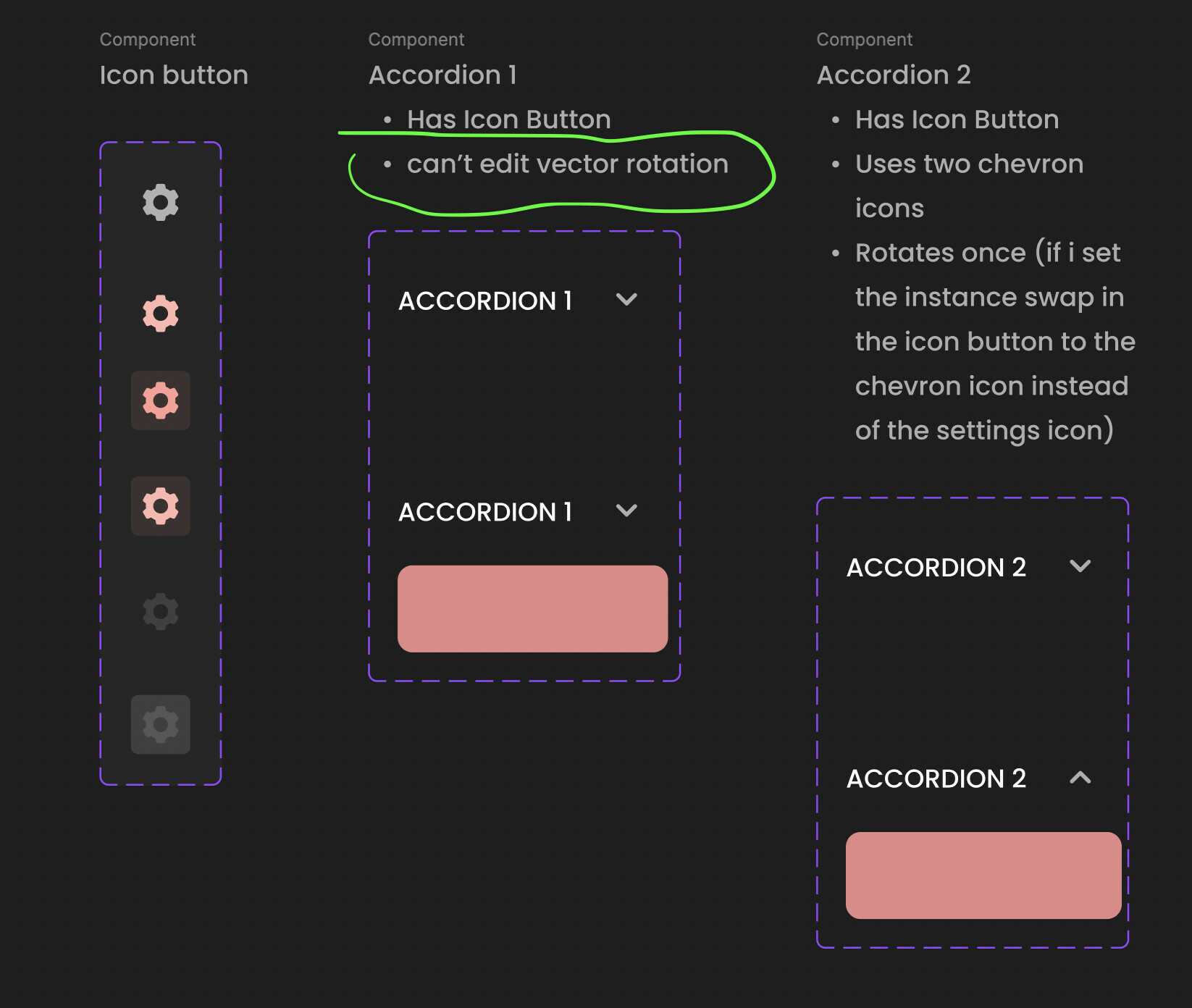
Aha! Okay I’m really grateful you shared the file because that helped me see the issue. Actually, you’ve already identified it yourself! Right here:


The issue lies with your ❖ Icon Button component. Since you can’t edit the rotation of nested layers, you’re not able to make the animation happen.


I’m a bit surprised to see an icon button within an accordion, but perhaps this is a developer requirement you have? I am more used to the entire top area of accordions (the part you click on to reveal the content) being using a <button> HTML tag. So having a button inside a button (as your structure suggests) seems like it could cause trouble… But you of course have more context than me! I should not try analyzing your layer architecture on assumptions from afar 🙏


In the event your current layer architecture and approach is the best for you and your team, I’d recommend a set up like this:


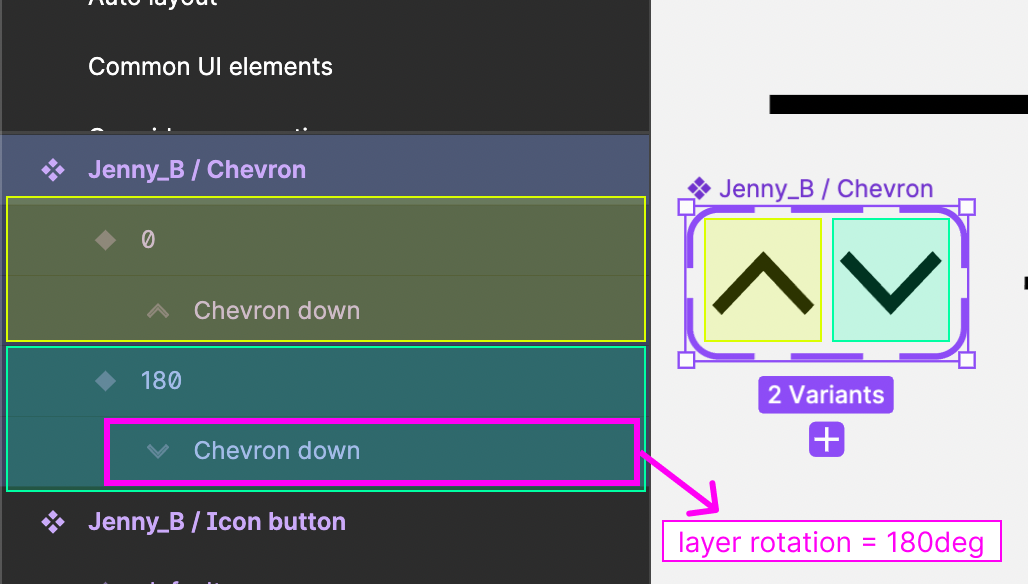
  1. A chevron with a single variant property called “rotation” with two values: 0, 180. The “180” variant is rotated on the container level, not the nested vector.


  2. This will allow you to use an instance of Icon Button inside the Accordion. You can swap your default icon for the chevron with the “rotation” property from step 1.


  3. On the open state of the Accordion, click through the layers until you have the chevron icon within the Icon Button instance selected and change the variant from 0 to 180
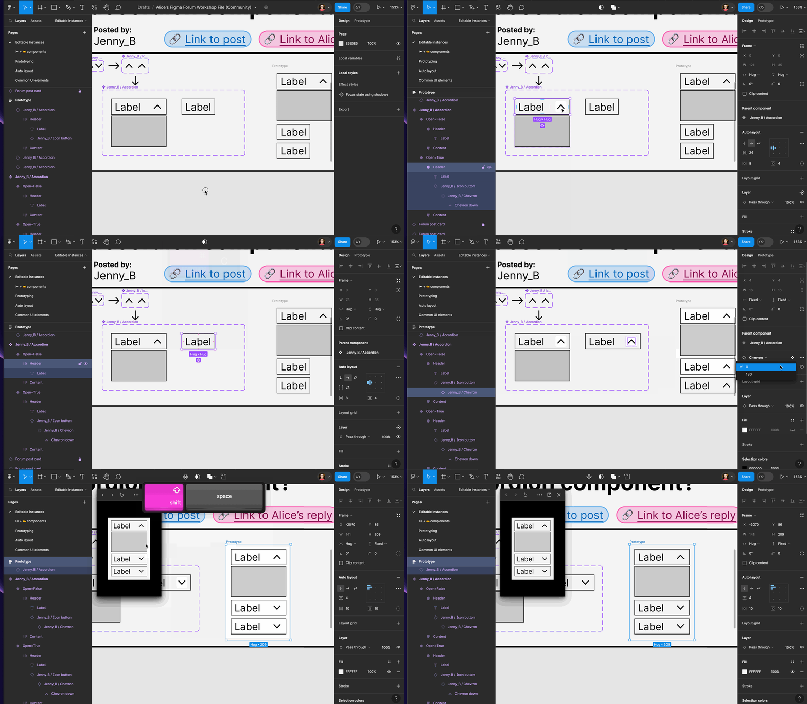
    accordion2


I’ve updated and re-published the community file that I used to create the examples above. I see in your file your ❖ Icon Button has addition layers named “container” and “state” (I’m very curious about these!)—this method should work even with those layers present. Just a bit more clicking/drilling down to do in step 3 😁


Thanks for your patience! I do hope this helps you get where you’re trying to go 🙏 let me know if not.

Thank you so much for your help! ❤️


We sometimes have a need to add clickable trailing elements to the top area of the accordion (before the chevron) and that’s why we don’t want the whole area to expand/close the accordion.


The Icon button component comes in more sizes than the one in the test file. So the container and the state-layer are there to help create the correct paddings that we need. The state layer contains the hover effect. The container could probably be removed (it’s just something that was inherited from an old component) 😊


More than happy to help!!


Thanks for staffing my curiosity about the icon button layers haha.


Reply