Question

How to center an "hug" group with icon+text in a component and make it react to padding?


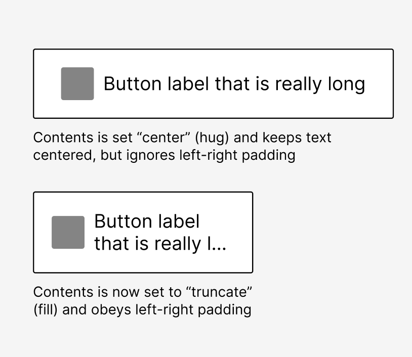
So I try to design a Snackbar component :

  • It’s supposed to have left and right padding
  • In the middle of the component there is an auto-layout group with an icon and a text.
  • The text and the label are “Hug”

Problem is when I resize the component the text don’t react to the padding since it is hug.
If I set the text as “fill”, the group will be aligned to the left of the component since the text will fill all the empty space.

What can I do ?

This topic has been closed for comments

3 replies

Nate_G
  • Power Member
  • 180 replies
  • January 31, 2024

Not sure if this helps, but a way around this for me is to create a button (or element) with 2 variants “center” and “truncate”. Then I can quickly toggle the layout from an button instance as needed.

  • Center: Set to “hug”, which keeps them centered, but ignores left-right padding
  • Truncate: Set to “fill” (with truncate turned on for text) and obey left-right padding

Get the File


Hello Nate, thank for your quick response !
So you confirm that theres is no solution that work for both case on ?
Indeed in that case, a truncate variant is the only solution (I wanted to avoid that because it is for a design system that won’t be used by myself)


Nate_G
  • Power Member
  • 180 replies
  • February 1, 2024

There may be some way to use min-max width, but I haven’t found a way yet to support both a hug/fill at the same time.


Cookie policy

We use cookies to enhance and personalize your experience. If you accept you agree to our full cookie policy. Learn more about our cookies.

 
Cookie settings