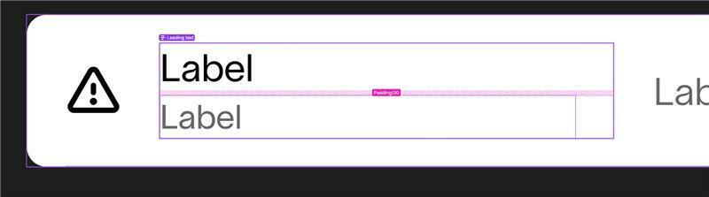
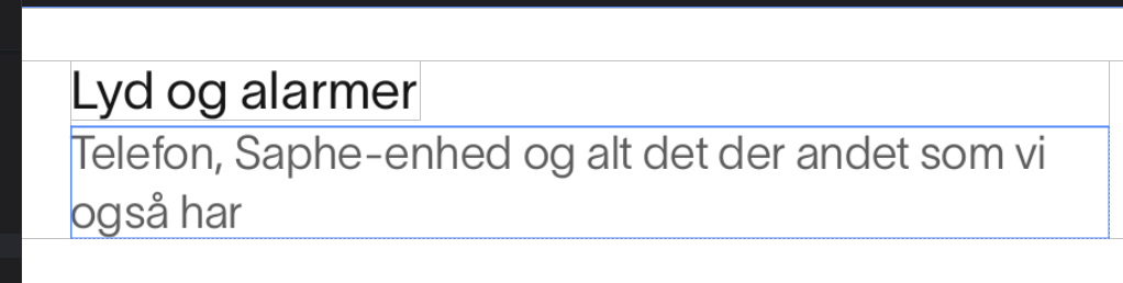
The top picture is from Figma and the bottom is from Android Studio. We also have same issue on iOS.
Is there a way to ensure that Figma is closer to how the font is rendered in the app? Right now we are going to have alot of issues with padding both between the text boxes and also top and bottom in general. We have tried to “Vertical trim” to “Set cap height to baseline”, but that does not work either because the descenders are not in the text frame.
Thank you :)