Solved

Descender and ascender are not aligned


Umut_Aydin1

Hi all,

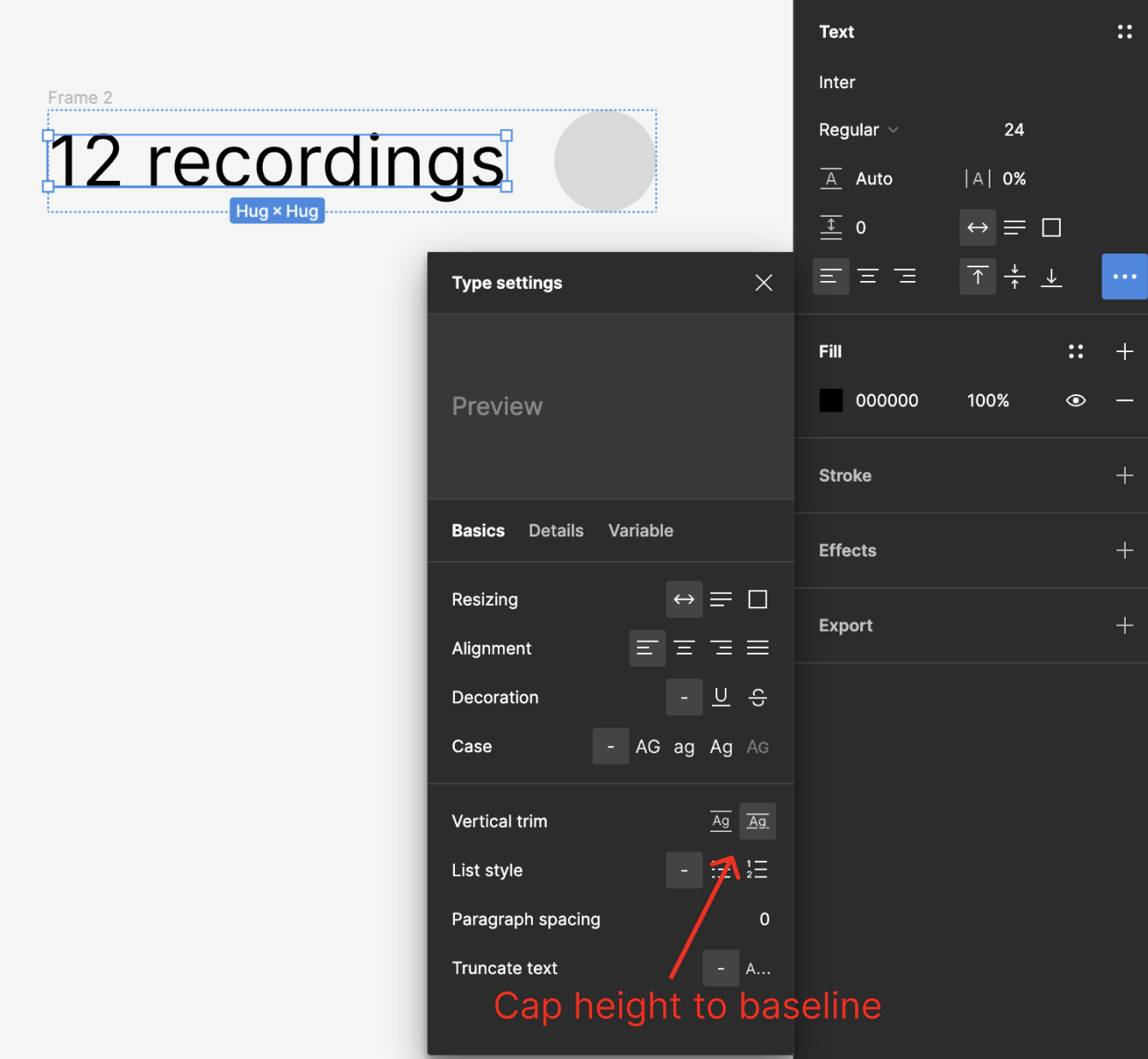
This has been an ongoing issue with our new Design system. The space that a descender in the type box is not aligned, which causes the icons look misaligned with the text. I tried everything even making the line height bigger but it just looks proportionally wrong.

I attached an example of what it looks like at the moment as you can see the spacing in ascenders is totally different to descender


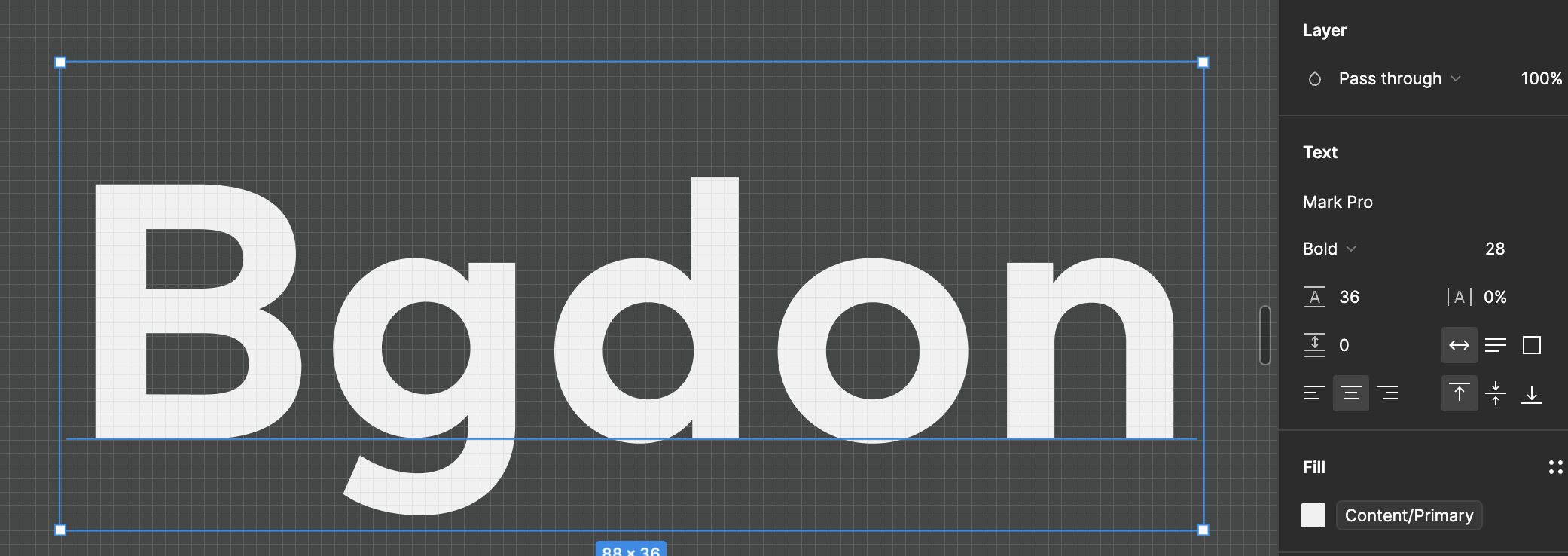
. Has anyone experienced something similar before

Best answer by Nate_G

You could try using “Vertical Trim” to cap the height to the baseline, to see if that helps.

View original
This topic has been closed for comments

3 replies

Umut_Aydin1

Here’s what the text looks like next to an icon… This has been doing my head in!


Nate_G
  • Power Member
  • 180 replies
  • Answer
  • October 13, 2023

You could try using “Vertical Trim” to cap the height to the baseline, to see if that helps.


Umut_Aydin1

I applied Auto height instead of a specific number it seems to fix it for now…


Cookie policy

We use cookies to enhance and personalize your experience. If you accept you agree to our full cookie policy. Learn more about our cookies.

 
Cookie settings