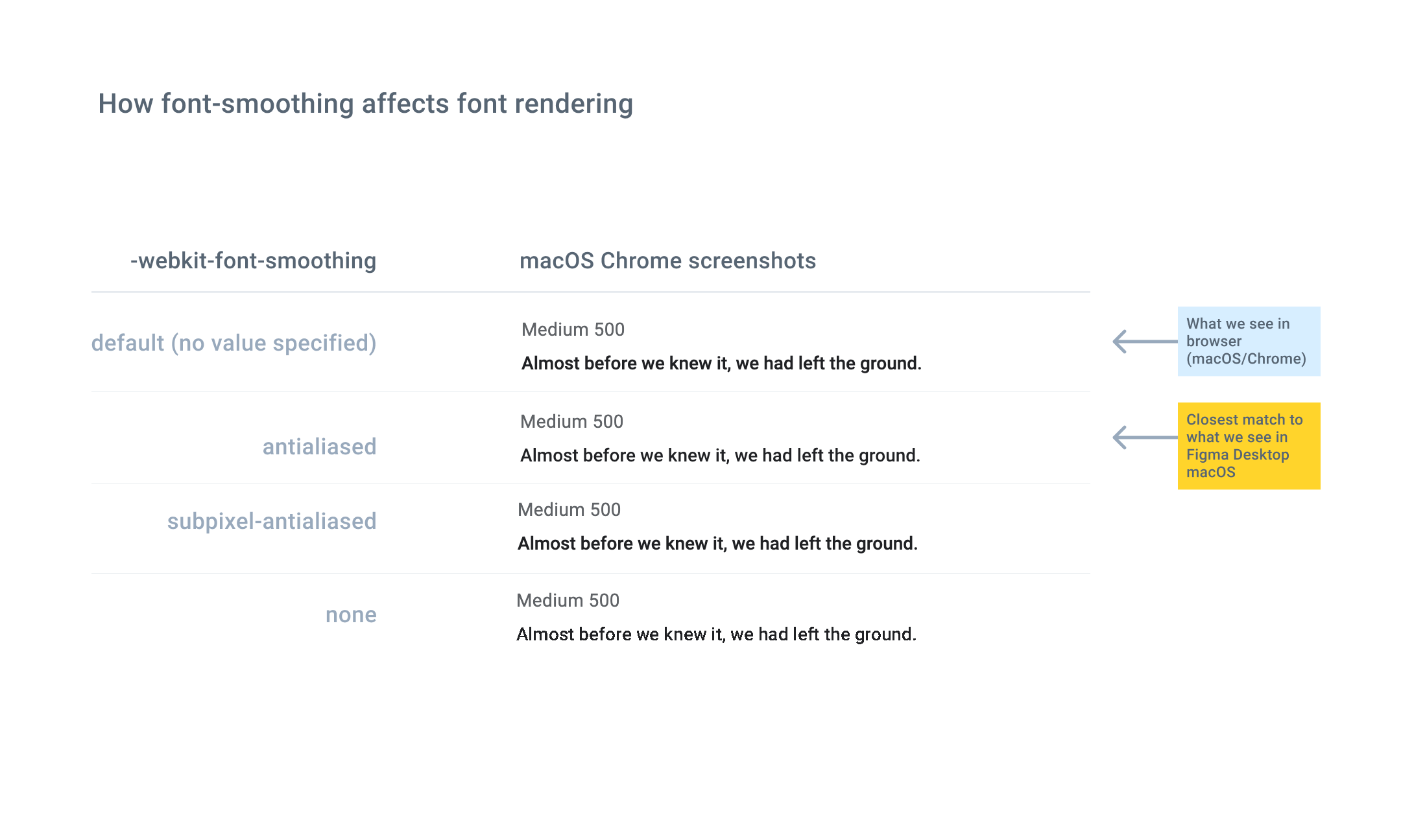
We’re seeing a difference in how font weights look in Figma, and how they appear in the browser. For example, 16px #000000 Roboto Medium (weight 500 in the Inspector) in Figma Desktop macOS optically looks similar to 16px #000000 Roboto Regular (weight 400) in macOS/Chrome or Safari.
In debugging this, we tried adding a CSS property, -webkit-font-smoothing, to the browser text, and noticed that setting the property to “antialiased” made the text look a bit lighter and more similar to Figma’s rendering. According to the CSS documentation, this setting disables subpixel rendering.
We know that the browser is not using a fallback weight.
Is there a straight-forward technical explanation of why the font in Figma looks different in the browser? For example, is it primarily related to differences in how Figma and various browsers/OSs implement font-smoothing?

