Hi Figma team,
I’m writing to share my initial thoughts on the new UI3 interface. While I appreciate this update’s fresh look and effort, the light and dark themes have some readability issues.
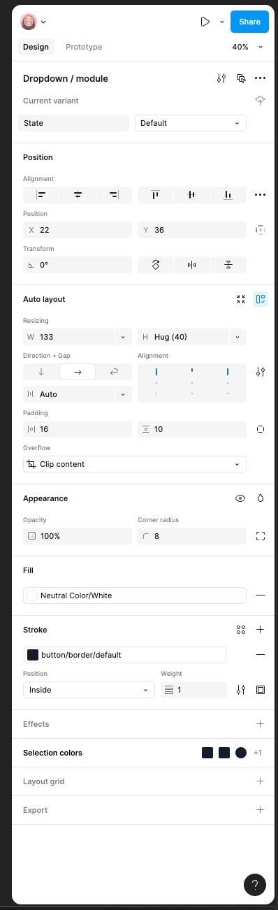
I find that the contrast between certain elements can be a bit challenging on the eyes, making it slightly difficult to distinguish different parts of the interface. For example, I find the text in the component panel to be a bit faint against the background color.
Perhaps a slight adjustment to the contrast levels could improve the overall reading experience. For example, increasing the font-weight or adding a subtle contrast to the background.
I believe that addressing this issue would make the UI3 even more user-friendly and enjoyable to work with.
Thank you for your time and consideration.
Best regards,
Ngân Võ