Hi there!


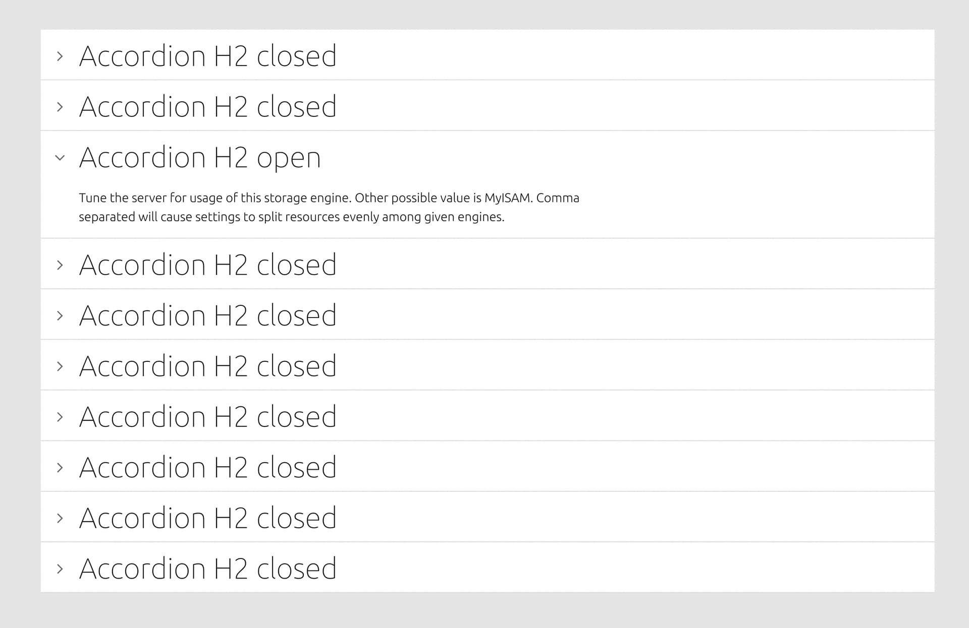
I am trying to create an accordion component made out of various variants representing each accordion row.


These accordion row items are used as instances for another accordion group component made out of 10 accordion item instances:


With auto layout and variants it is possible to customize state, and hierarchy of all these accordions easily.


HOWEVER, when an accordion is expanded/open, the content shown should be modular and can really be anything. It’s not something which can be restricted by a component (nor is it simple text, it can be images and checkboxes or other things as well).


Is it even possible to keep this system while allowing users of the design system to add content they need without detaching the components. I assume there is not so I am also curious what your recommendations are.


Thanks in advance!


Now the content section within the accordion can be any kind of content one want

Yes, there is a technique to pull this off - placeholder or slot components. We use it all the time throughout our design system. The best tutorial/description I know of is here: Placeholder Components β€” Editable components without detaching in Figma - YouTube


If you want to have default content available, but still let people put in their own content, you can extend the technique like this:


@Shane Thanks so much! This is indeed what I was looking for. After 4 years of Figma usage I learned something new: You can replace instances of an external component with an instance of a local component. So we can have a placeholder embedded in the design system, yet the content is a component which lives in the actual design file which fetches the external design system. That didn’t occur to me, for whatever reason I assumed you cannot swap instances from different component libraries.


This topic was automatically closed 30 days after the last reply. New replies are no longer allowed.