I have a design pattern I keep stumbling upon over and over where I have a certain component that is perfect for auto layout (or needs to support it) except that it has an element or two that are outside the column/row layout.
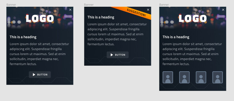
For example, take the three designs below for a generic banner:
Breaking it up I can see that the design can be divided into three areas. The top area, which is an image + logo or orange ribbon and a close icon. Then we have the content area which is the reason for AL - component needs to grow vertically as we have different amount of text in it. And lastly we have the bottom area which is either a button or a row of icons, and some zig-zac decorations.
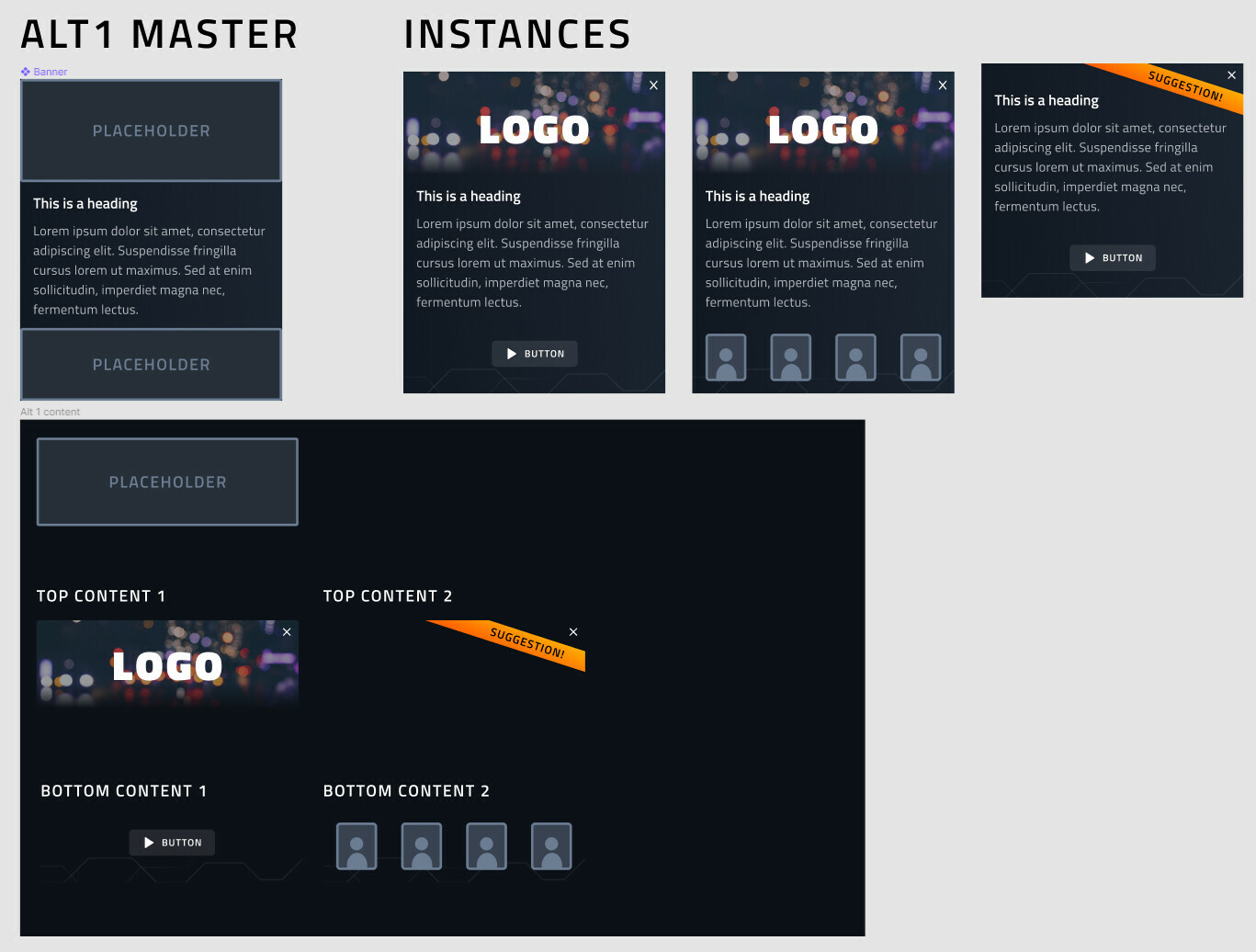
Since the three banners have a lot in common (same text padding, background, fonts, etc), I would rally like to avoid making three different components to upkeep, and wanted to ask if anyone has any idea on how to make a single component that is flexible enough to support all the designs. As I try keeping my components as flexible as possible, I came up with the below solutions, both build on the idea of having top and bottom areas as swappable blocks:
This kinda works, but the issue is that since close button, orange ribbon and the decorations at the bottom overlap other elements we have to hack them into right position through frame nesting, resizing and overflow. Further on if I need to change position of the close button or the bottom decoration, I have to do so in each of the “content” component, while logically they belong to main banner component so it’s a single controller for them. Also, on desktop I would have the banner content in a horisontal row (Image - text - CTA), so putting bottom decorations into the “bottom content” no longer works when they need to stretch over others horisontally.
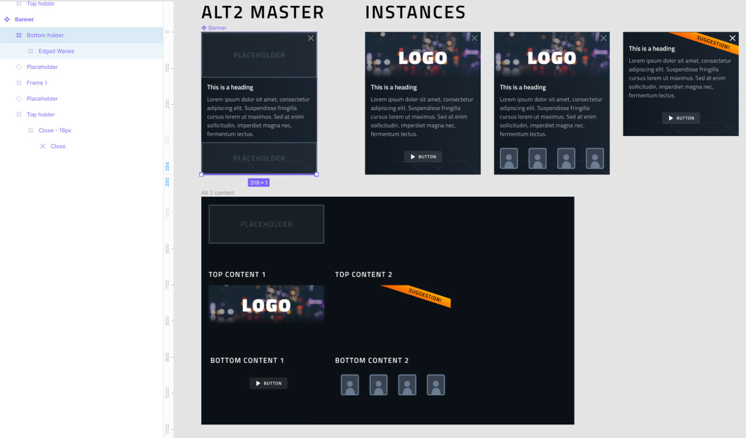
Taking a different approach, I tried getting around the overlapping by creating 1px high “holder” frames at top and bottom of the banner to hold the “decorations” that are positioned outside of them:
This almost works except that for some god forsaken reason Figma treats top objects in the layer list as being at the bottom of the Auto Layout order, so I am forced having my bottom holder with waves as the top layer, which in turn makes them appear on top of the content (buttons/avatars) due to layer visibility order instead of behind them.
So question, does anyone have any ideas or tricks how to structure such a component in a flexible enough way, other than swallowing the bitter pill and making 3?
Demo file: Figma


