Solved

Auto Layout Nested Design for Icons and Text


Naufal

Hello all,

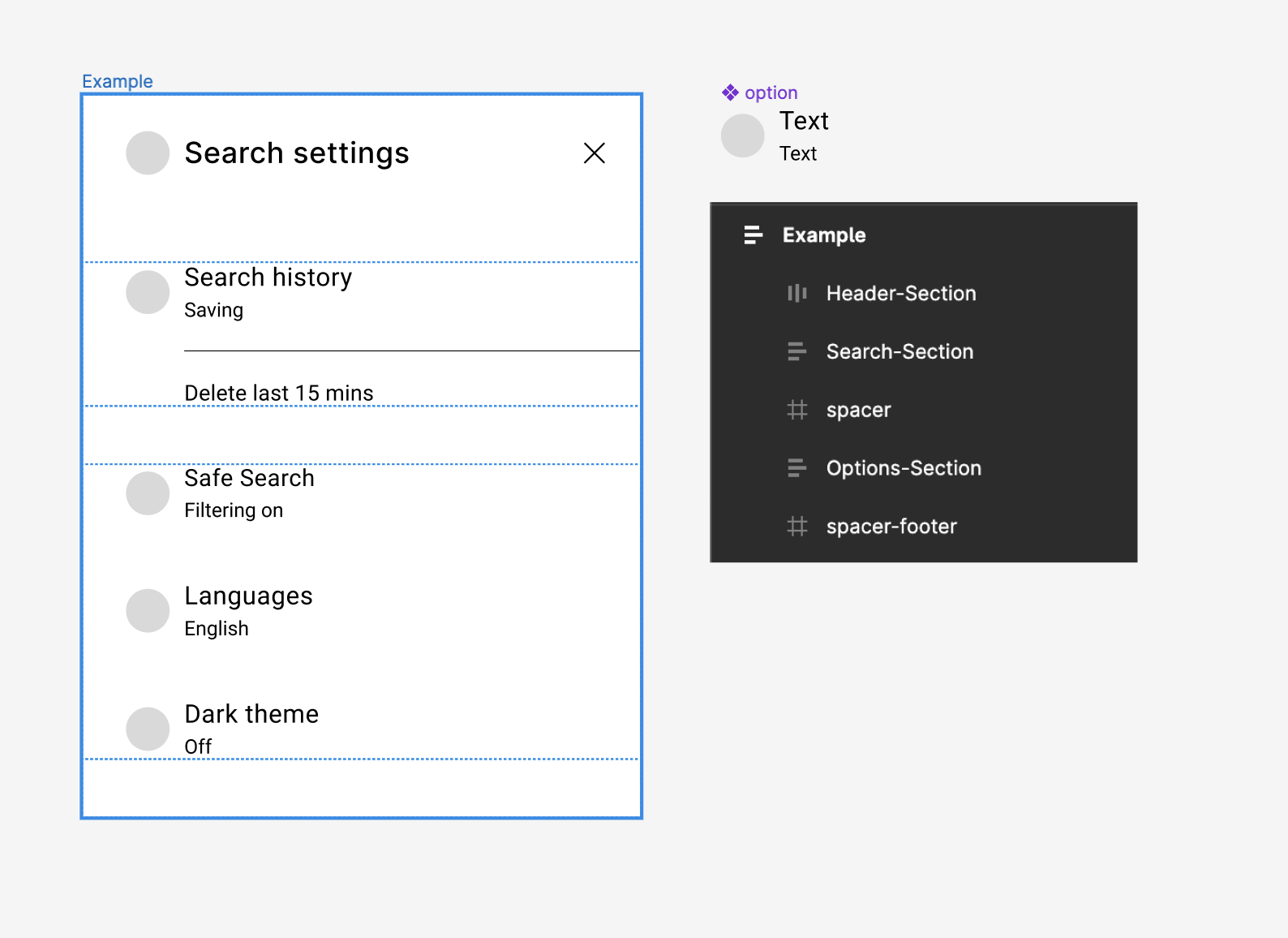
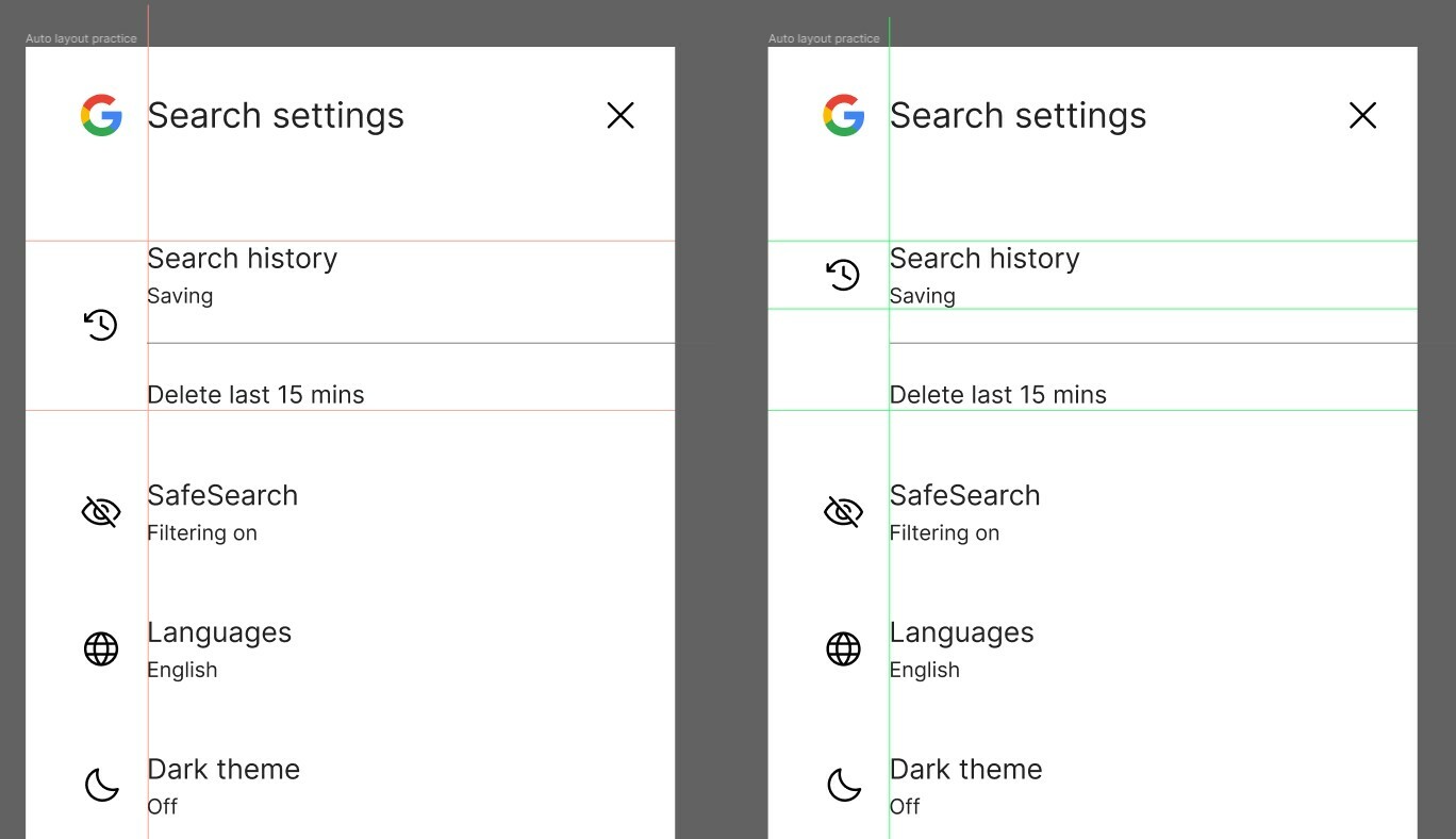
I’ll get straight to the point, how do you recreate this icon alignment here in Google settings using 1 nested Auto Layout group, or is it not possible without separating them? (Because that’s what I did to achieve the desired result) Though I was wondering if it is actually possible to do it with Auto Layout alone for future use.

Thank you

Best answer by Nate_G

You could use auto-layout to build the whole thing, but would need multiple auto-layout elements.

I put together a quick example where everything is using auto-layout and elements are positioned through spacing and padding. I also created an “option” component to be reused for the similar Icon+Text elements, that way I can just make tweaks to that component versus having to adjust each element separately.

View File

View original

4 replies

Pavel_Kiselev

You just need to give more negative space around regular icons. Let’s say G is 32px and the icon is 24, just wrap each icon with a frame, give it 4px padding on each side and now you have it


Naufal
  • Author
  • 5 replies
  • October 4, 2023

Sorry if I wasn’t clear, I meant I was looking for a way for the icon on the left to be aligned to the text “search history - saving” as shown on the right example, while the text “Search history” etc is also Auto-Layout grouped with the line divider and “Delete last 15 mins” text

Thanks


Nate_G
  • Power Member
  • 180 replies
  • Answer
  • October 4, 2023

You could use auto-layout to build the whole thing, but would need multiple auto-layout elements.

I put together a quick example where everything is using auto-layout and elements are positioned through spacing and padding. I also created an “option” component to be reused for the similar Icon+Text elements, that way I can just make tweaks to that component versus having to adjust each element separately.

View File


Naufal
  • Author
  • 5 replies
  • October 4, 2023

Thanks, seems like I was going about it the wrong way. Positioning it with padding was a nice touch.


Reply


Cookie policy

We use cookies to enhance and personalize your experience. If you accept you agree to our full cookie policy. Learn more about our cookies.

 
Cookie settings