Hello,
I’m generally pretty chill about product updates, and I understand that companies need to evolve and improve their features Figma included. But honestly, I think you're heading in the wrong direction when it comes to prioritisation.
Obviously, us the users don’t get insight into your development plans until changes are released. But I urge you to reconsider your product roadmap in terms of real, tangible benefits for designers.We’re the ones paying you after all…
The new UI3 update introduces several changes that just don’t align with fundamental design principles. Since the rise of tools like Photoshop in the 1990s, there has been an industry standard in layout alignments, UI iconography, and UX best practices. Disrupting these conventions for the sake of change feels counterproductive.
I understand the ambition to create the best possible software, but some of these decisions feel like change for change’s sake. With UI3, it genuinely feels like I’m driving in reverse, dealing with UX decisions that hinder usability rather than improve it.
Ok, now, the main reason I’m writing this…
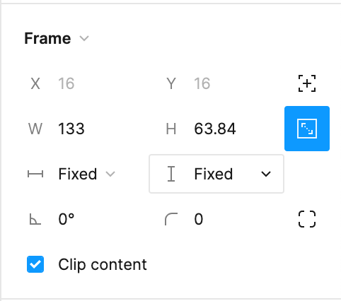
Once again, Figma is reinventing the wheel when there’s no need to. It feels as though product changes are being picked from a hat just to meet a release quota. Case in point: the recent update to the padlock/chain ‘locked ratio’ icon.
I received a signposting message saying something about the padlock/chain icon had been replaced with a square block containing aspect ratio details. Honestly I just dismissed it…
(For context: I refuse to use the new UI3 layout, so this is within the classic setup.)
Why was this changed?
It makes absolutely no sense. The padlock/chain icon is a universal standard in design software—it’s instantly recognisable and has been for years. In contrast, the new icon is typically associated with video media. Did no one stop to consider the impact of this change?
Now, instead of instinctively clicking the padlock/chain, I have to pause and search for this new, unfamiliar icon. It disrupts my workflow and slows me down. From a UX perspective, has anyone assessed this change in terms of cognitive load?
To make things worse, this new icon now sits alongside the border radius control, making quick identification even more confusing. A glance at the interface should make things clearer, not more convoluted.
Frankly, it’s baffling.
I know this feedback will likely fall on deaf ears within the all-seeing, all-knowing product team (if it even gets that far). But sometimes, the right call is to reverse a decision, no matter how difficult or disheartening it may be. With the rise of alternatives like Penpot, switching to a different design platform is becoming a far easier decision for teams than it used to be.
Please change the icon back or allow me to change it.