Question

Popovers/Overlays in interactive variants

  • February 22, 2022
  • 3 replies
  • 2133 views

Dave2

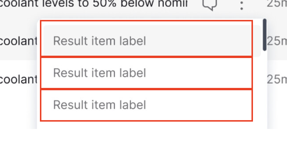
I have a ‘menu button’ component in my design system. Basically an icon that triggers a popover to show below it (a hidden layer being switched on).

I want to use this component within another component, task row item. But it seems like this is impossible because:

  • Figma continues to apply the hover state to elements behind my popover
  • I cannot use auto layout on the task list because it causes layering issues with the popover (popover opens behind the subsequent task row
  • If anyone wants to edit the contents of this popover menu, they have to know to manually open about 5 levels of hidden layers, make the changes, then close them again. This is not workable
  • I cannot use ‘open overlay’ as this does not work within interactive variants.

This feels like a common thing to want to do, am I missing something? Same logic for any form of overlay/popover/tooltip within an interactive variant. How are other designers supposed to know which hidden layers they have to find and edit in order to make changes to these overlays?

3 replies

Raph
  • 7 replies
  • June 2, 2022

I’m experiencing the same issue with a hover interaction on an interactive component behind the component I want to be interactive with. It makes interactive with the component impossible.


Joel14
  • 1 reply
  • November 6, 2022

Any solution for this would be appreciated as I am also having this exact problem.


AlicePackard

Hey @Dave2 (and @Raph and @Joel14 ) I might have a fix for you, but it uses an alternative set up. I re-created the necessary architecture of Dave’s designs to illustrate (thank you for those screenshots, very helpful!). I believe my solution gets at all the points you mentioned:

✅ Results menu is not hidden behind other task rows
✅ Allows Task row component to make use of auto layout
✅ Editing the contents of the popover results menu does not require deep-clicking

This solution boils down to not baking in the results menu of options into the Task row component. Instead, the prototyping happens within a designer’s local file. This means there’s a tiny bit more work required to set up this interaction, but that’s the tradeoff for maximum flexibility with content and also getting the benefits of auto layout in your library components. Here’s how I’d approach this:

  1. Remove the prototyping connection from your Task Row component in your library file.
  2. In you haven’t already, create a “results item” component to handle the default and hover states for these guys:
  3. You’ll also need a “Results card” that uses ✂️ placeholder component which designers can swap out for actual content (made up of instances of “results item”)

You could package instances of your Task row, Results item, and Results card component into a ⍂ Starter Kit component with instructions on how to set up prototyping connections in any local file. Those instructions would go like this:

  1. Detach and de-frame the Starter Kit component to reveal the layers contained within.
  2. Make the contained instance of Task Row into a local main component. Set the instance inside to “fill”, ensure the outer-most frame is also using auto-layout
  3. Create the result menu content using instances of the Result item component. Wrap these in an auto layout frame and make this a local component.
  4. Swap the placeholder within the instance of the Results card component for the newly made Results card content component.
  5. Establish a prototyping connection from the local Task row component’s 3 dot menu and have it open an overlay on the instance of the Results card (which is now populated with real content).

Designers can use instances of the local Task card component. I know this is quite a few steps, so I also recorded a 📼 video demo to explain. And I recognize this set up might not be ideal for every team. I just wanted to share an alternate in case it works for you, or at the very least inspires other ideas for how to handle these circumstances. If you want a closer look at the components I used in the video demo, I published the file in the community, so you can get a copy if you’d like.


Reply


Cookie policy

We use cookies to enhance and personalize your experience. If you accept you agree to our full cookie policy. Learn more about our cookies.

 
Cookie settings