Why does a font weight in Figma seem lighter than the same weight in the browser?

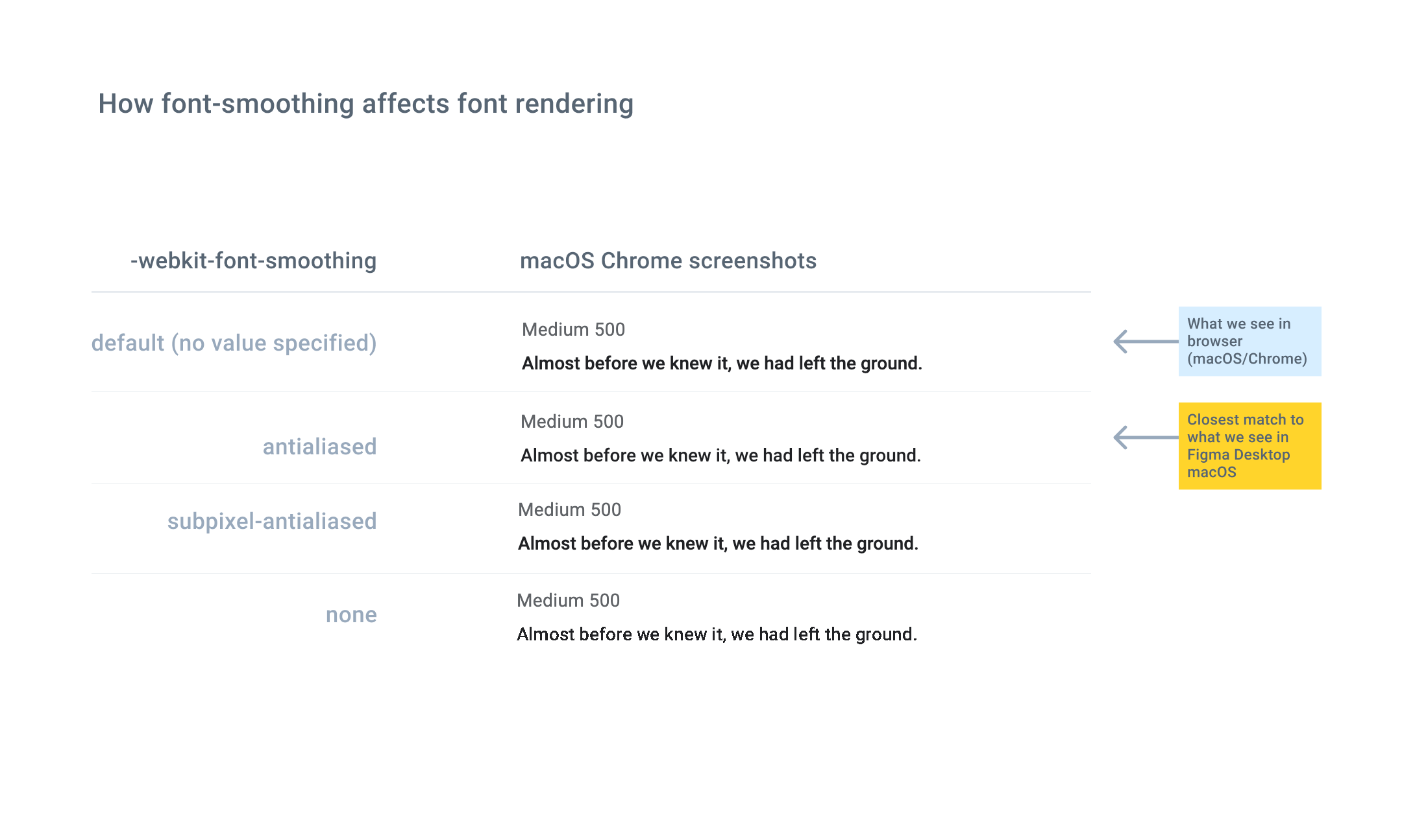
We’re seeing a difference in how font weights look in Figma, and how they appear in the browser. For example, 16px #000000 Roboto Medium (weight 500 in the Inspector) in Figma Desktop macOS optically looks similar to 16px #000000 Roboto Regular (weight 400) in macOS/Chrome or Safari.

In debugging this, we tried adding a CSS property, -webkit-font-smoothing, to the browser text, and noticed that setting the property to “antialiased” made the text look a bit lighter and more similar to Figma’s rendering. According to the CSS documentation, this setting disables subpixel rendering.

We know that the browser is not using a fallback weight.

Is there a straight-forward technical explanation of why the font in Figma looks different in the browser? For example, is it primarily related to differences in how Figma and various browsers/OSs implement font-smoothing?

5 Likes

TL;DR: it’s fine, don’t worry about it.

Why

Figma uses its own font rendering because each device renders fonts differently depending on the device, OS type and version, browser and its version, system settings, browser settings, display and maybe some other factors. Figma has to use one font rendering for all because it’s a collaborative tool with one source of truth.

What to do

It is the current reality of the web that fonts render differently for everyone. There is nothing you can do about it. Yes, your font differs from Figma, but it would also be different for every user who visits your website. You can even be thankful that you got noticeable difference from Figma because it’s a reminder that everyone will be seeing your website in a different way.

8 Likes