
I’ve built up a pretty extensive library for my project, with hundreds of components, being used in different design files.
This library was designed so far with only one theme in mind: a light one. We are now thinking of adding a dark theme to the project. I was wondering what the best approach would be to add a new theme to our library.
Currently, I’m thinking of renaming all current main components so they can’t be found in the other design files (by adding a dot in front of the component name), and then making two copies of that component (one for the light theme, and one for the dark) then and combine those as variants. See this example:
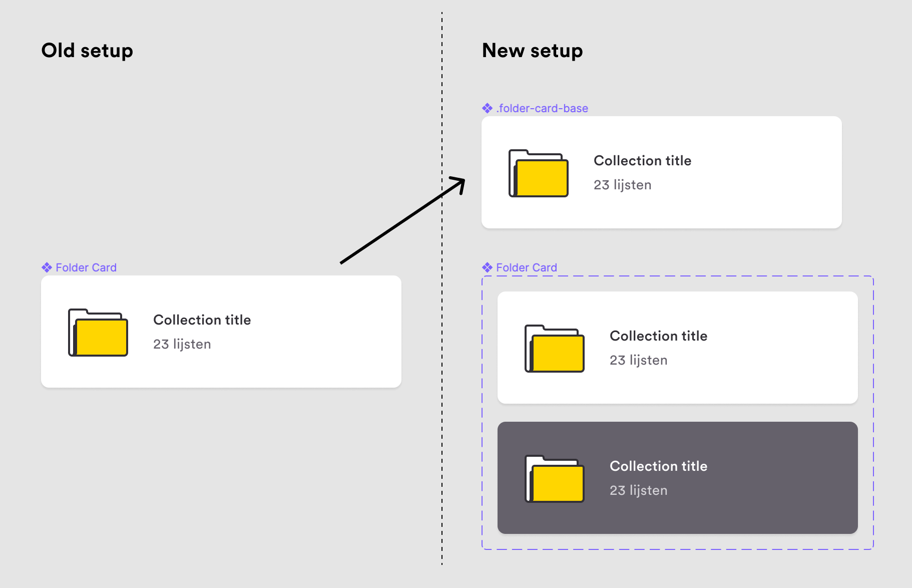
The upside is that the structure of both variants will be exactly the same, and you would be able to switch between the light and dark variant while keeping all overrides in the design files.
The downside is that it’s going to take a really long time to restructure all components in the library, and we would then also have to replace every ‘old’ component used in the design files with the newly created variants.
Before doing this, I would like to know if this would indeed be the best approach, or if there would be a better one. Thanks in advance.