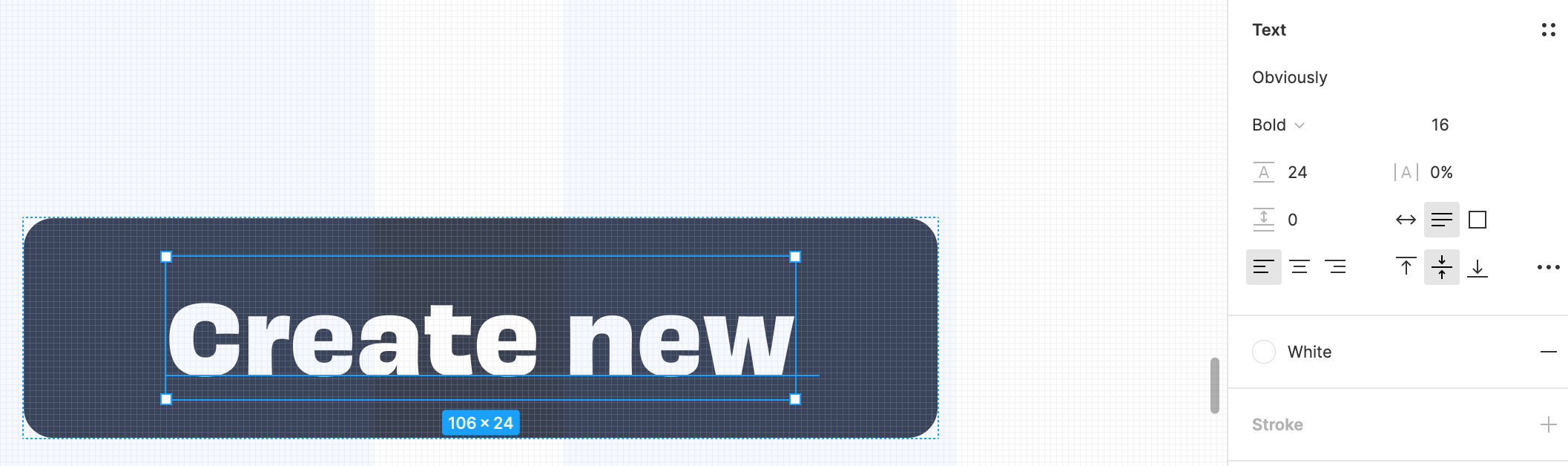
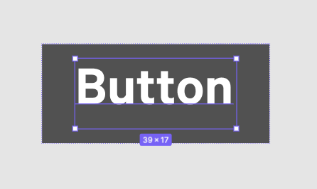
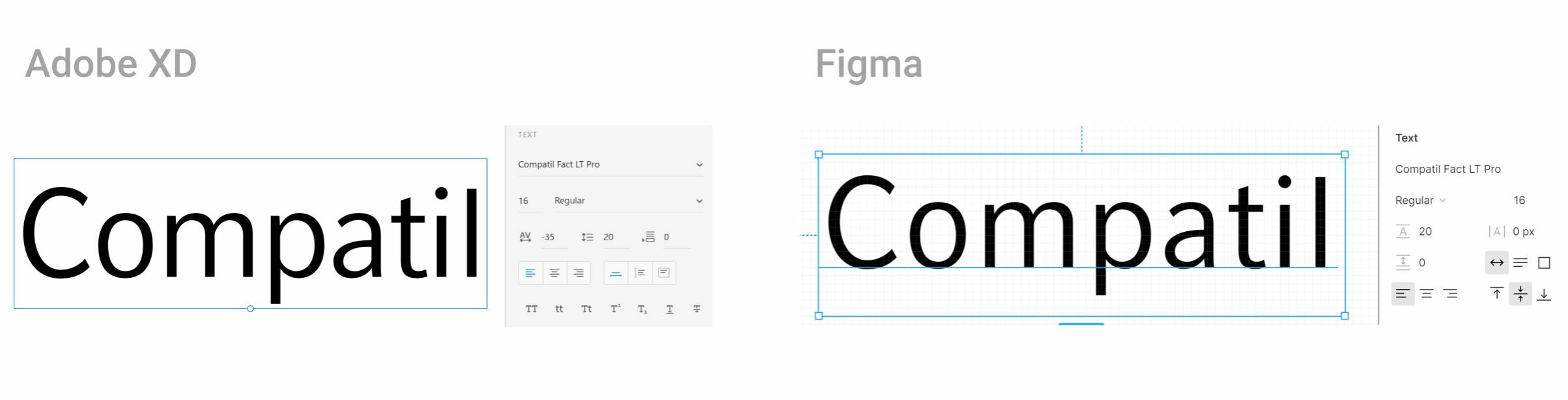
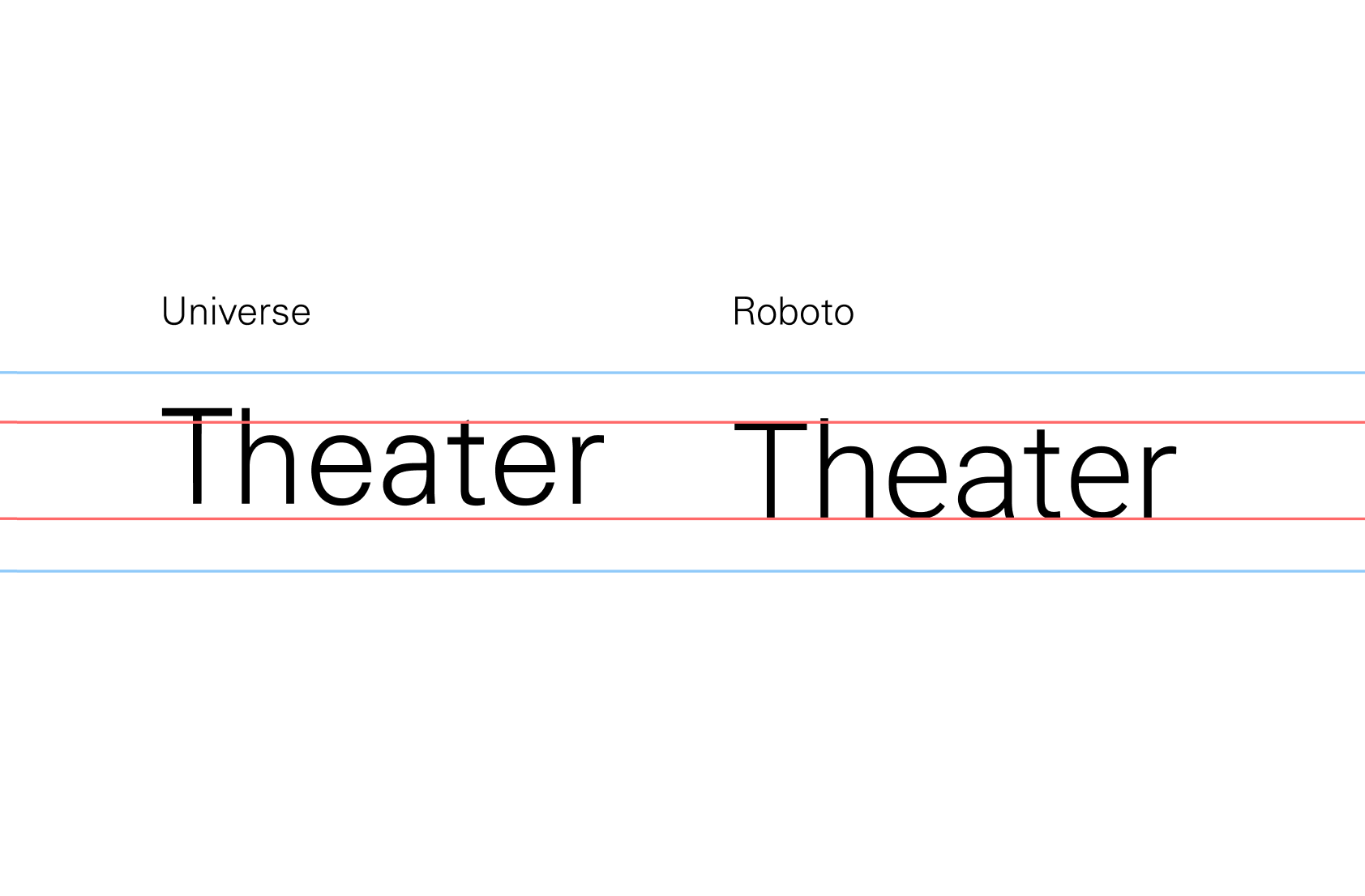
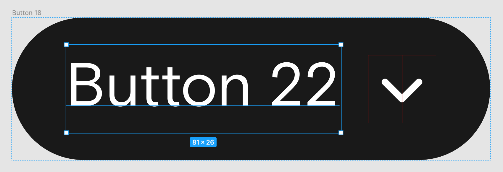
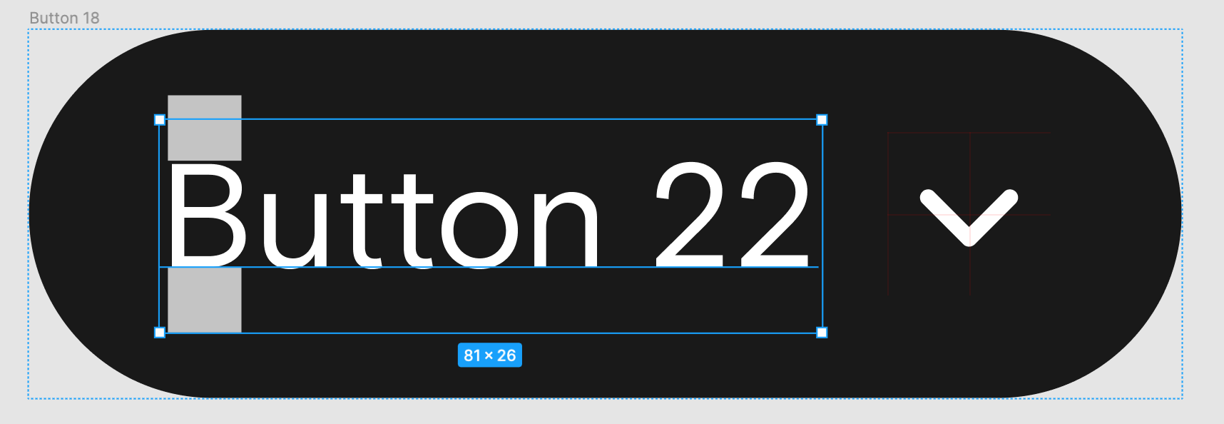
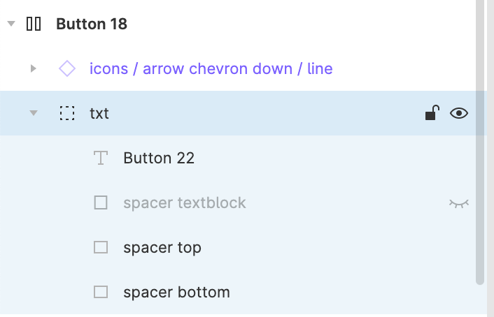
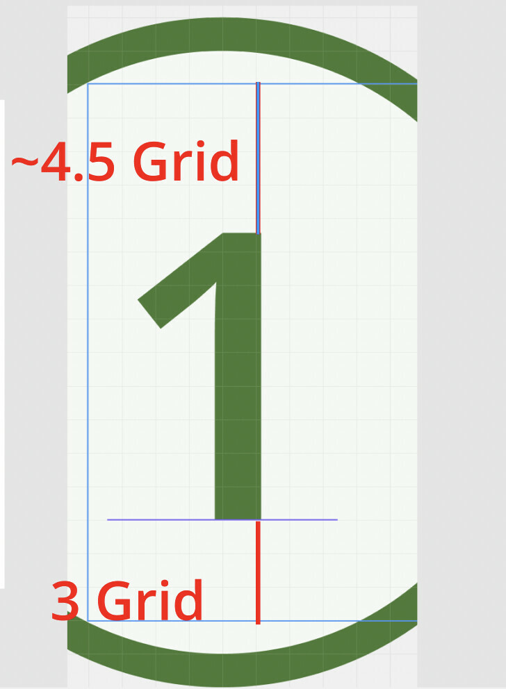
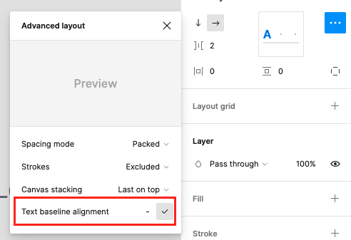
SOLVED: Align and style your text by trimming any extra spacing

I wish myself and you that figma will not turn out to be a ‘little adobe’, where you have to wait for bugs fixes for years, and during this time the corporation deals with ‘gadgets’ instead of improving the foundations of the software

4 Likes

@joshmillgate idea is a great fix but it’s better if Figma fix it by their own because I don’t want to corrupt files or create bugs when I collaborate with everyone with the font !

@Figma_Support

Any chance of an update on this? The prospect of trying to create a Design System with this inherent behaviour is… troubling. Due to inheritance across components, starting with an atom that is problematic is going to cause a serious headache.

I’m using “Helvetica LT Std” for a project and its driving me crazy . hopefully a fix will come soon

same issue , i just start using it now after 5 min stuck with this crap

Hi ! The last release resolve that problem:
Capture d’écran 2022-06-16 à 10.18.52

I hop it will help you :slight_smile:

3 Likes

Any updates on this @figma? What is the matter, that fonts (Helvetica Neue LT Std in my case) are not displayed correct? I tested in Adobe InDesign, and there the font has the right boxing.

We build our entire design system with this font and it would be crucial, to have it displayed properly.

Sadly, this doesn’t do anything with the Helvetica Neue LT Std. The problem stays the same, since Figma does not seem to recognize the correct bottom box line of the font.

1 Like

@Figma_Support

Hey,

Can we have any update on that? This is critical bug and it affects a lot of fonts…

Hey All,

Our team has investigated this issue, and it’s likely not a bug.

Figma uses the whole vertical size to position middle alignment, so if the glyphs of a certain font are unusually top/bottom aligned already, they’ll look strange.

This screenshot shows highlighting of the different text laid out in figma and a 3rd party tool. We can see that TTCommon is just very offset. It’s even more visible in the 3rd party tool where the redline indicates the bottom of the glyphs. You can clearly see how much space there is below.

example

1 Like

So you found one font that has the same problem in other software and you mark the thread as solved? Dvaliao have you read the whole thread where users give examples of fonts that work well elsewhere, but not in figma?

4 Likes

We understand your frustration, & we apologize that this is not an ideal outcome. But yes - I read the entire thread, & our team evaluated several different user files & fonts.

Again, because Figma uses the whole vertical size to position middle alignment, if the glyphs of a certain font are unusually top/bottom aligned already, they will look strange in Figma.

1 Like

Has anyone found a solution to this? I have a font I have to use for a client and it’s making my normal autolayout workflow for creating padding on buttons etc impossible and inaccurate. (This is using Nimbus Sans loaded through Adobe Fonts).

  1. Designer creates file in iOS
  2. I open file in Figma desktop app on PC
  3. I click into text field where text is perfectly aligned in the middle of the cell
  4. Text jumps to top of cell

Font = Overpass

1 Like

Since this is not an ideal outcome, are there any plans on the roadmap to solve this problem? Even popular system & open source fonts (Segoe UI, IBM Plex) have a baseline that sits well below (or above) the center of whole vertical size. Which makes it very cumbersome for designers to center align text with other elements and inside of elements.

All fonts should be accessible for use in Figma, not just the choice few that have a baseline which sits at or near center. My fingers are crossed for a swift and elegant solution because the problems generated by the concious choice to center by whole vertical size results in a solution that is very upstream to the values at Figma.

Thank you @dvaliao for addressing the community regarding this problem.

2 Likes

Just to note for anyone struggling with this as well,

I tried @joshmillgate 's workaround but was unsuccessful with FontForge even after following the video explicitly.

I then tried @Theo_Kekatos 's workaround by using Transfonter. This is a font converter with some neat settings. To achieve the workaround you have to set the “Fix vertical metrics” toggle to “On”. I then downloaded the converted files, installed them, restarted Figma, and it works. My font is now vertically aligned inside it’s bounding box.

Good luck everyone.

1 Like

Just adding in another request for this. We use Calibre across the entire app and this issue is wreaking havoc on our design system and forces us to use inconsistent padding. Doing the workaround with a frame on the text can cause issues when engineers inspect. We can’t easily convert our app so I would really like to see this fixed in Figma.

1 Like

Jumping on this topic. Agree with everyone that this is a very frustrating issue. Why am I only noticing this font display problem lately? If I recall, it wasn’t always this way in Figma?

I am fairly certain this is “new” behavior. I am designing a card game in Figma, but haven’t worked on it actively for more than a year, before recently picking it up again. All of my card templates are now broken. They look OK until I click a text box to edit the content, and then the font resizes and screws up the padding of the elements. I am using the Overpass font too, as someone else in this thread is doing.

1 Like

Bro, thank you! :heart: