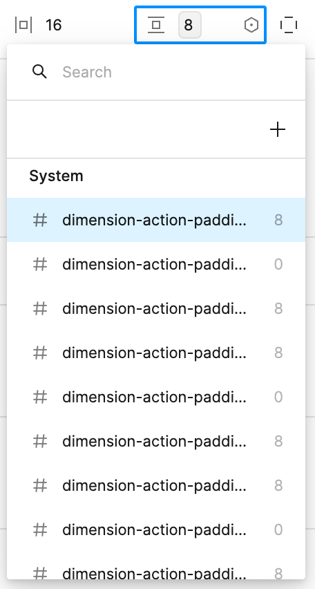
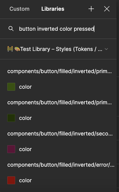
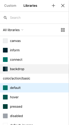
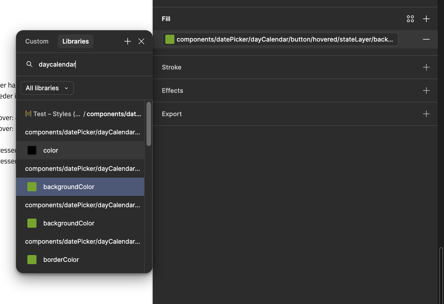
When I click into an input field eg. auto-layout/vertical spacing I cannot differentiate the variable names in the list because the window is not rescalable. See image.
I fully agree. We always need to be able to see the full names of our variables and modes.
I’m at the point with several variable sets where I’m trying to decide the least terrible way to shorten the names of variables, just so we can tell them apart in selection menus in the Figma interface. Parts of words are bad, while acronyms and single letters are tied for worst. We shouldn’t even be considering this.
I’m using the desktop app. When I list the variables to assign one to a property in the right panel in design mode, there is a problem to see the variable names. If the variable name is long, and/or the default value is long, it is really hard to guess what is what.
Unfortunately when hovering over the variable name do not show me the full text.
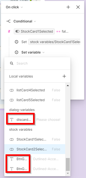
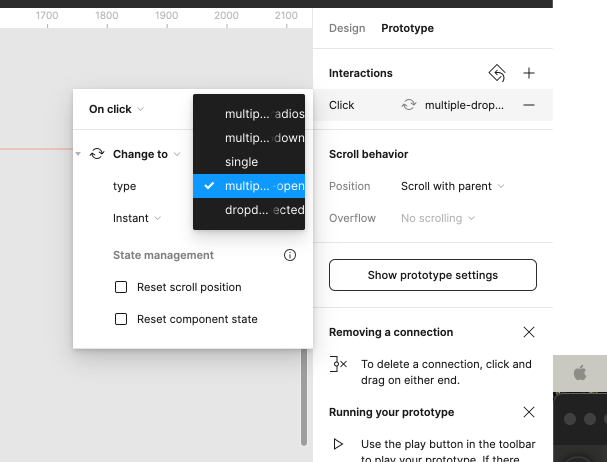
Same issue, when using variables in the prototype interactions. For example using the Set variable action. In the drop-down, you can not see the variable names well.
This comes back to the issue with the entire right panel being fixed-width, but having much more features in it now. The same truncation issue comes up with component variant property names and their values.
I don’t know why the left side panel with layers is flexible in size. But every panel or menu on the right side is fixed in size, cutting things off. I’m stumbling upon this issue regularly and find it really annoying.
With the latest Figma update, the right side panel can now be adjusted in its width. Which is nice It would still be great, if the width could be increased even further. Long component token names are still being cropped.
But worse: The window for searching variables (screenshot left side) is by far too small. The part of the token name, which differentiates the tokens from another, is being cropped. It’s a guessing game which component token to pick.
Please Figma, improve the search for long variable names.