
UI3 Feedback


linh_nguyen3

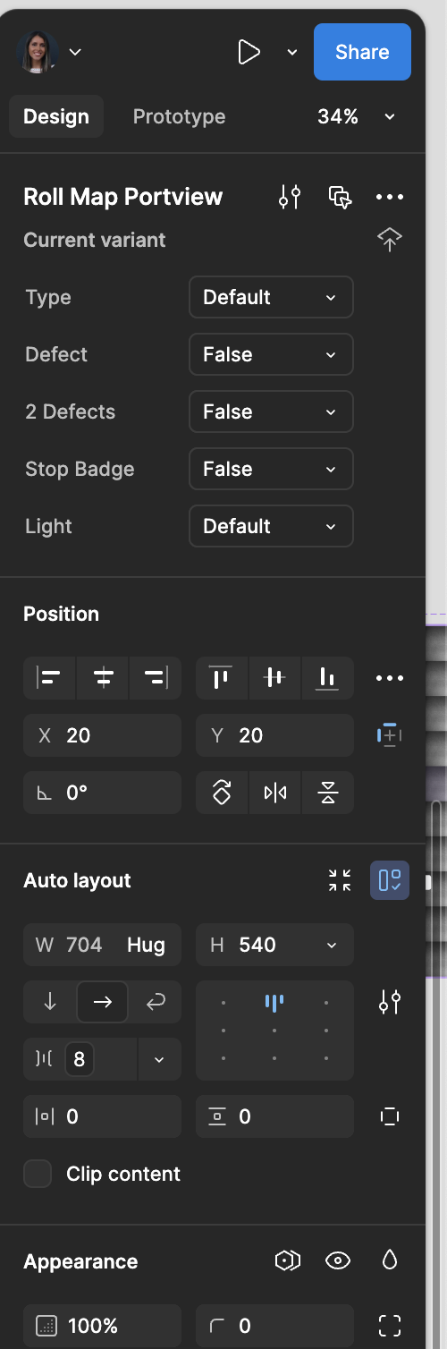
Component properties section
I find that the component controls are too high on the right-side panel, it makes the distance between designing and changing properties too far. It would be great to place this more in the center like it was before or allow us to rearrange the right bar to follow the order that works best for our workflow.

Bottom actions and assets
Why does this stay open after you drag the component you want onto screen? So annoying I always have to hit esc each time I drag what I want onto the screen. This wouldn’t be as big of a deal if it wasn’t directly covering where I’m working.

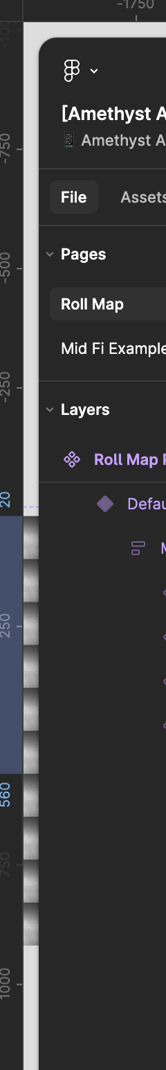
Layers panel - long names
This was an issue before but when there are many nested layers and the panel isn’t wide, you can’t view what layer you’re on. Might be nice to introduce a horizontal scroll.

Thank you for bringing the clip content checkbox back! Looking forward to the fill/hug updates too.

This topic has been closed for replies.

3 replies

djv
Figmate
  • Community Support
  • 4803 replies
  • August 14, 2024

A post was merged into an existing topic: UI3 – Feedback – Call me oldschool, but


djv
Figmate
  • Community Support
  • 4803 replies
  • August 14, 2024

Hey @linh_nguyen3, thanks for your feedback!

We’ve merged it with an existing UI3 feedback topic here in the community:


Joana_Anjo
  • 3 replies
  • September 20, 2024

I loved the new button to minimize tool bar, makes total sense! 🙂 But can’t see the need of having a floating toolbar. Feel it steals space from the center with no need and also looks visually confusing 😕 Right toolbar’s


spacing arrangement is also feeling overwhelming.

Overall i like the new UI, but just suggesting some adjustments 🙂


Cookie policy

We use cookies to enhance and personalize your experience. If you accept you agree to our full cookie policy. Learn more about our cookies.

 
Cookie settings