This year I am learning Figma as I’ve been unable to get work with my UX-research+physical product portfolio. The industry wants UX*/UI designers. * User-retention > user experience
I gave up on XD back in 2018 because it couldn’t do basic things that most apps can do.
I Once again find myself greatly discouraged due to not being able to do a few key things that all apps have/can do:
-
Automatically add dominant/ever present OS-Status & Nav bar
-
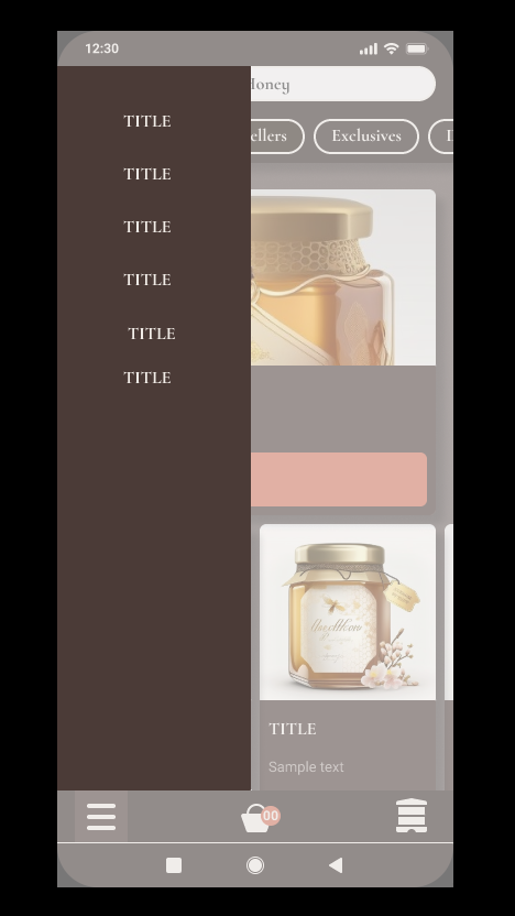
Overlays that don’t blur Status/NAV BAR when using the “add background behind overlay” feature.
-
Opacity on content in overlays. passthrough and aplha don’t work on shapes, just on an outer-frame/component level which defeats the purpose.
-
The “add background behind overlay” feature covers EVERYTHING, including my DIY status/nav bar. Overlays can’t be part of the same frame as what it’s covering and thus it doesn’t respect the hierarchy.
Why do Figma designers design apps without the OS nav/status bars? instructors omit it in courses and YouTubers omit it in tutorials. But it’s always there in real apps regardless of phone or OS. it’s as integral as a steering wheel and dashboard in a car.
Hope someone can enlighten me on industry standards, as I find it difficult to find solutions when there are more casual users than designers. Democratized design is my jam, but it often amplifies the voices of people who assert themself rather than the reclusive experts.
given that I can’t post more than 1 media file, I’ll had to choose the scenario that blurs out my nav/status bars despite the overlay component being scaled to fit between the two.
I hope people can test out how Opacity, passthrough and background blur doesn’t work with overlays themselves.