Toggle Browser Overlays

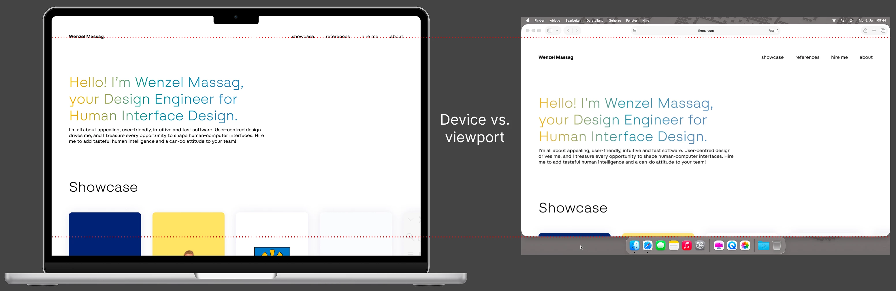
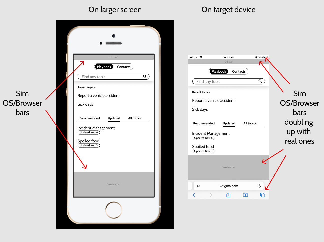
  1. I’m building a web app. The issue I have is that the mobile frame options in Figma don’t include the header and footer that browsers have. So when you preview your work, it looks like a native app, not how you’d actually see it when browsing the web on a phone.

I know I can manually add this as a header and footer for every frame for every page of the site I’m designing, but it’s kind of a pain.

Real mobile browsing includes these headers and footers of the browser.
2.

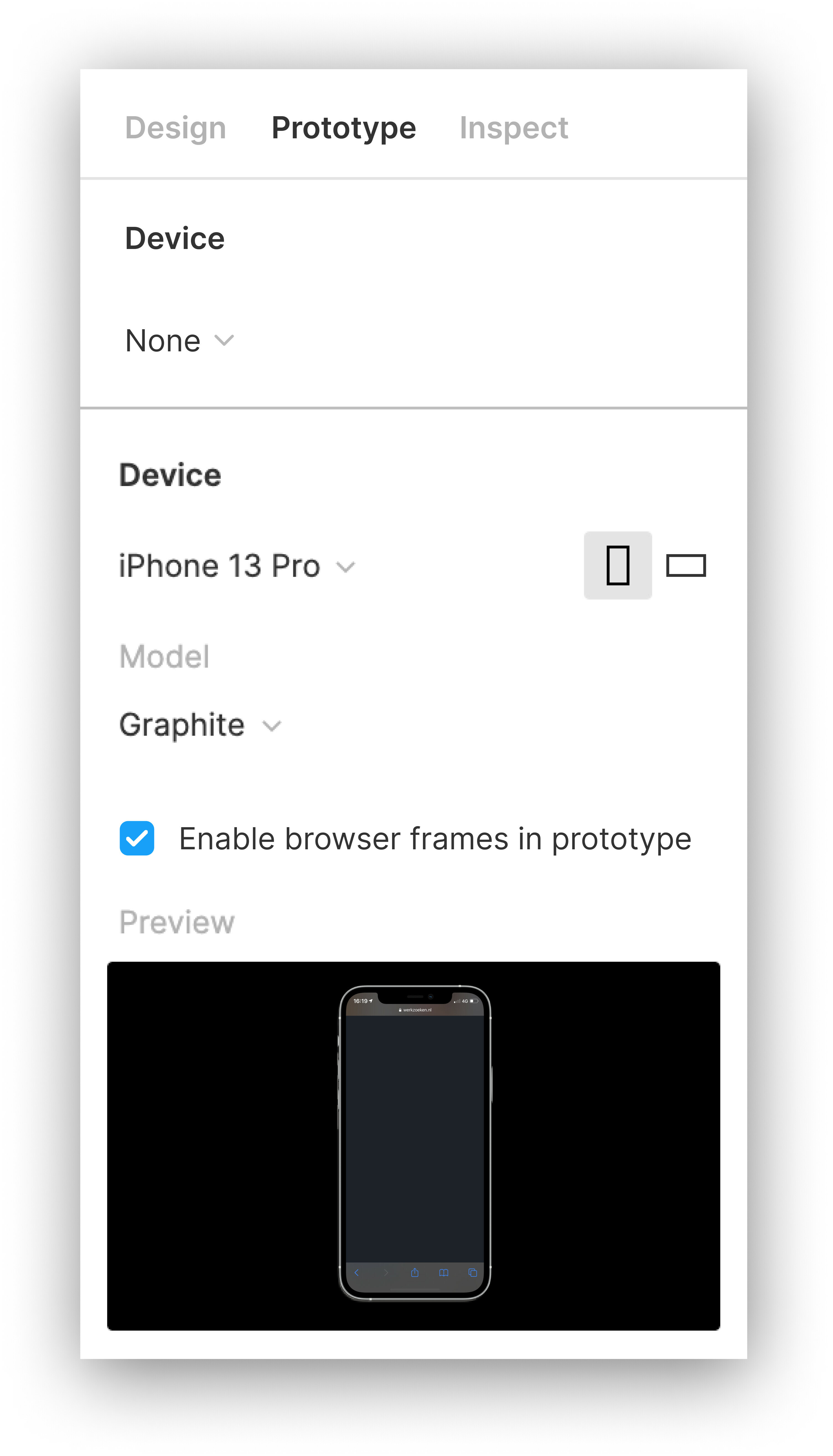
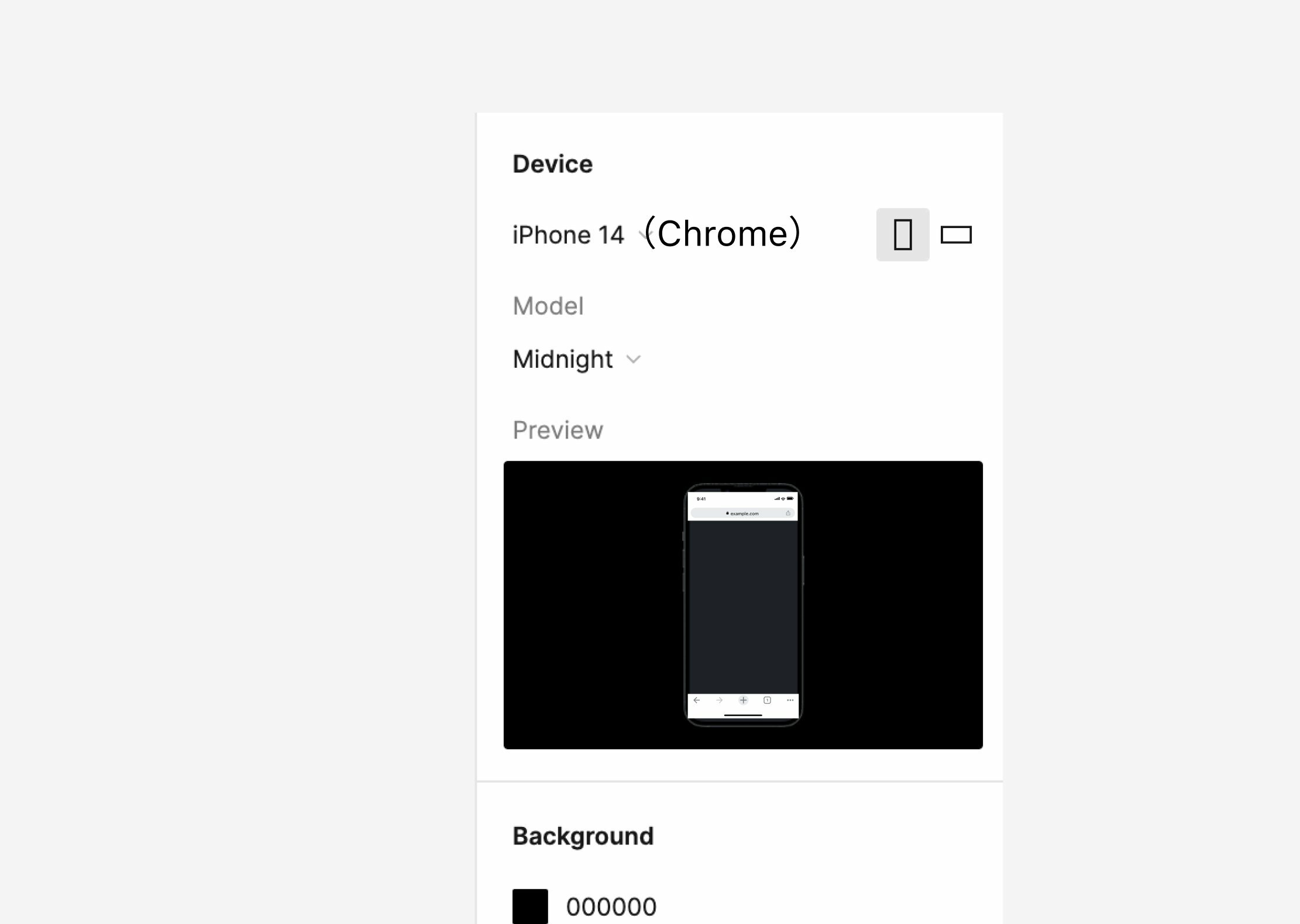
3: Would like to see an option to turn on this kind of overlay for frames, so I can easily design for mobile browsing, and not just for native apps.

4 Likes

This topic was automatically closed 30 days after the last reply. New replies are no longer allowed.

Lately, I have been designing and prototyping mobile websites and applications. A dominant problem I run into is that I need to add browsers frames to my design frames whenever I design for mobile websites to provide the proper context.

This workaround works quite well for previewing the prototype in prototype mode, but whenever I want to walk through designs in design mode, the frames are lying on top of the content of the page, which needs to be reviewed.

An excellent solution would be a toggle in the prototype mode to add or remove browsers frames. iOS designers would have Safari, Andriod has Chrome, etc.

By allowing users to toggle only for prototype use, the actual (needed) content within design mode can be more easily reviewed and is always accessible.

8 Likes

When I use protype in the phone I always had to add a design of the browser in my UI to make it more real. For a solution I suggest to add a checkbox in the prototype section that said “Add Browser to your prototype”

Does anyone else experience this? Is anyone using a plugin or workaround to help solve this?

5 Likes

When working on mobile web design, the design team has to consider how Safari or Chrome’s interface will go around the UI we’re designing. If the website design is left unaltered, the curved shape of most smartphone displays crops the interface. This can be especially annoying when accounting for things like the iOS home indicator.

We’d like for Figma to have an option in the prototype settings to indicate whether the design is a native app or a website. If it’s a website, we’d like to have some basic settings like which browser is being used and whether the OS is set to dark mode or not.

If the prototype is set to be a website, the design would appear in the prototype with the browser and OS interface.

This would also allow us to preview the same prototype on our phone or on desktop without having to add or remove the browser interface from the designs to accurately reflect how the designs will appear to customers.

4 Likes

I’d really appreciate it if Figma prototyping would support simulated OS and Browser chrome when viewing for smaller screens and devices.

Full screen is great for games but apps show the OS chrome and web apps show OS and Browser chrome until scrolling. Not depicting that leads both designers and stakeholders astray, thinking they have more screen real estate than they really do.

There’s currently no way to simulate web apps well between the target device AND a larger screen. If I include them for viewing on larger screens, then they double up with the real ones on target devices. If I don’t include them to display correctly on target devices, the larger screens depict more room than will really be shown on the target devices.

The example I’m showing here is for an iPhone but the same thing applies for Android, Windows, Mac, and Linux.

Does anyone have a work around for this?

The only things I could think of so far are 1) knowing that people will only either use one device or the other, or 2) duplicating your whole design into with and without versions.

3 Likes

I am having the same issue. This is a huge oversight and massively limits mobile prototyping!

2 Likes

Can I use a browser as the prototype device in presentation instead of the Macbooks? I think those mockups occupy too much of the screen size and a browser mockup would be more clean and efficient.

1 Like

Any updates on this? Looks like Figma assumes everyone builds for native mobile apps only. You can view your prototype in an actual browser on a mobile device, but Figma adds a very annoying black header with button to open it in the native Figma app. If only you could hide that bar, it would go a long way to deal with things like phone notches.

1 Like

Figma, please make this happen, it’s been a pain for me to simulate the browser with layers on every single frame, which I have more than 100 frames to work on…

2 Likes

Yes please Figma, add this!!

1 Like

I really hope there can me forward movement on this. It’s a pretty big gap for prototyping.

2 Likes

Many of us are building for both mobile web and mobile app. Please make this happen.


Like this