Text size vs text height

Dear community,

Novice designer here getting better at spacings, placements, alignment, proximity etc.

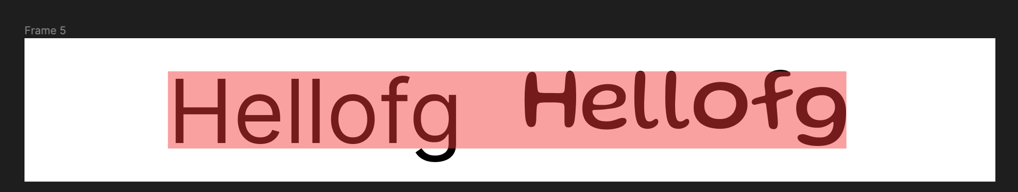
What I’m currently struggling is the height of text. Using 8px grid system I’ve started with creating top bar. My idea was: font-size: 16, top and bottom padding 24px, so the whole top bar gets 16+24+24=64px. However, text (with size of 16) seems to have 11px height, so the container is 59px tall.

Any ideas of how the text sizes are related to height in pixels and how to put that all together, so I can apply 8px rule to every container, every space and every piece of text?

Thank you in advance,
B.

Hello,
Different fonts won’t have the same line-height (image below 2 different fonts at 16px)

If you want your font line height to match the font size, you should set the line-height value to 100%

but the best solution would be to fix your top bar height, use autolayout and center vertically your elements :slight_smile:

I would go for this type scale in my design (size/height):

12/16
14/20
16/24
18/28
20/32

… and so on

So 16px font size to have 24px height. And with these magic numbers you wouldn’t have to worry about weird element sizes again

Thanks for your replies, that clraifies a lot to me :smile:

(Screenshot) When specific text has to have exact 24px vertical distance after previous and before next elements (to create proximity) is this how you would align the red square (24x24) to make sure the spacing is not 23 or 25 ?

If we align the red square to the top edge of line height (which in most cases is higher than the text itself), it will result in nice 24px spacing from the edge of LINE HEIGHT, but somewhere around 27 or so from the TEXT top edge. My goal is to space the elements very precisely.

Personnaly, I would :

  • Set the text in a frame with autolayout
  • A 24padding top & bottom to the frame