
So this is what I have:
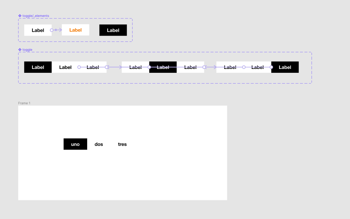
- A Toggle element variant with states for enabled, hover, and active states. I set the interaction on the enabled state to change to the hover state while hovering.
- A toggle variant with 3 tabs and one variant for each one (because I need them to be mutually exclusive). I set the interaction on each tab to change to the corresponding tab on click.
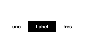
When I place the component on a frame and change the text inside of each tab, it behaves well. Also when I switch the variants the text overrides are treated well.
When I play the prototype, the hover states behave as expected, but when I click on each tab, the text resets to “Label” instead of maintaining the override.

I’ve tried to delete the auto layout and still have the same problem, so I guess it’s not that. I guess it’s just a bug.
Hope it helps!
