Please search for existing topics before posting! Press 🔍 at the upper right to search.
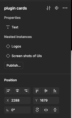
"Creating components is hindered by a poorly positioned property panel that’s often too small. Additionally, the property panel icon is inconsistent, appearing only after hovering, which creates a frustrating user experience. This makes the component creation process feel more like managing instances than building new elements.


