Hi,
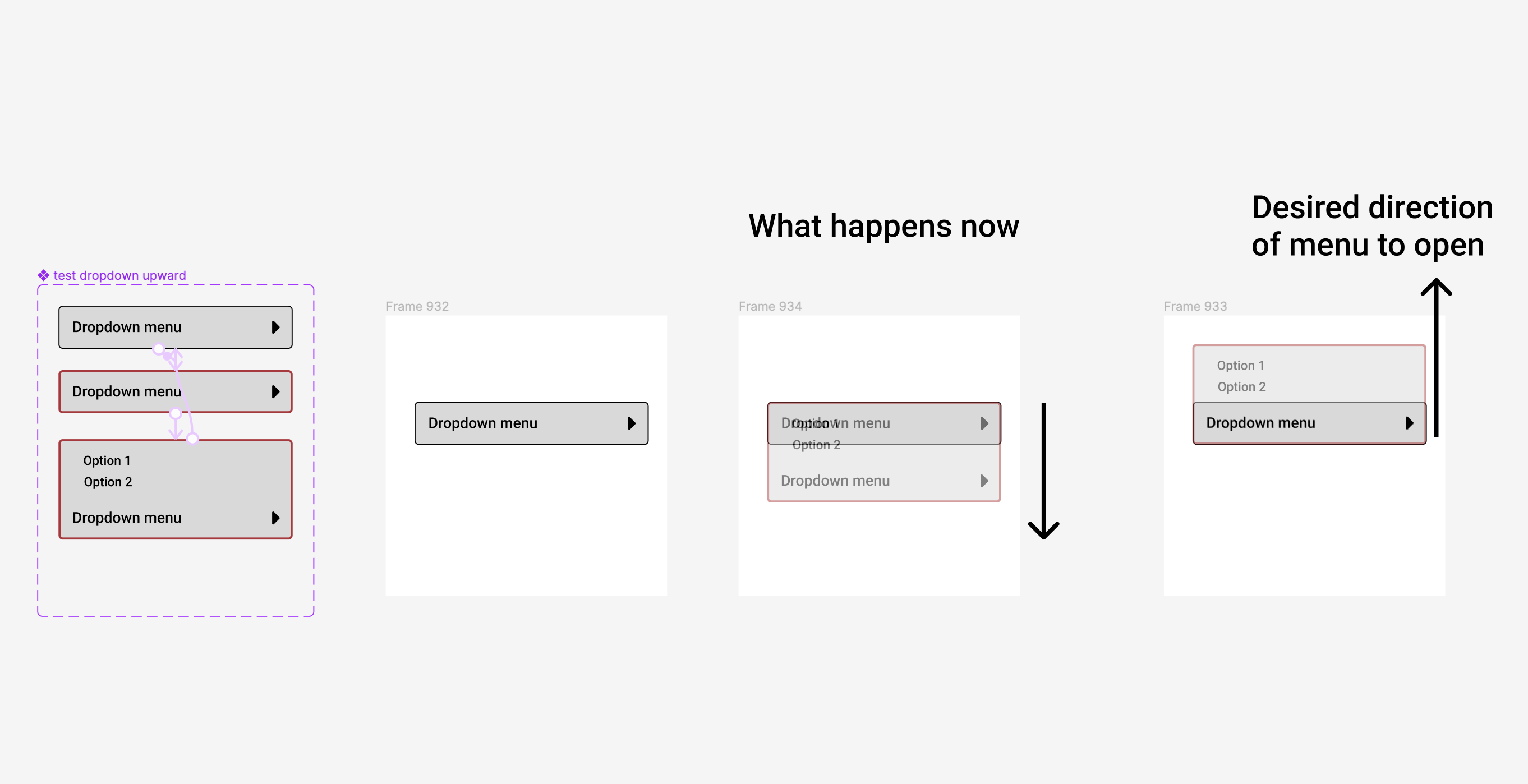
I’ve been trying to make a component of a dropdown menu open upward because of space constraints within the design. I can’t seem to make it.
Surprisingly, the smart animate opens the menu drawer ONLY in a downward direction. Now, is there any justification or preference for a downward animation rather than an upward or even sideward? Not really.
I am aware that it could be done through Overylay but then I lose the Smart Animate.
In After Effects, where you put the center point of an object determines the direction of the animation. Adding the option to change the center point in Figma is the right step forward and will greatly improve animation options.
Please consider tackling the discrimination against upward animations because this only favors the rich (the desktop users). 😉 Poor vertical mobile screens are hungry for upward animations as well as dropdowns.

