
Simplified assets display


Fred_Tinsel

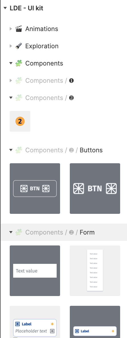
I would like to get rid of unuseful level indication in the assets panel.
You could easily remove the parent level when opening an accordion.

In my screenshot for example why do you keep “components”?
Even grayed it’s unuseful, there are other ways to keep indentations information.

4 replies

Lan_Van
  • 5 replies
  • April 22, 2021

This list is so difficult to navigate. Please add some indentation. It’s hard to distinguish which list am I opening. Some highlight to visualise the hierarchy of the parent and children item will help a lot.

Please help !!!


Melanie_Yeche

We are creating our design system and we are having issues with the components names being truncated because the name of components are displayed as [page name] / [Component name] (see screen shot)


When I look at Figma’s documentation, they don’t have the name of the page displayed before the component name

Is there a way for us to not see the page name (grey text)?


Gleb
  • Power Member
  • 4708 replies
  • May 14, 2021

The screenshot is from the old UI. There is no way to hide them. Feel free to edit your topic to turn it from a question to a suggestion and move it to #product-feedback.


Hazel
  • 11 replies
  • January 18, 2022

I have the same problem. Is there a plugin for this if Figma won’t make a fix?


Reply


Cookie policy

We use cookies to enhance and personalize your experience. If you accept you agree to our full cookie policy. Learn more about our cookies.

 
Cookie settings