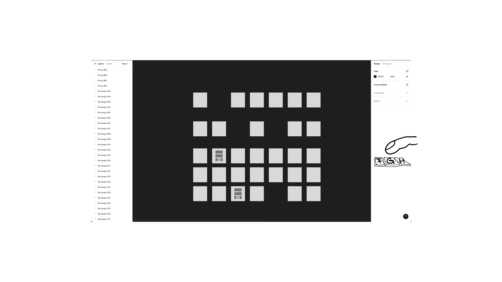
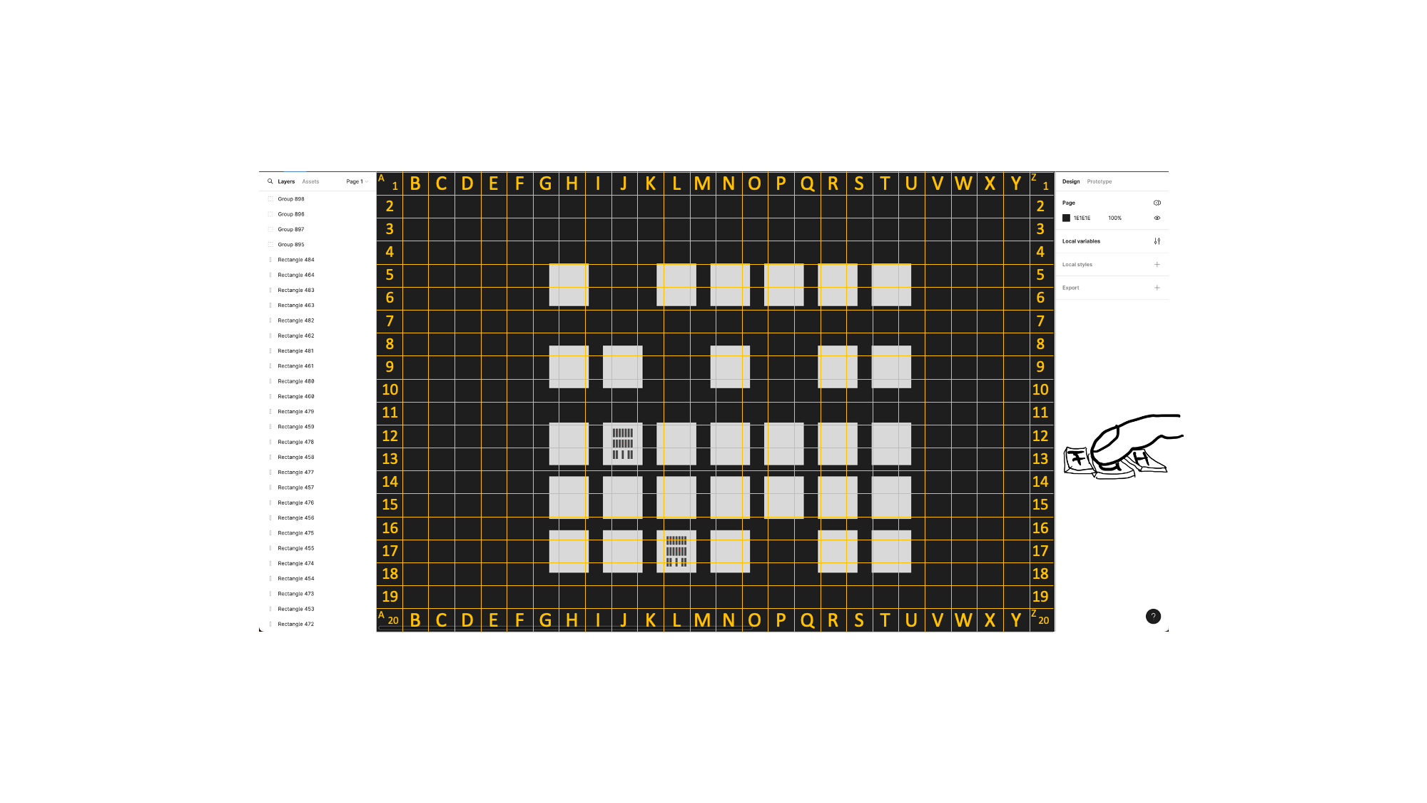
For better orientation when discussing screens, an overlay w/ a simple grid could be great. So one could say “Could you enlarge screen ‘H9’, please?”, and it would be clear which screen is meant. And no-one would have to place such marks upfront manually (which is a lot of work to maintain when the screen flow evolves and the screens become moved, and further screens are added).
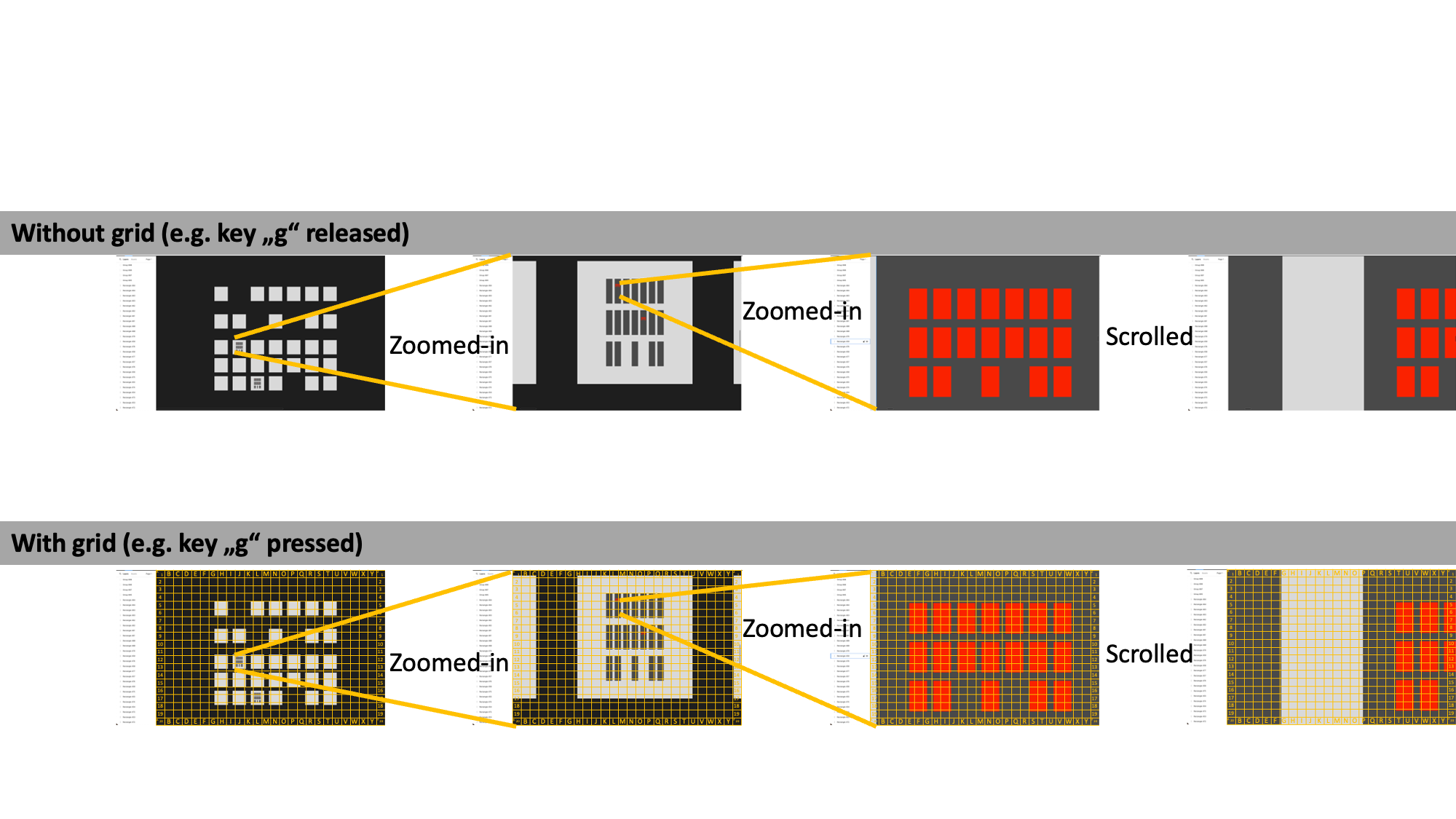
- The grid could show up when pressing a defined key (e.g. “g” for “Grid”), and vanish when releasing the key again. Maybe an additional tool button could make sense for showing the grid permanently during a discussion.
- The lines of the grid could always be the opposite color of the color on the screen (like when pixels covered by a line are white, this part of the line appears black - and vice-versa). Note that this is not shown on the attached screens.
- The grid could e.g. be always 26columns (labelled a-z)/20rows (1-20), and resizing could shrink/stretch the columns/rows. This would allow to not having to find characters beyond “abc…xyz”


